- Made by AppCoda
- Contact us / Support
- Tweet this book
- Preface
- 1. The Development Tools, the Learning Approach, and the App Idea
- 2. Your First Taste of Swift with Playgrounds
- 3. Hello World! Build Your First App in Swift
- 4. Hello World App Explained
- 5. Introduction to Auto Layout
- 6. Designing UI Using Stack Views
- 7. Introduction to Prototyping
- 8. Creating a Simple Table-based App
- 9. Customize Table Views Using Prototype Cell, Diffable Data Source and Dark Mode
- 10. Displaying Alerts with UIAlertController and Handling Table View Selection
- 11. Object Oriented Programming, Project Organization and Code Documentation
- 12. Table Row Deletion, Custom Action Button and MVC
- 13. Introduction to Navigation Controller and Segue
- 14. Detail View Enhancement and Navigation Bar Customization
- 15. Navigation Bar Customization, Extensions and Dynamic Type
- 16. Working with Maps
- 17. Basic Animations, Visual Effects and Unwind Segues
- 18. Working with Static Table Views, Camera and NSLayoutConstraint
- 19. Working with Core Data
- 20. Search Bar and UISearchController
- 21. Building Walkthrough Screens with UIPageViewController and Container Views
- 22. Exploring Tab Bar Controller and Storyboard References
- 23. Getting Started with WKWebView and SFSafariViewController
- 24. Exploring CloudKit
- 25. Localizing Your App to Reach More Users
- 26. Deploying and Testing Your App on a Real iOS Device
- 27. Beta Testing with TestFlight and CloudKit Production Deployment
- 28. Submit Your App to App Store
- 29. Adopting 3D Touch, Haptic Touch and Context Menus
- 30. Developing User Notifications in iOS
- 31. Appendix - Swift Basics
- Published with GitBook
Chapter 14
Detail View Enhancement, Custom Fonts, and Self Sizing Cells

To create something exceptional, your mindset must be relentlessly focused on the smallest detail.
- Giorgio Armani
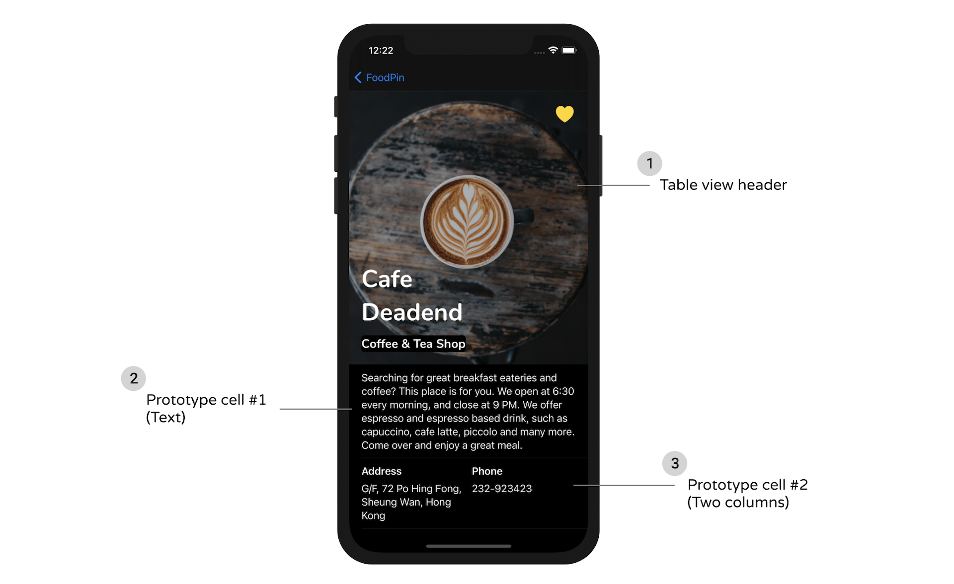
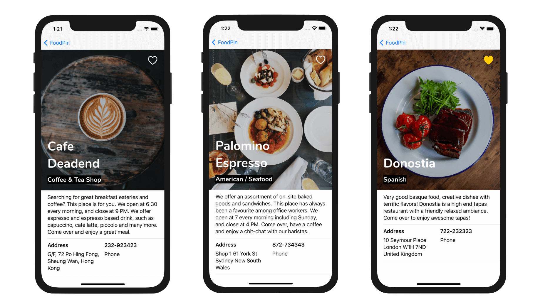
The detail view is a bit primitive. Wouldn't it be great to improve the detail view to the one shown above? In this chapter we'll focus on three areas:
- Design the detail view of the FoodPin app using a custom table view.
- Learn how to use your own fonts.
- Learn how to automatically resize a table view cell to fit its content.
We will cover a lot of materials in this chapter. You will probably need several hours to work on the project. I suggest you set aside other stuff and let yourself focus on it. On top of that, I assume you already understand how to build a custom table using prototype cells. If you forget what it is, go back and read chapter 9 again.
If you are ready, let's begin to tweak the detail view to make it look great.
What we're going to do is to present the restaurant information including name, type, location, phone and description in a well-designed table view. The restaurant image will be used as the header of the table.
Familiarize with the Starter Project
To begin, first download the FoodPin project from http://www.appcoda.com/resources/swift55/FoodPinDetailViewStarter.zip. The project was based on what we have completed in the previous chapter but I have modified the Restaurant struct to include two additional properties:
- phone
- description
The initialization of the restaurants array has been updated. If you look into the code in RestaurantTableViewController.swift, you should find that the values of the location property are updated with the full address. Also, it includes some dummy phone numbers and description like this:
var restaurants:[Restaurant] = [
    Restaurant(name: "Cafe Deadend", type: "Coffee & Tea Shop", location: "G/F, 72 Po Hing Fong, Sheung Wan, Hong Kong", phone: "232-923423", description: "Searching for great breakfast eateries and coffee? This place is for you. We open at 6:30 every morning, and close at 9 PM. We offer espresso and espresso based drink, such as capuccino, cafe latte, piccolo and many more. Come over and enjoy a great meal.", image: "cafedeadend", isFavorite: false),
    Restaurant(name: "Homei", type: "Cafe", location: "Shop B, G/F, 22-24A Tai Ping San Street SOHO, Sheung Wan, Hong Kong", phone: "348-233423", description: "A little gem hidden at the corner of the street is nothing but fantastic! This place is warm and cozy. We open at 7 every morning except Sunday, and close at 9 PM. We offer a variety of coffee drinks and specialties including lattes, cappuccinos, teas, and more. We serve breakfast, lunch, and dinner in an airy open setting. Come over, have a coffee and enjoy a chit-chat with our baristas.", image: "homei", isFavorite: false),

      ...

]
In the storyboard of the starter project, all the subviews of the detail view controller have been removed. We no longer use those views because we are going to redesign it.
These are the changes that I have prepared for you in the starter project. After you download the project, I encourage you to run it once and familiarize with the changes.
Using Custom Fonts
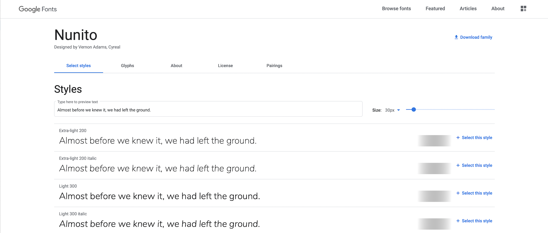
The San Francisco font was introduced in Nov 2014 and has been used as the default font in iOS apps. What if you find an open source font on Google Fonts (https://fonts.google.com) and want to use it in your app? How can you do it?
Xcode has made it very easy for developers to use custom fonts. All you need is just add the custom font files into your Xcode project. Let's say, you prefer to use Nunito in your app. You can go up to https://fonts.google.com/specimen/Nunito. Click Download Family to download the font files.
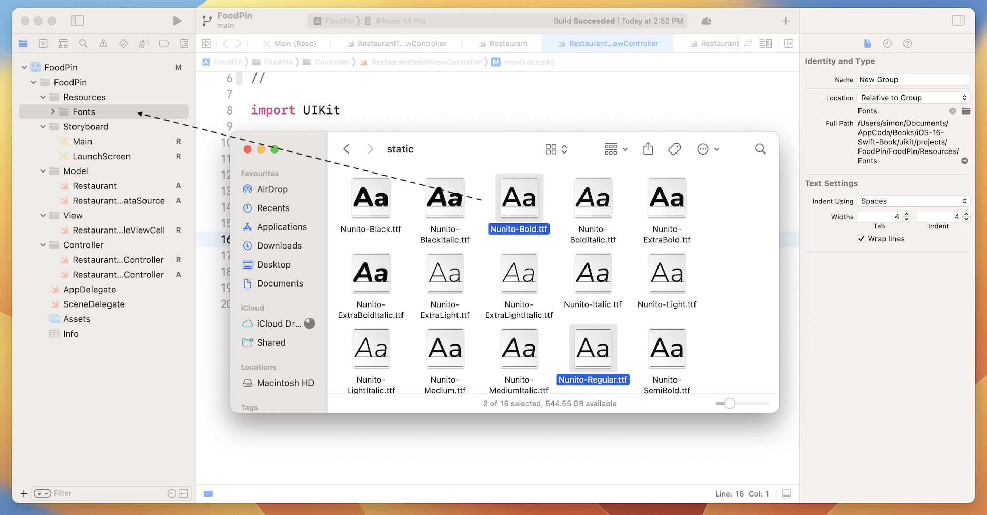
Now go back to Xcode and open the starter project (if you haven't). In the project navigator, right click the FoodPin folder and select New Group. Name the group Resources. Next, right click the Resources folder and select New Group to add a sub group. Name the sub group Fonts. Select Nunito-Regular.ttf and Nunito-Bold.ttf, and add them to the Fonts group. In case if you want to use all the font styles, you can add all the font files to the group.
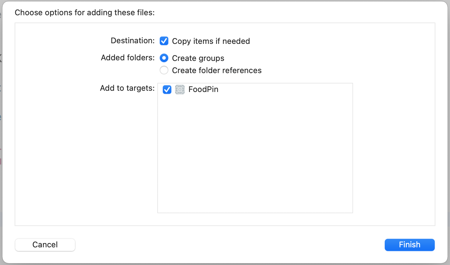
Note: Is it a mandate to create a sub group? No, it is my practice to organize resource files like that.Once you dropped the files into the group, you will be prompted with the dialog as shown in figure 14-3. Make sure you check the Copy items if needed option and the FoodPin target.
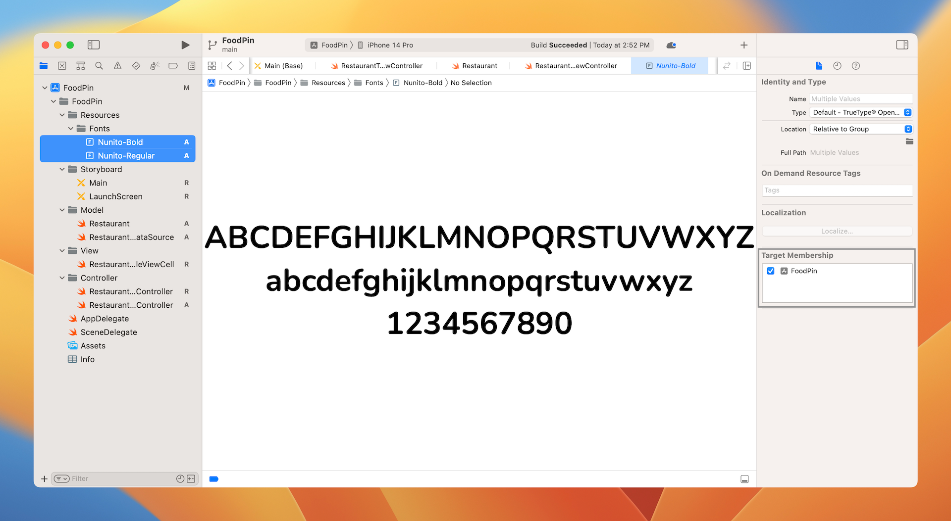
Once you hit Finish, the font files will appear in the project navigator. To ensure your app can use the font files, hold command key to select all the fonts files. In the File inspector, make sure the FoodPin option under target membership is enabled. If not, tick the option.
That's the procedures to install a custom font. Later you will be able to use the Nunito font when we design the detailed view.
Designing the Table View Header
Now let's start to design the detail view. Figure 14-5 shows the expected design of the detail screen. There are multiple ways to implement this kind of screen. One way is to use a dynamic table view to realize it. You have learned what a dynamic table view is. In earlier chapters, you created a custom table view with prototype cells. The prototype cell is similar to a design template. Though the cell's data differs, the look & feel of each cell is exactly the same. That's the idea of prototype cells.
As you know, it is not a mandate to design a table view using one prototype cell. We have already created two prototype cells for the restaurant table view. To create the detailed screen, we will create a couple of prototype cells. The other thing I haven't mentioned so far is that each table view has its own header view. This header view resides on top of the table cells. The header view is empty by default, but you are allowed to add your own view to that.
So, here is what we are going to do to realize the detail view design:
- Create a table header view that displays the restaurant image, name, type, and the heart image.
- Create two prototype cells for the restaurant information:
- Prototype cell #1 - for displaying a paragraph of text.
- Prototype cell #2 - for displaying two columns of information. In the detailed view, we use this prototype cell to display the restaurant's address and phone number.
Now that you should have some ideas about how we structure the table view, let's dive into Interface Builder and design the view.
Go to the Main storyboard of the starter project. Open the Object library and select a table view object (note: it's a table view instead of a table view controller). Drag it to the detail view controller. Resize it to fit the whole view and then click "Add new constraints". Set the value of the top, left, right, and bottom sides to 0. And, click Add 4 constraints. This ensures the table always fits the whole screen regardless of the screen size. Your screen should look like that in figure 14-6.
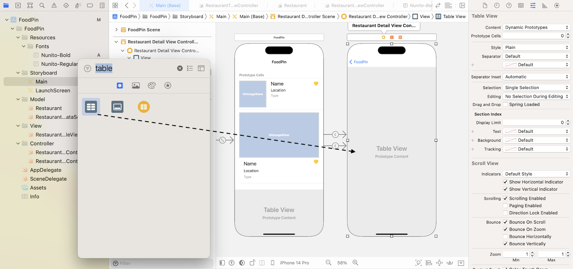
Select the table view and set the prototype cells to 2 in the Attributes inspector. This adds two prototype cells in the table view. We will deal with the prototype cells later.
Now, add a view from the object library to the table view's header. To locate the view object, you can search for UIView. In the document outline view, drag the view to table view and place it right above the first table view cell. Change the height of the view to 445 points in the Size inspector. This view serves as the container view holding other elements (e.g. image view) which we will add later. Once done, the design of your detail view should look like that in figure 14-7.
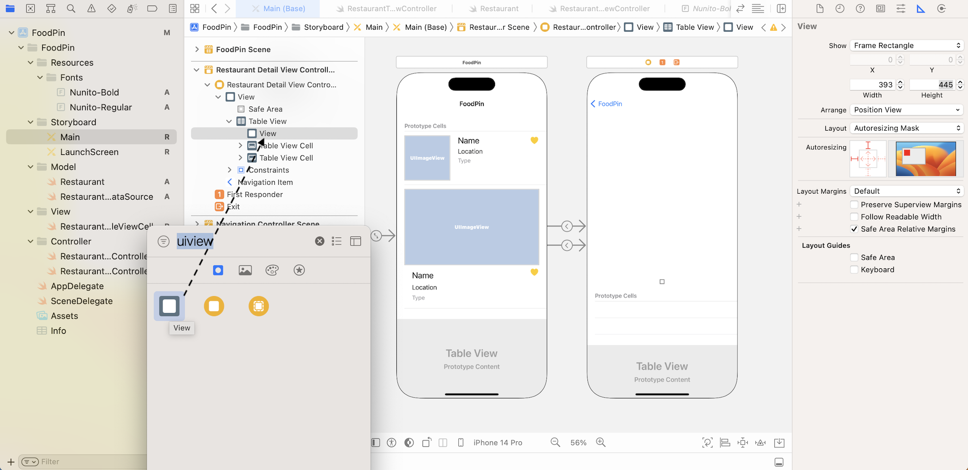
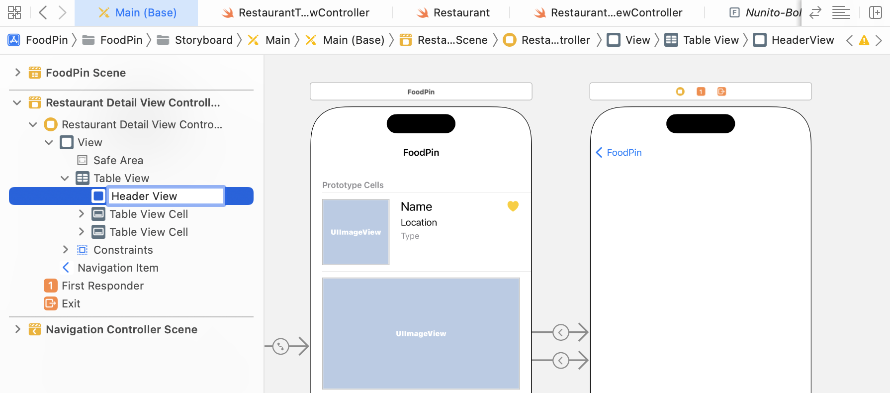
You can rename the view from View to Header View in the document outline. Just click on View and change it accordingly. This step is completely optional. However, by giving each view a meaningful name, it will make you easier to identify a specific view later.
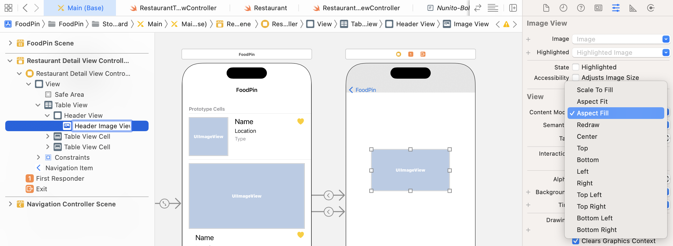
We haven't designed the header view yet. Now drag an image view from the Object library and place it in header view. In the Attributes inspector, change the Content Mode to Aspect Fill. Again, to organize our UI components better, give the image view a proper name in document outline. Set it to Header Image View.
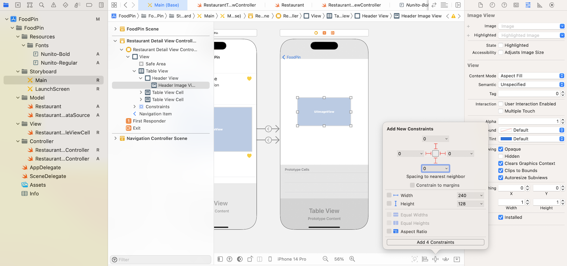
You do not need to add auto layout constraints for the header view because it is added as the table view header. However, we have to define some constraints for the header image view. The image view should always fit the size of the header view. To make this possible, we will define four spacing constraints for the top, bottom, left and right sides of the image view. Select the image view and click the Add new constraints button of the layout bar. Set the spacing of the top, left, right and bottom side to 0. Make sure the bars are in solid red and the Constrain to margins option is unchecked. Then hit the Add 4 Constraints button to add the constraints.
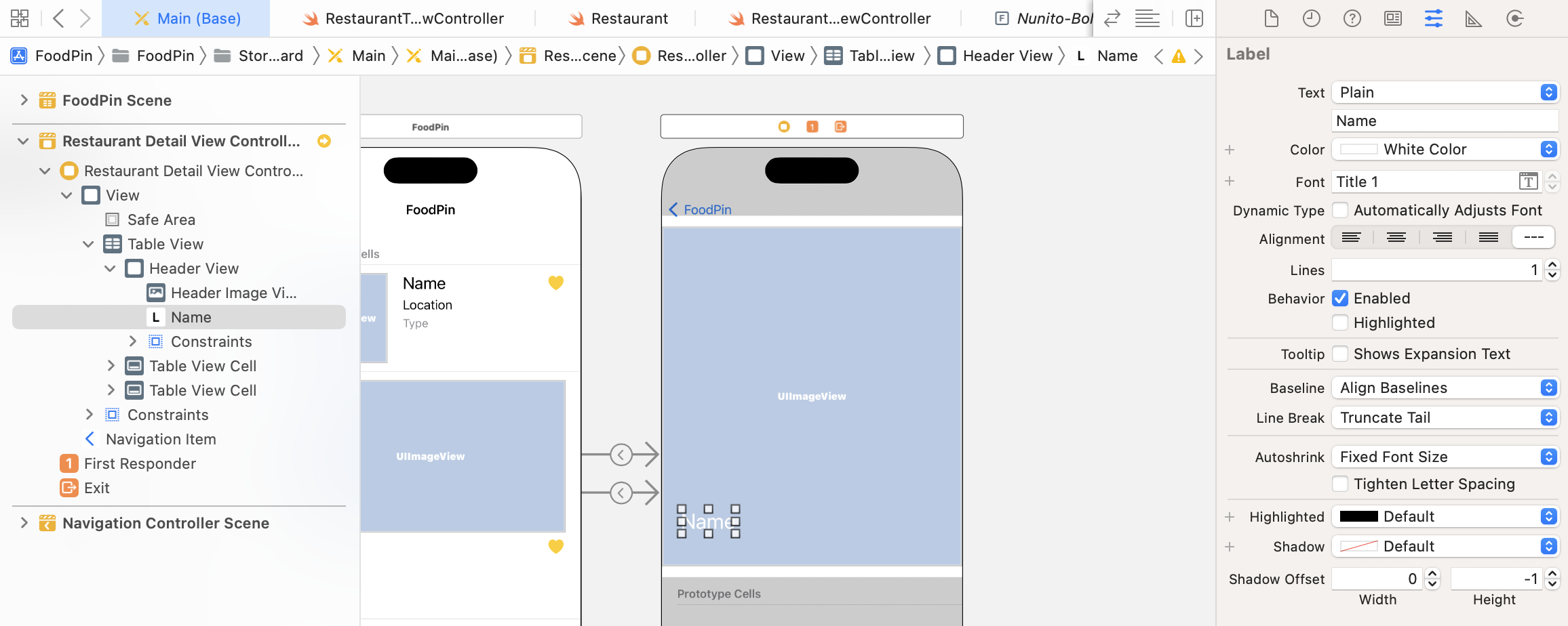
Next, add a label and place it near the lower left corner of the image view. This label is used to display the restaurant name. Make sure the label is selected and go to the Attributes inspector. Change the color to white and set the Font to Title 1 text style. Also, change its text to Name.
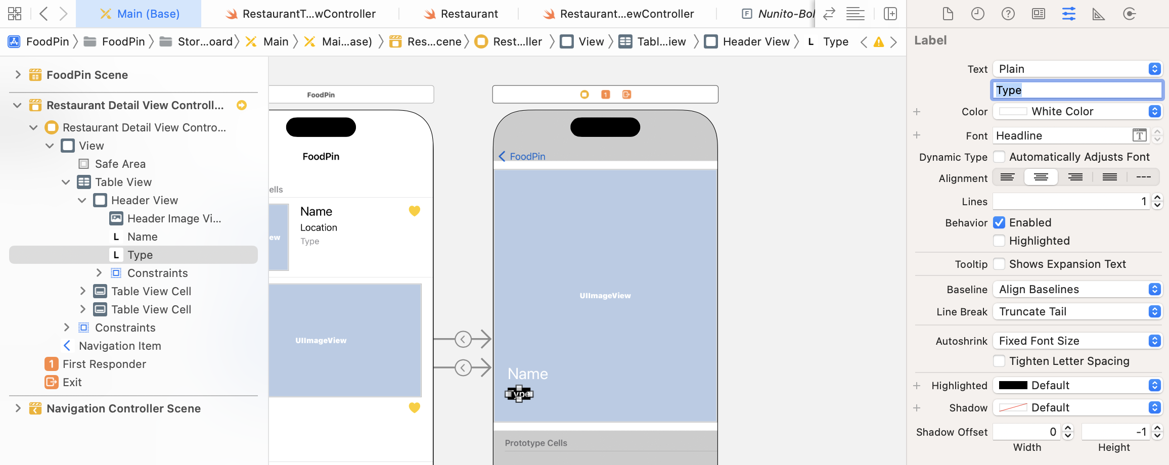
Now drag another label and place it under the previous label object. This new label is used for presenting the restaurant type. In the Attributes inspector, set the background color to black. For the font color, change it to white. Change the font style to headline. Also, change the alignment option to center. Lastly, change its text to Type.
Next, drag a new button from the Object library and put it at the top right corner of the header view. This is an image button that allows users to mark the restaurant as favorite. In the Attributes inspector, set its title to blank and image to heart, which is a SF symbol. To resize the heart symbol, change the configuration option in the Default Symbol Configuration section and set it to Point Size. Increase the point size to 30 points to make the heart icon larger. As a final touch, change the button's tint color to white.
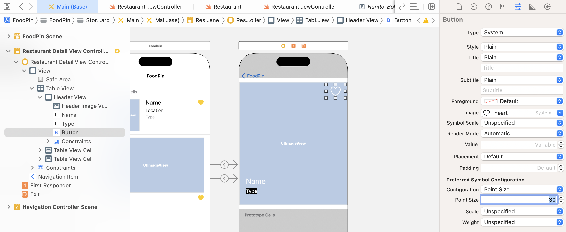
Now it's time to add some layout constraints for these components. Let's first start with the heart button. I want to define the following layout requirement for it:
- The size of the button should be fixed
- The top side of the label should be 10 points away from margin of the header view.
- The right (or trailing) side of the label should be 10 points away from margin of the header view.
Select the heart button and then click the Add new constraints button. Set the values of both top and right sides to 10 points. Please make sure the Constrain to margins option is checked. Next, check both width and height options to enable the size constraints. Lastly, click the Add 4 Constraints button to proceed.
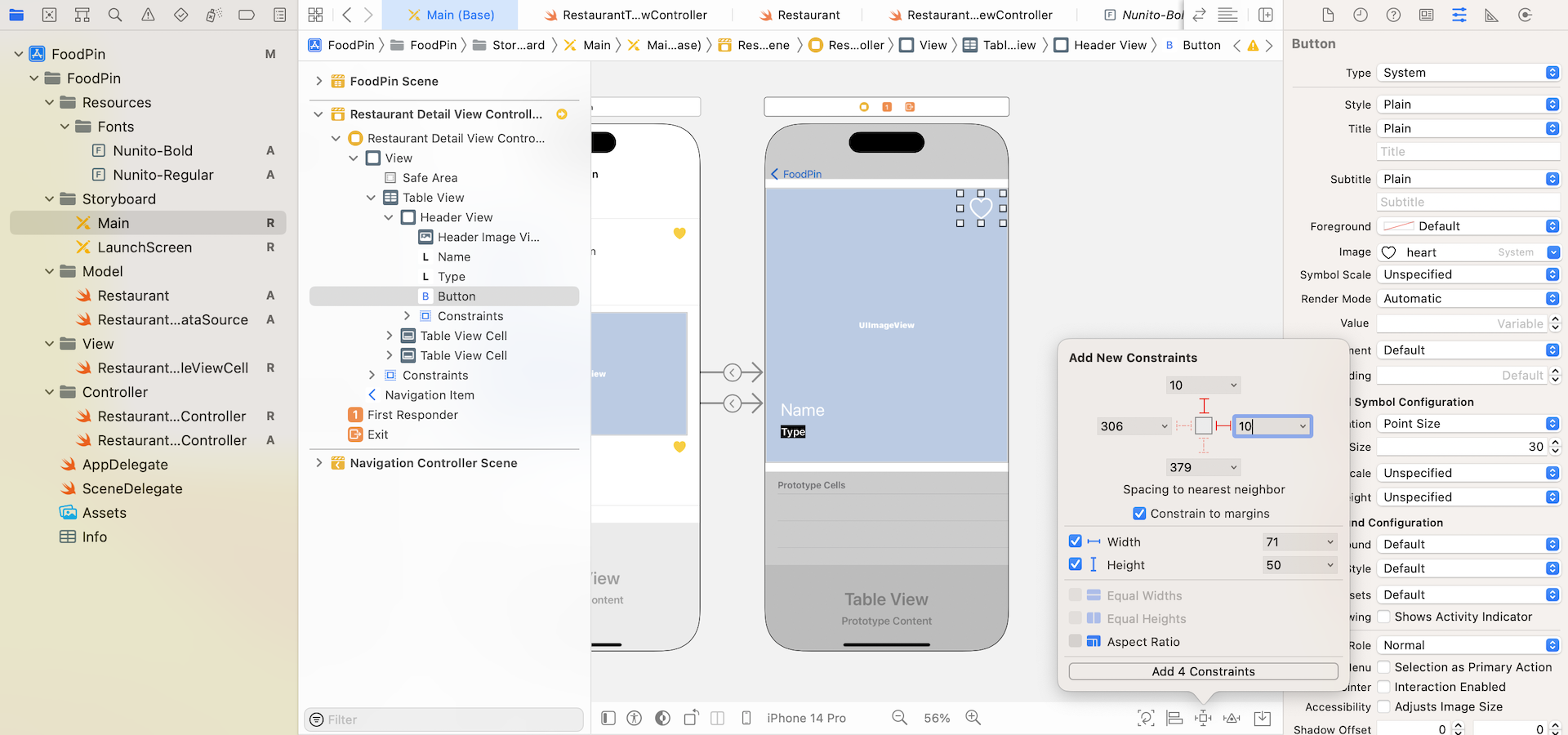
Next, let's add the layout constraints for the name and type labels. We will first embed both labels in a stack view. Select both labels in the document outline. Click the Embed in button and choose Stack view to embed both labels in a stack view. Once you created the stack view, go to the Attributes inspector and set the spacing value to 10 points.
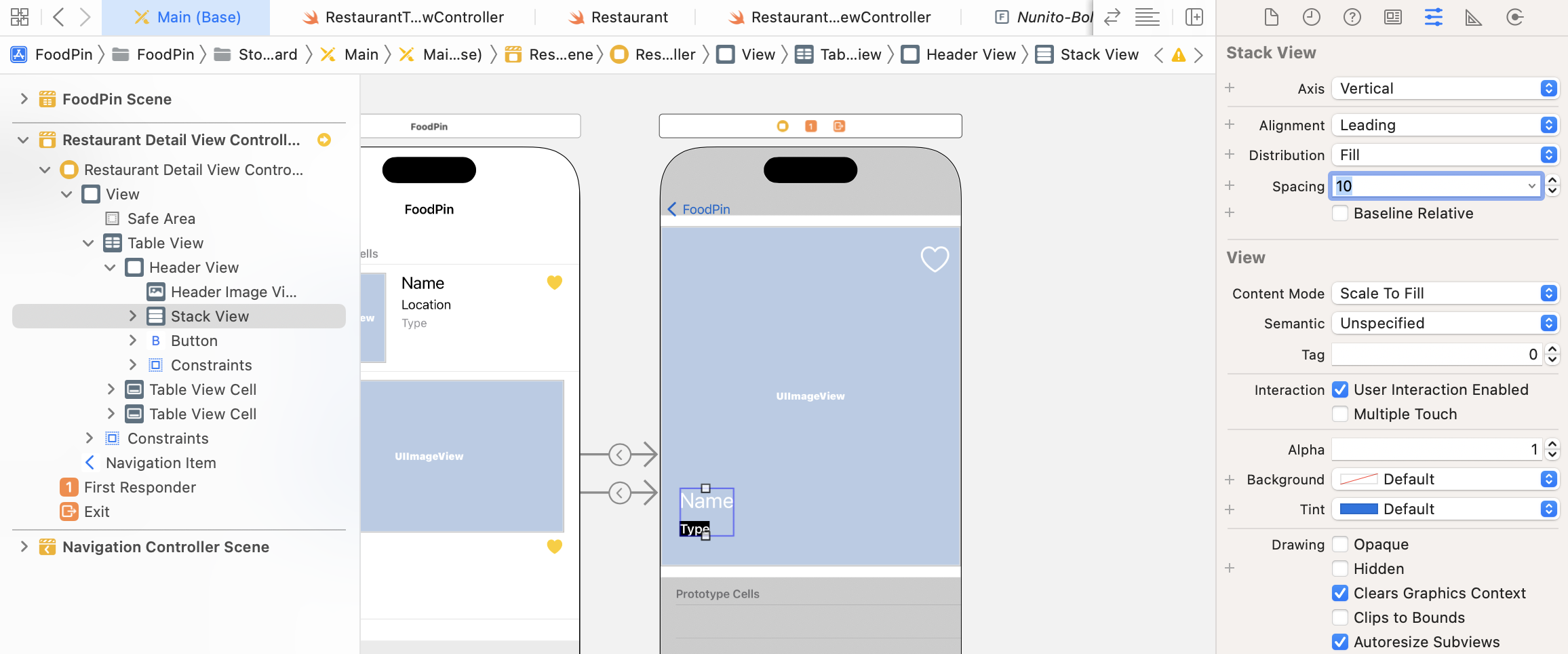
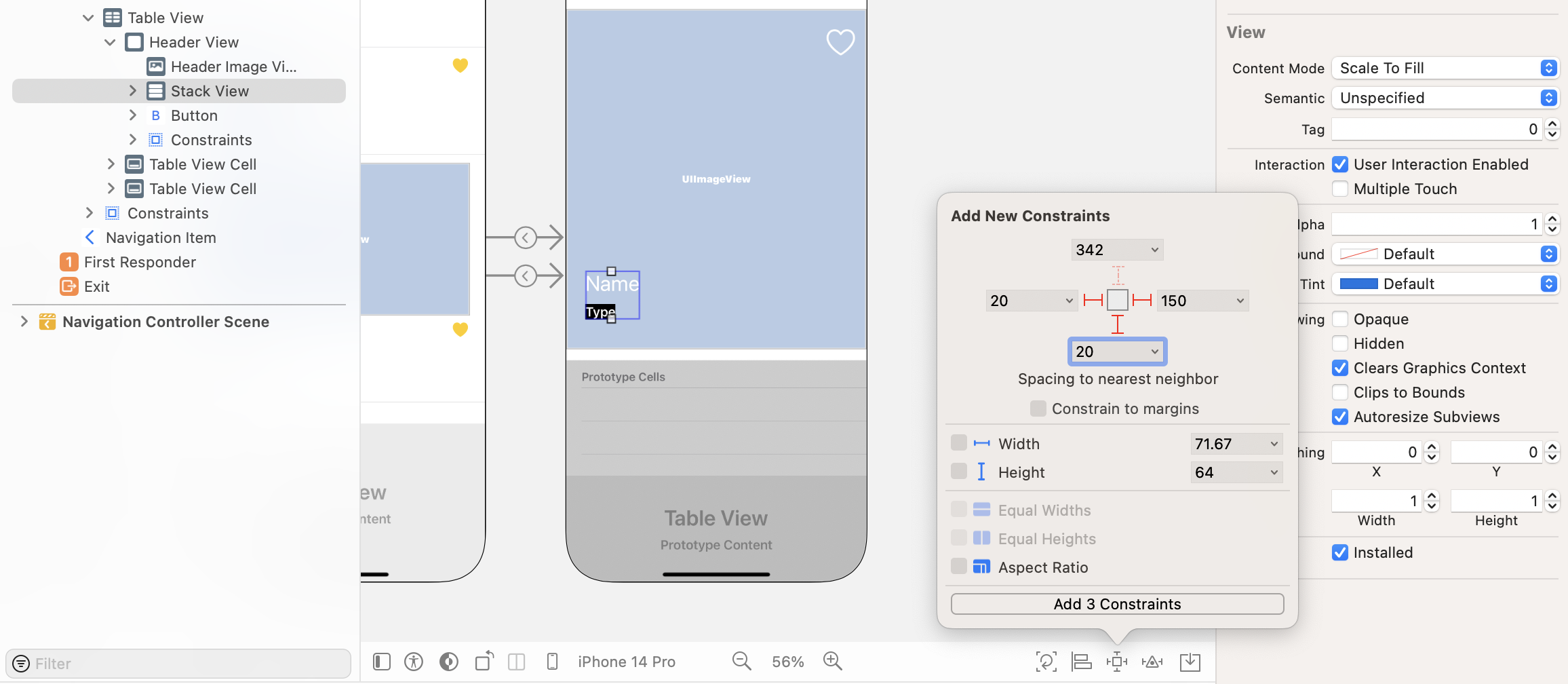
Now it's for the layout requirement. I want to keep the stack view at the lower left corner of the header view, so we will add a few spacing constraints. Select the stack view and click the Add new constraints button. Set the left, right, and bottom value to 20, 20, and 150 points respectively. You are free to adjust these values if you want to change the position of the stack view.
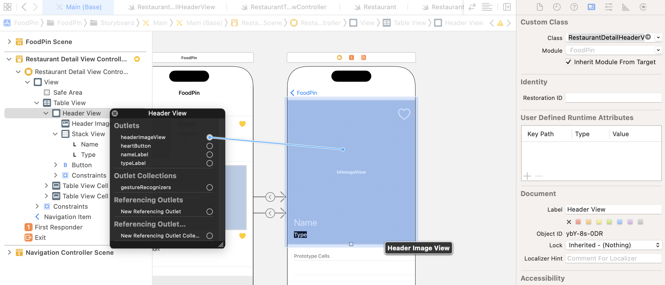
That's it! We've completed the design of the header view. Now let's move onto the coding part. We will create a class for the header view. In project navigator, right-click the View folder and select New File…. Choose the Cocoa Touch Class template and hit Next. Set the class name to RestaurantDetailHeaderView and its subclass to UIView. Click Next to create the file.
Edit the RestaurantDetailHeaderView.swift file like below to add the required outlet variables:
import UIKit

class RestaurantDetailHeaderView: UIView {

    @IBOutlet var headerImageView: UIImageView!
    @IBOutlet var nameLabel: UILabel!
    @IBOutlet var typeLabel: UILabel!
    @IBOutlet var heartButton: UIButton!

}
Go back to Interface Builder and select the Header View in document outline. In Identity inspector, change the custom class to RestaurantDetailHeaderView. Next, establish a connection with each of the corresponding outlet variables.
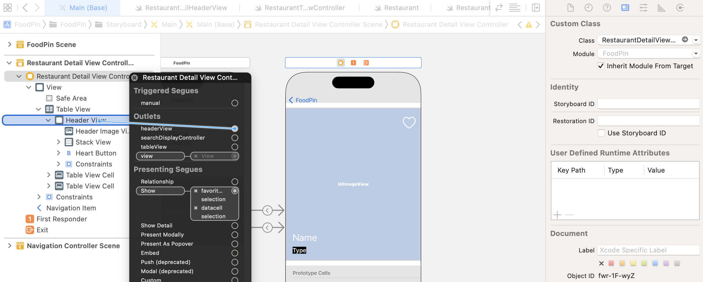
Now that the header view is ready for us to populate the restaurant data, it is time to modify RestaurantDetailViewController.swift. In the RestaurantDetailViewController class, insert two new outlet variables for the table view and the header view. Later, we need to modify their content in code. This is why we need to create these outlets:
@IBOutlet var tableView: UITableView!
@IBOutlet var headerView: RestaurantDetailHeaderView!
Next, update the viewDidLoad method with the following code:
override func viewDidLoad() {
    super.viewDidLoad()

    navigationController?.navigationBar.prefersLargeTitles = false

    // Configure header view
    headerView.nameLabel.text = restaurant.name
    headerView.typeLabel.text = restaurant.type
    headerView.headerImageView.image = UIImage(named: restaurant.image)

    let heartImage = restaurant.isFavorite ? "heart.fill" : "heart"
    headerView.heartButton.tintColor = restaurant.isFavorite ? .systemYellow : .white
    headerView.heartButton.setImage(UIImage(systemName: heartImage), for: .normal)

}
The code is very straightforward. When the detail view is loaded, we set the restaurant data to the corresponding label or image view. We also check the isFavorite property of the selected restaurant and change the color of the heart icon. To make the code work, don't forget to connect the outlets with the corresponding UI components. The tableView outlet should be connected with the Table View of the detail view controller and the headerView outlet should be connected with Header View.
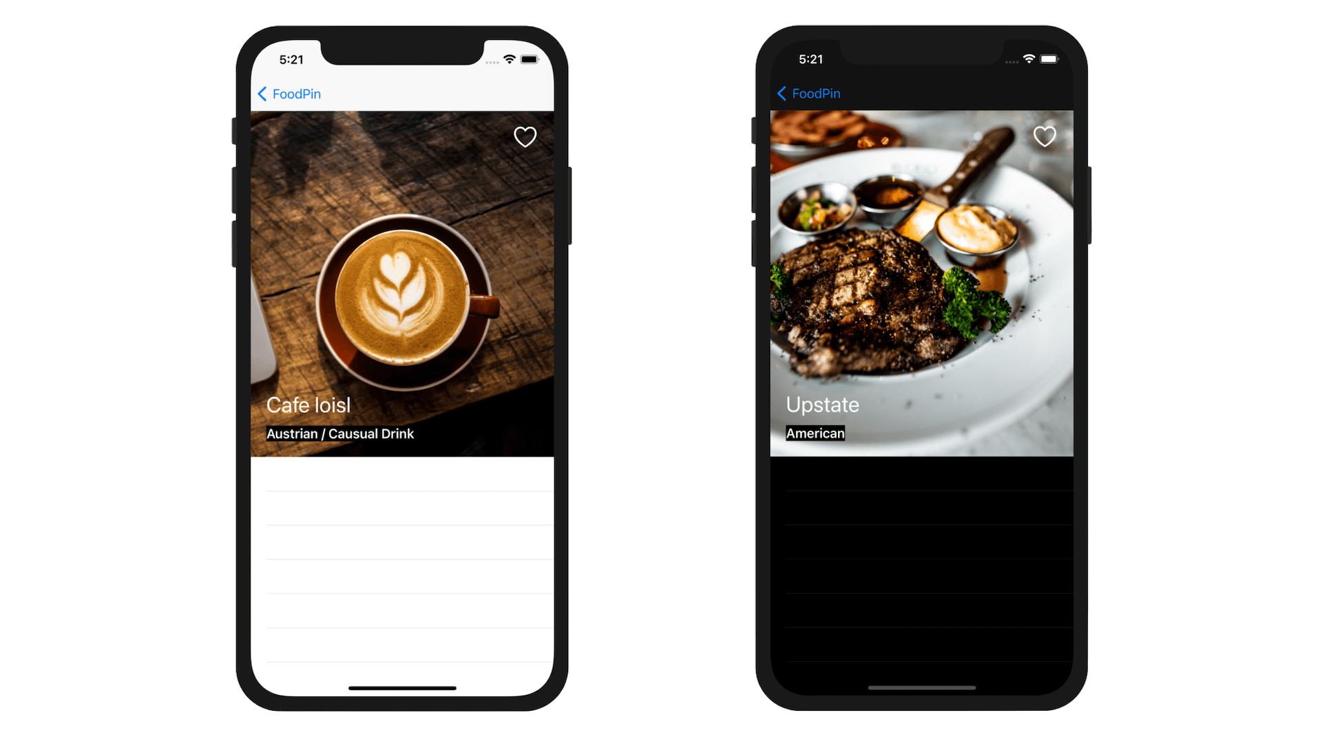
After all the tedious procedures, it is now ready to test your app! Run the project and have a quick look. The image is now displayed in the table view's header (right above the rest of the table rows).
Understanding Image View Scaling
Earlier, I asked you to set the content mode of the image view to Aspect Fill. We haven't discussed how this content mode option affects the presentation of the image. Before we continue to build the detailed view, let me explain the usage of this option. Every view in iOS has a content mode. The UIImageView class is a subclass of UIView, so it also has a content mode property to specify how a view adjusts its content. Here are the three common scaling modes you usually use:
- Scale to Fill (default)
- Aspect Fit
- Aspect Fill
By default, the UIImageView object is set to Scale To Fill . In this mode, the image view scales its image to fit the view's size. The aspect ratio of the image may be changed due to the scaling. If you change the mode to Aspect Fit, the aspect ratio of the image will be maintained. However, it may leave some extra spaces on both sides of the image if the image view's aspect ratio is different from that of the image.
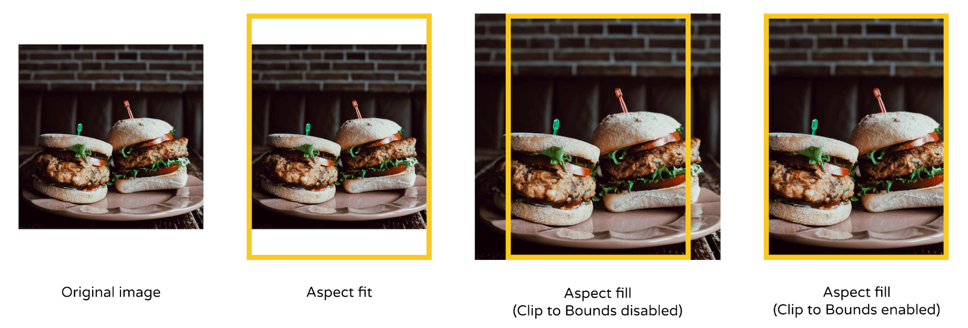
The Aspect Fill mode is the best fit for our design, which is why we set the header image view to this mode. In this mode, the image view scales the image to fill the size of the view. The aspect ratio is maintained, though some parts of the image may extend over the edges of the image view. In this case, you will need to enable an option called Clip to Bounds to cut off the extra parts (see figure 14-20).
In Xcode 14, the Clip to Bounds option is enabled by default. This is why the Aspect Fill mode works out of the box. You can select the image view and check the Clips to Bounds setting in the Attributes inspector.
Fixing a Couple of Issues
The header view looks great, right? However, there are a couple issues we need to fix:
- For some lengthy restaurant names, they cannot be fully displayed.
- For some restaurant images with a lot of white backgrounds, the restaurant name may be clearly shown.
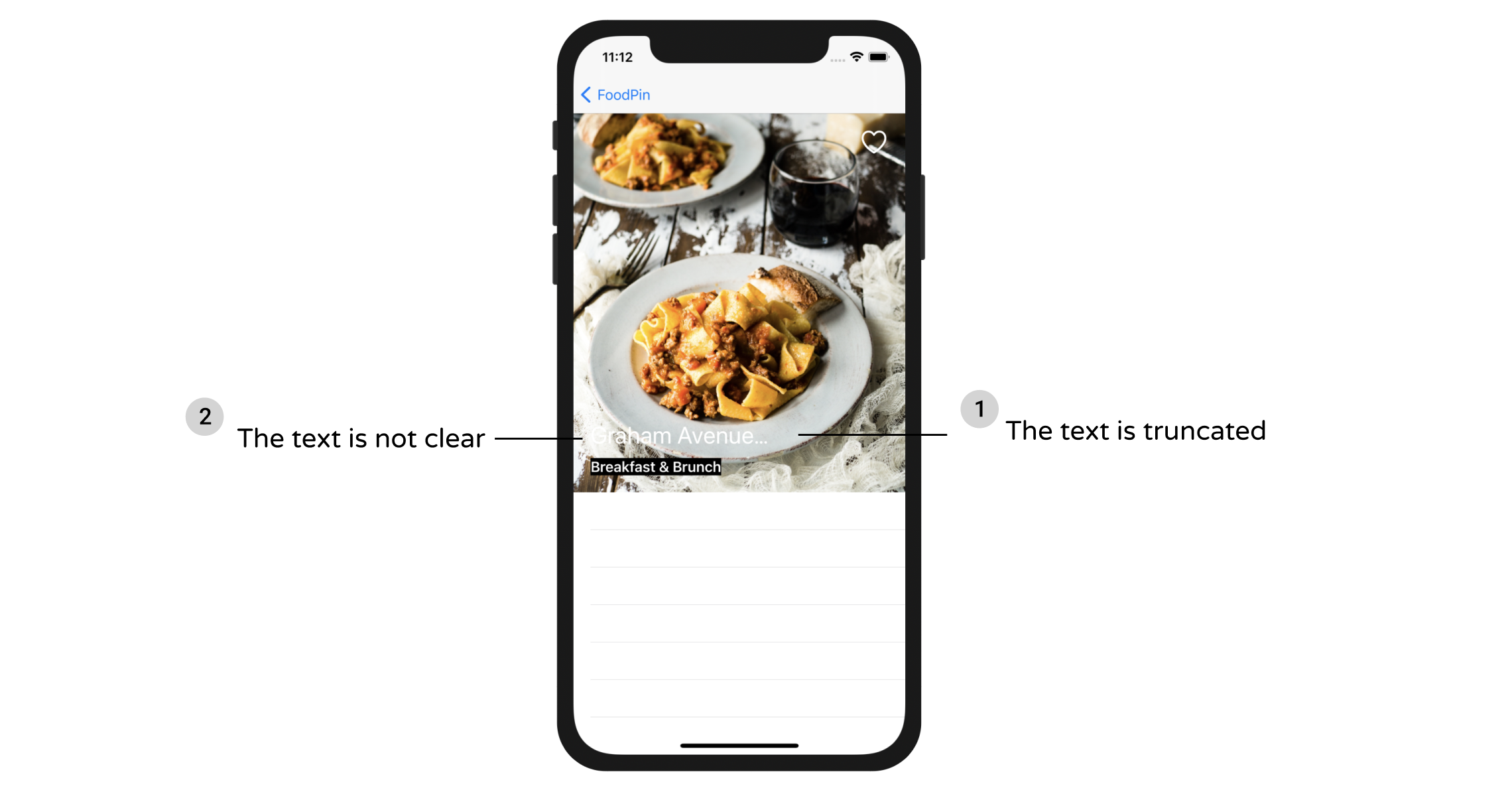
Truncated Restaurant Names
The first issue is related to the restaurant name. If the name is too long, the label will truncate the text. By default, the label is set to display text in a single line. You can select the label and then reveal the Lines option in the Attributes inspector. The current value should be set to 1.
Labels in iOS are capable to display multiple lines. All you need is to change the value to 0. In this case, the label will automatically determine the total number of lines to fit its content. While you can change the value in Interface Builder, I prefer to customize the property of the label in code. Open RestaurantDetailHeaderView.swift and edit the nameLabel variable to update the numberOfLines property using didSet:
@IBOutlet var nameLabel: UILabel! {
    didSet {
        nameLabel.numberOfLines = 0
    }
}
Dimming the Image Using UIView
Now let's fix the second issue. Since the restaurant name label is in white, it may not be shown clearly if the restaurant image has a lot of white in it. How can we solve this issue?
One way is to add an overlay to dim the image. To do that, go to Main. Open the Object library, drag a view and place it right below the header image view in document outline. Name it Dim View.
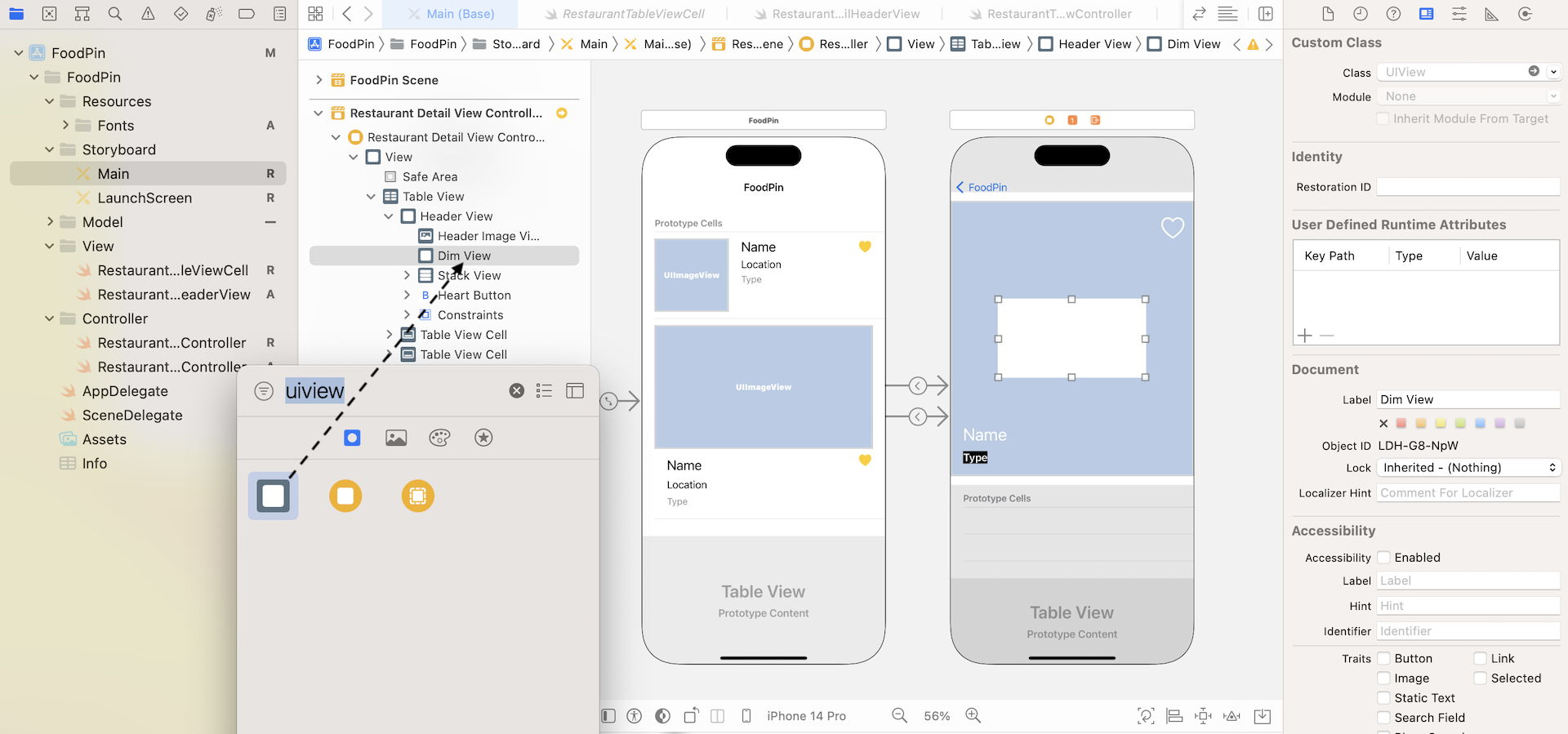
Resize the view to make it the same size as the header view. Then go to the Attributes inspector. Set the background color to black and alpha value to 0.2. The alpha value controls the transparency of the color. It goes from 0 to 1 where 0 is completely transparent and 1 fully opaque. We set the value to 0.2 so that it is partially transparent, and achieve a dimming effect. If you don't know how to change the opacity value, you can choose Custom in the Background option. Then you will see a Colors dialog. Choose the Color Sliders tab and set to RGB Sliders. You can then choose the opacity.
Lastly, don't forget to define the layout constraint for the view. Select the Dim View and click the Add new constraints button. Set the spacing of the top, left, right and bottom side to 0. Make sure the bars are in solid red and the Constrain to margins option is unchecked. Then hit the Add 4 Constraints button to add the constraints.
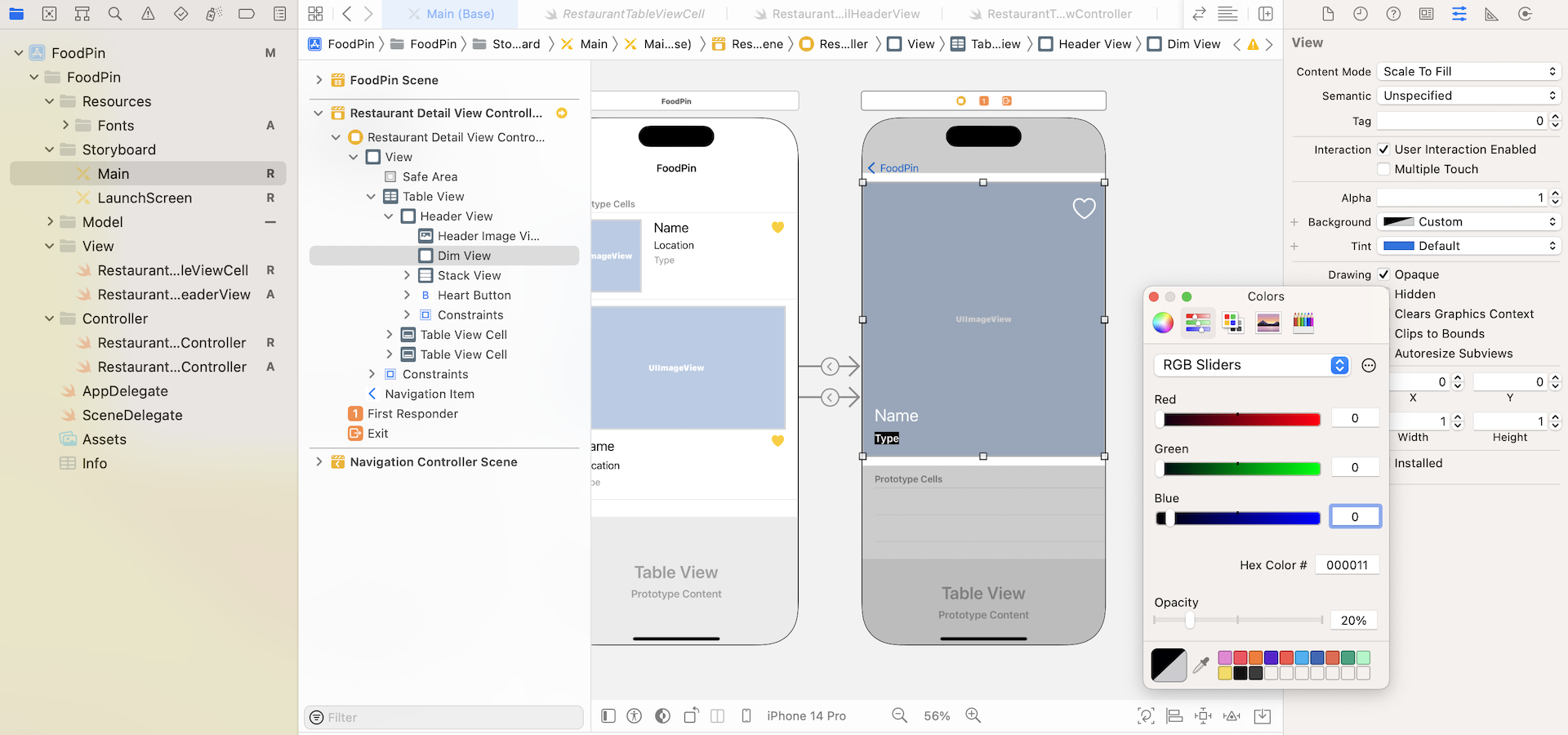
Now it is time to test the header view again. If you got everything correct, the header view should have fixed the mentioned issues. With the Dim View, we increase the color contrast of the image and the text. The restaurant name is now clearly shown even in light background. And, the name label automatically wraps the text onto a new line.
Using Custom Fonts for Dynamic Types
Do you still remember the fonts files we imported at the very beginning of the chapter? We haven't used them yet. Right now, all the labels are configured to use text styles. For example, the name label uses the Title 1 text style. Without any customizations, iOS uses San Francisco as the default font.
To use a custom font for text style (or Dynamic Types), we first have to configure those font files in Info.plist, which is the configuration of the Xcode project. In the project navigator, select Info.plist and right-click any blank area to open the context menu. Select Add row to create a new row in the file.
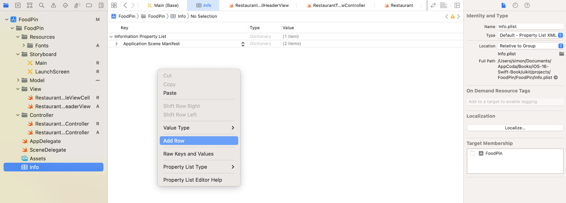
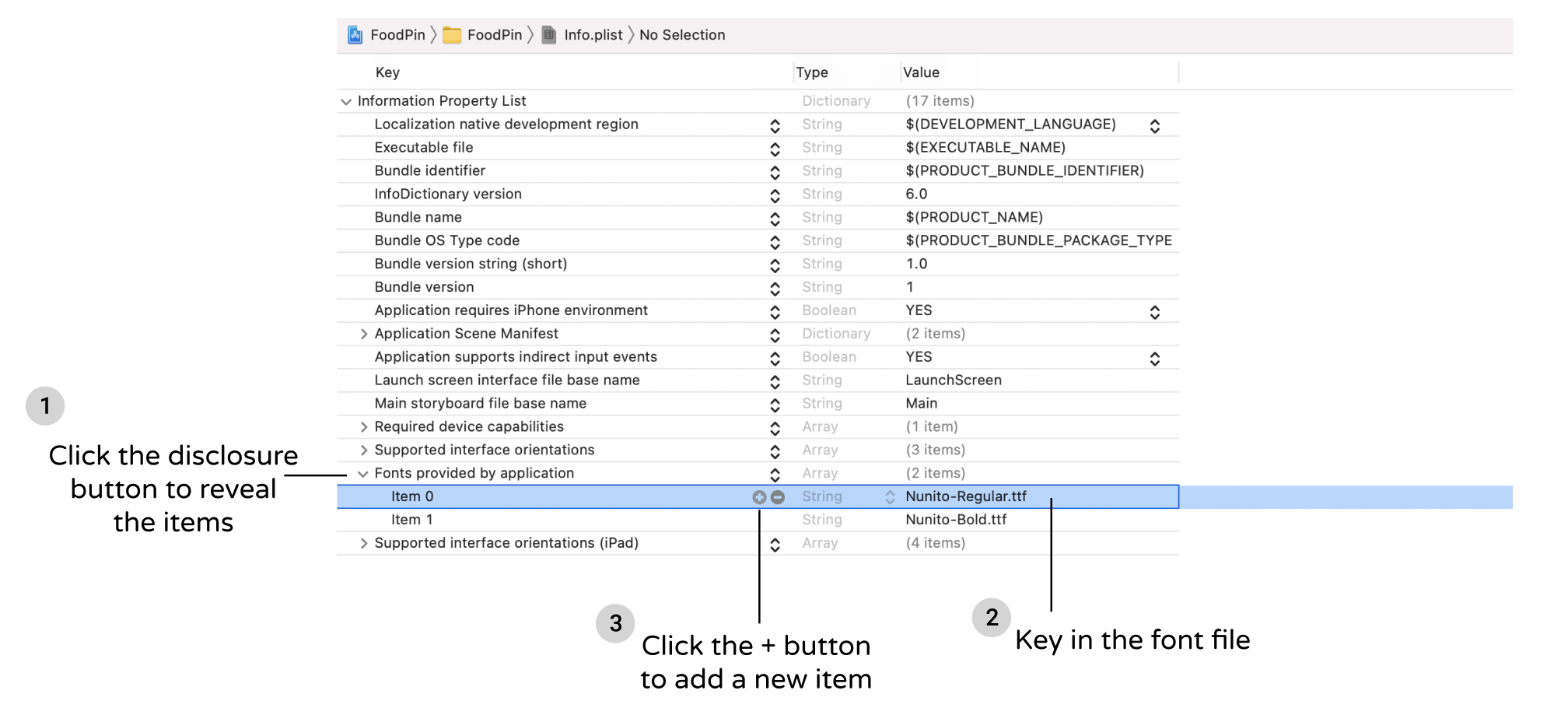
Next, type Fonts provided by application in the Key field. In order to register the font files, we need to add the key and specify all the font files. Once you add the key, click the disclosure button to expand it. For item 0, set its value to Nunito-Regular.ttf. You can click the + button of item 0 and add another item. For item 1, set the value to Nunito-Bold.ttf.
Now you are ready to use the fonts in Interface Builder or using code. To change the font of a specified text style, you can write the code like this:
if let customFont = UIFont(name: "Nunito-Bold", size: 40.0) {
    nameLabel.font = UIFontMetrics(forTextStyle: .title1).scaledFont(for: customFont)
}
The UIFont class lets you load the font file and provides you with access to the font’s characteristics. You use a UIFontMetrics object to support scalable custom fonts in your app. In the code above, we apply the Nunito-Bold font to the Title1 text style. If you want to set the custom font for another text style, just pass the forTextStyle parameter with another value.
Now modify both nameLabel and typeLabel in the RestaurantDetailHeaderView class like this:
@IBOutlet var nameLabel: UILabel! {
    didSet {
        nameLabel.numberOfLines = 0

        if let customFont = UIFont(name: "Nunito-Bold", size: 40.0) {
            nameLabel.font = UIFontMetrics(forTextStyle: .title1).scaledFont(for: customFont)
        }
    }
}
@IBOutlet var typeLabel: UILabel! {
    didSet {
        if let customFont = UIFont(name: "Nunito-Bold", size: 20.0) {
            typeLabel.font = UIFontMetrics(forTextStyle: .headline).scaledFont(for: customFont)
        }
    }
}
We tell the system to use our own font for both name and type labels. Once you made the change, you can run the app again. In the detailed view, the app should now use the custom font.

Designing the Prototype Cells
Now that we've completed the implementation of the header view, let's move to the implementation of the table view cells. If you read the book from the very beginning, you should know how to customize the prototype cell. To display the restaurant information, we will create two prototype cells to support two different types of cell layout. One prototype cell is designed to display the multiline text. The other cell is for displaying two column data.
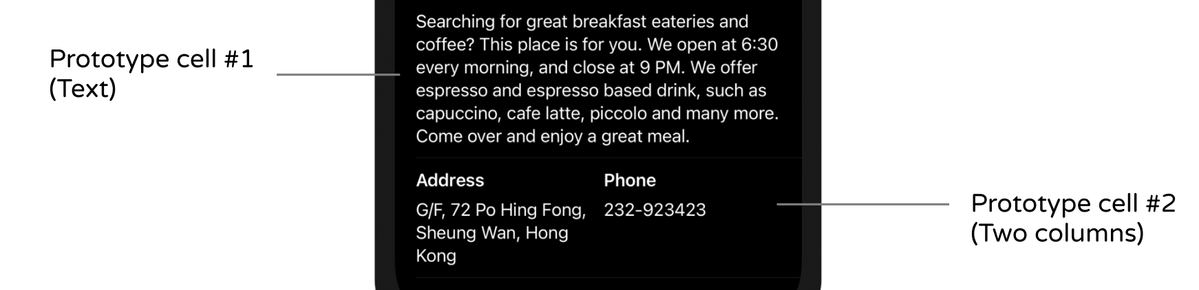
RestaurantDetailTextCell
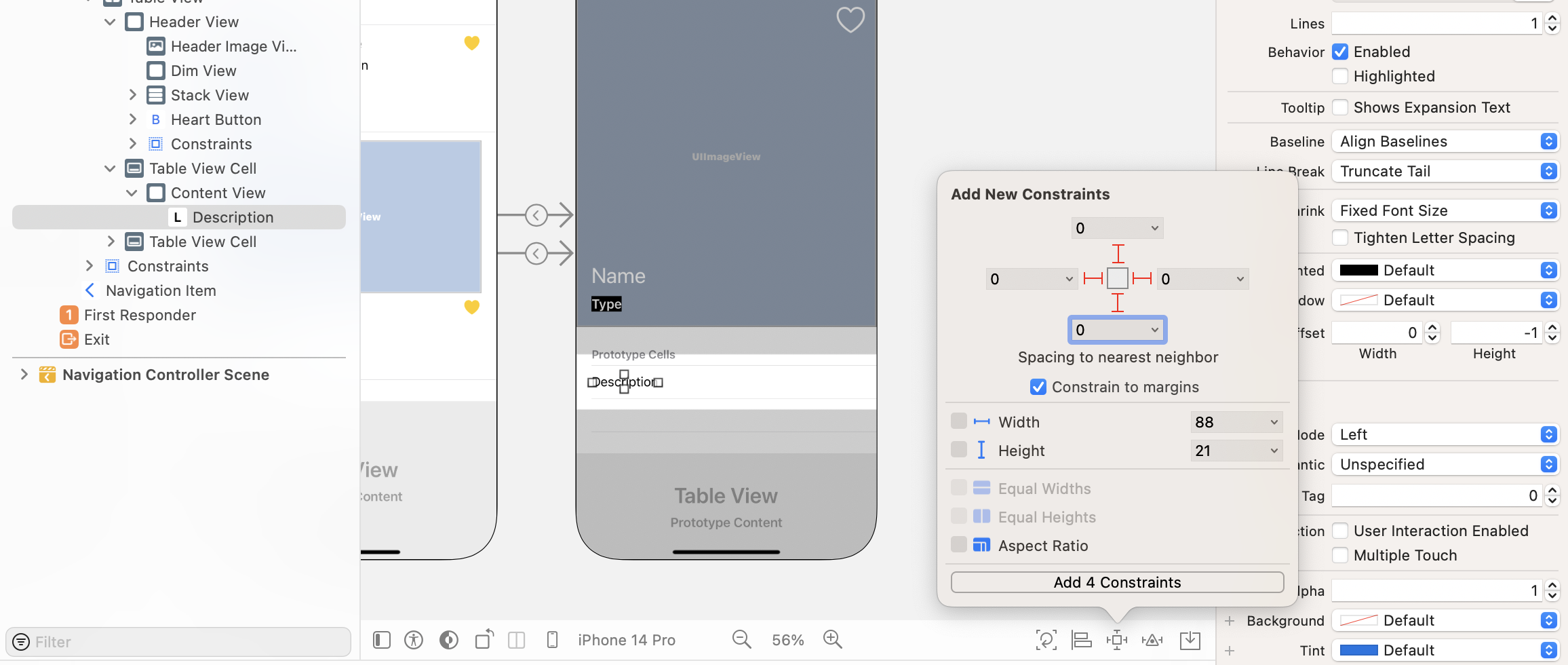
Now open the Main storyboard and drag a label object to the first prototype cell. Double click the label and change its title to Description. Go to the Attributes inspector and change the font to the Body text style. Then click the Add new constraints button to add four spacing constraints. Set the spacing value to 0 for all sides and make sure you check the Constrain to margins option.
For each prototype cell, we will create a corresponding Swift file to connect with it. In project navigator, right click View folder and choose New file…. Select the Cocoa Touch Class template. In the next screen, name the class RestaurantDetailTextCell and set it as a subclass of UITableViewCell. Click Next to save the file.
Similarly to what we have done before, we will create an outlet variables for the connections of the label. Declare the following variables in the RestaurantDetailTextCell.swift file:
@IBOutlet var descriptionLabel: UILabel! {
    didSet {
        descriptionLabel.numberOfLines = 0
    }
}
You should understand the code above. We just create an outlet for the text label. Since the text is going to extend over multiple lines, we set the label's numberOfLines property to 0.
Now go back to Interface Builder and select the prototype cell we just designed. We haven't set the cell identifier and custom class. So, go to the Attributes inspector and set the identifier to RestaurantDetailTextCell.
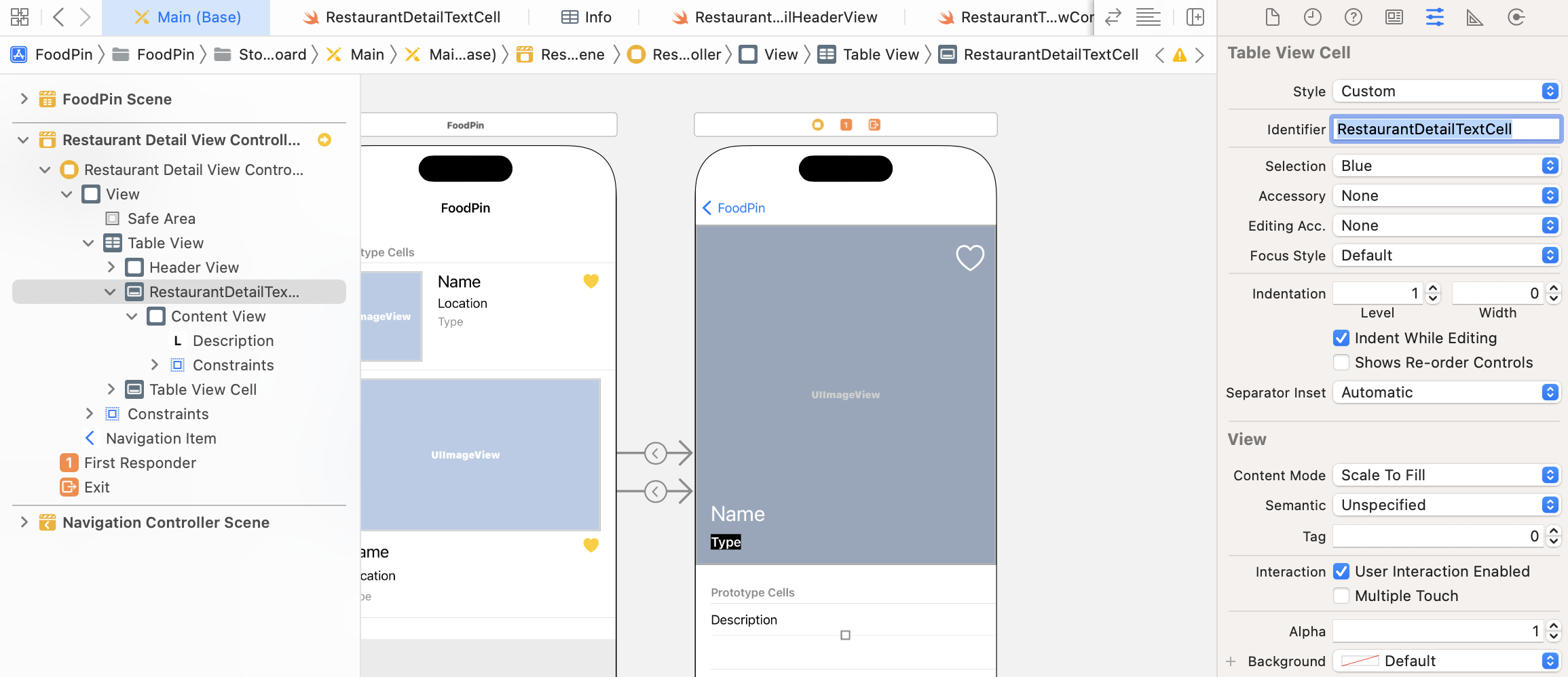
To set the custom class, go to the Identity inspector and change the custom class to RestaurantDetailTextCell.
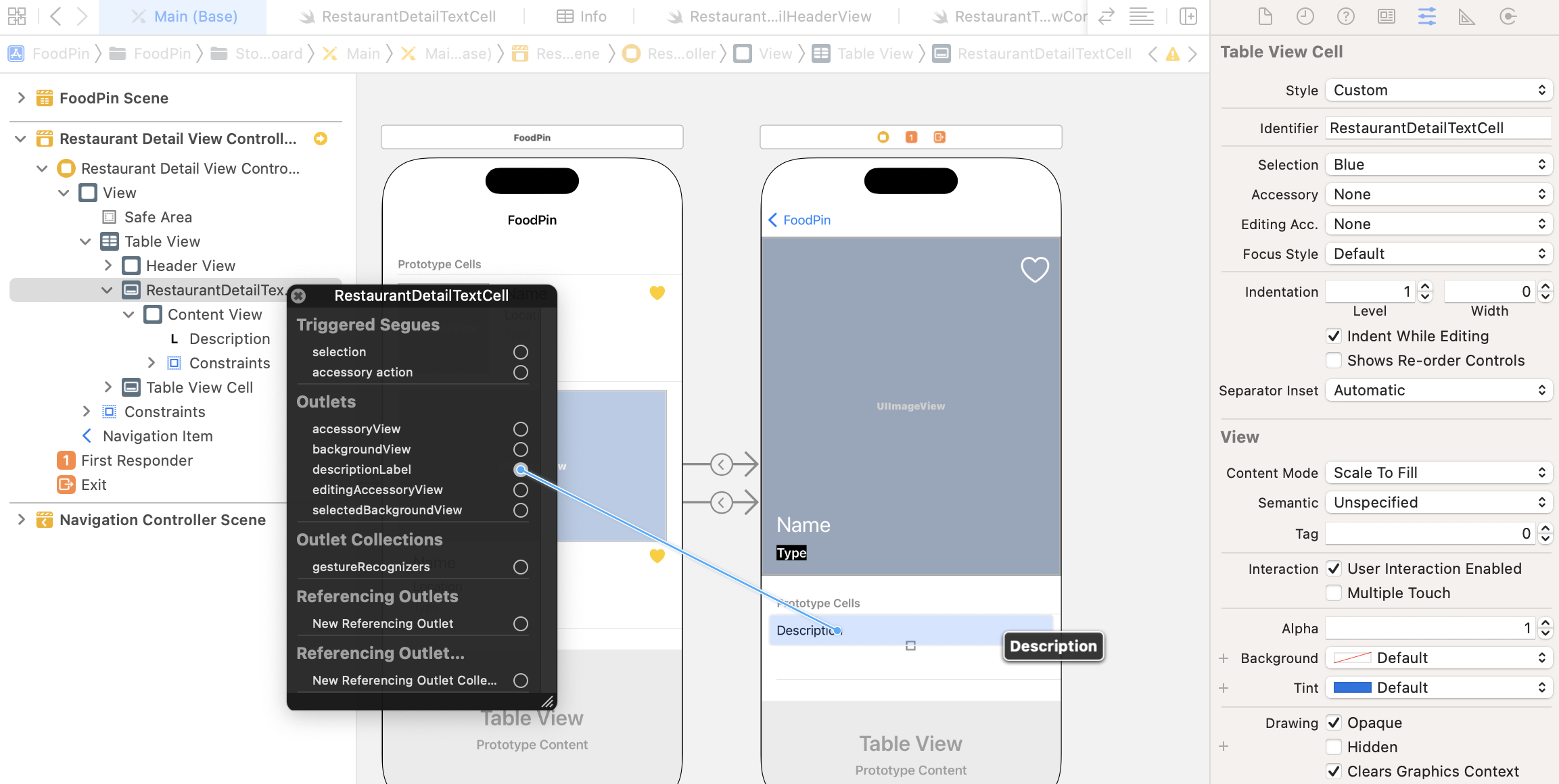
Did you notice that the identifier and the class name are the same? I will explain why I did that in a while. Now, right click RestaurantDetailTextCell in the document outline. Establish the connections between the description label and the outlet variable we defined earlier.
RestaurantDetailTwoColumnCell
Now we will move onto the implementation of the second prototype cell. This cell is designed to display two columns of data. Obviously, we will make use of stack views to create the layout.
First, make the second prototype cell a little bit taller (say, 140 points). This would let us easier fill the UI components in the cell. Now drag a label to the cell and change the text to Address. In the Attributes inspector, set its font style to Headline. Next, drag another label to the cell and place it right below the Address label. Name the label Full Address and set its font style to Body.
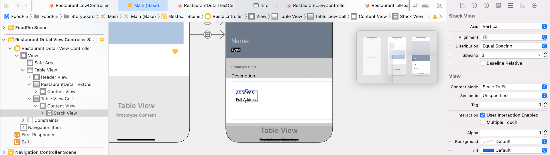
Once you configured the two labels, hold command key and select both items. Click Embed in and choose Stack view to embed both labels in a vertical stack view (see figure 14-32). In the Attributes inspector, change the stack view's distribution option to Equal Spacing and its spacing value to 8.
We will duplicate the stack view to create the second column. You can use copy-and-paste to duplicate the view. Alternatively, you can hold the Option key and drag the stack view to duplicate one. For the new stack view, change both labels to Phone and Phone Number respectively.
To arrange both stack views side by side, select both stack views and click Embed in. Choose stack view to embed them in a horizontal stack view. For the new stack view, set its alignment to Top because we want to align the text to the top of the view. Also, change the distribution option to Fill Equally and set its spacing to 10. Your stack view should look similar to the one shown in figure 14-33.
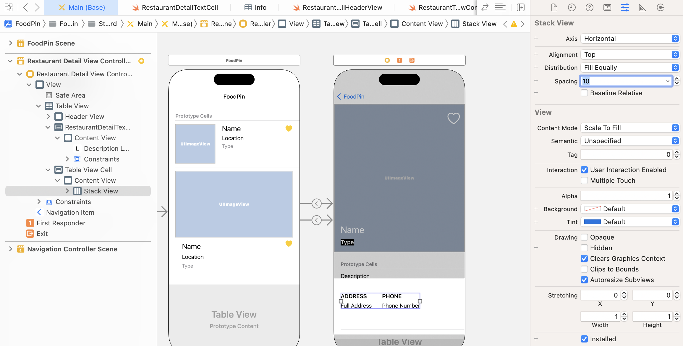
Now, we will add a few spacing constraints for the stack view. Select the new stack view and click Add new constraints. Set the spacing value for all sides to 0 and tick the Constrain to margins option.
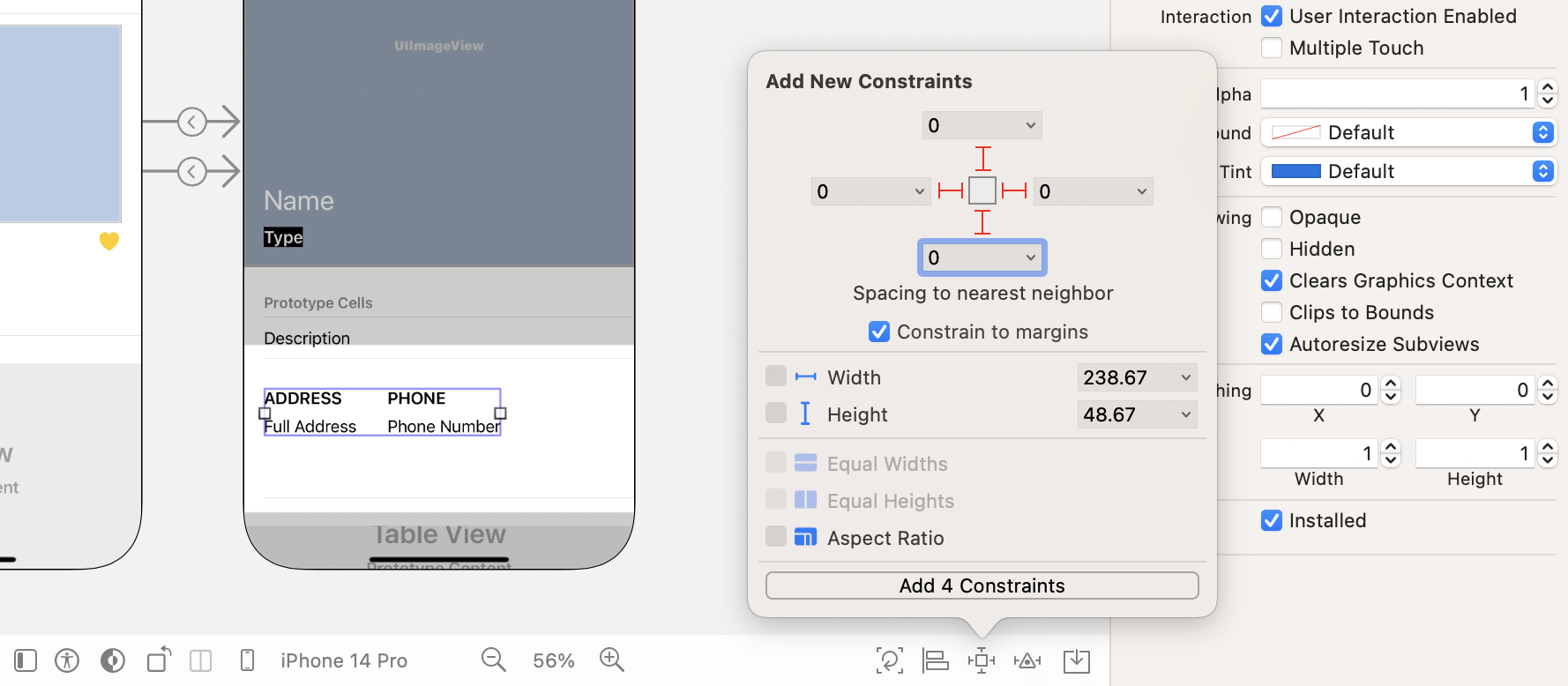
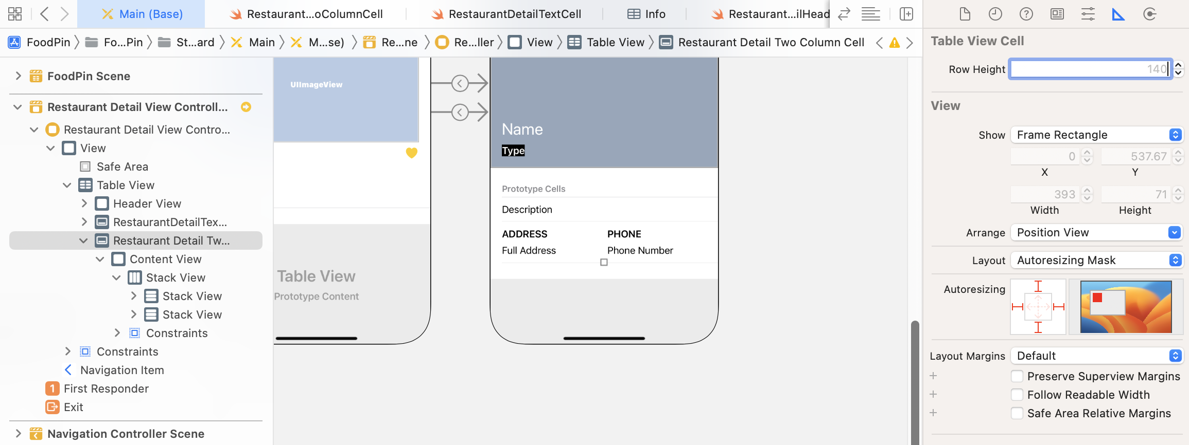
Currently, the height of the cell is fixed. To make the cell adaptable to variable height, select the table view cell in document outline. Go to the Size inspector and delete the preset row height.
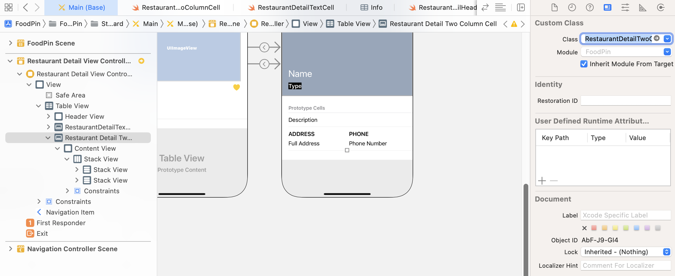
Now that we have completed the design of the second prototype cell, the next step is to create a Swift file to pair with this cell. In project navigator, right click the View folder and choose New File…. Choose the Cocoa Touch Class template and click the Next button. Name the class RestaurantDetailTwoColumnCell and set its subclass to UITableViewCell.
Once created, open the RestaurantDetailTwoColumnCell.swift file. Declare the outlet variables for the labels:
@IBOutlet var column1TitleLabel: UILabel! {
    didSet {
        column1TitleLabel.text = column1TitleLabel.text?.uppercased()
        column1TitleLabel.numberOfLines = 0
    }
}
@IBOutlet var column1TextLabel: UILabel! {
    didSet {
        column1TextLabel.numberOfLines = 0
    }
}
@IBOutlet var column2TitleLabel: UILabel! {
    didSet {
        column2TitleLabel.text = column2TitleLabel.text?.uppercased()
        column2TitleLabel.numberOfLines = 0
    }
}
@IBOutlet var column2TextLabel: UILabel! {
    didSet {
        column2TextLabel.numberOfLines = 0
    }
}
I tried to make this prototype cell as flexible as possible, so all the four labels can be configurable using code. They are not limited to display address and phone number. It is actually suitable to display any text in two column layout.
Again, we set the numberOfLines property to 0 in order to display multiple lines. For the title labels, we have an additional line of code to convert the text to uppercase.
Go back to Main and select the second prototype cell. Go to the Attribute inspector and set the cell identifier to RestaurantDetailTwoColumnCell. In the Identity inspector, set the custom class to RestaurantDetailTwoColumnCell.
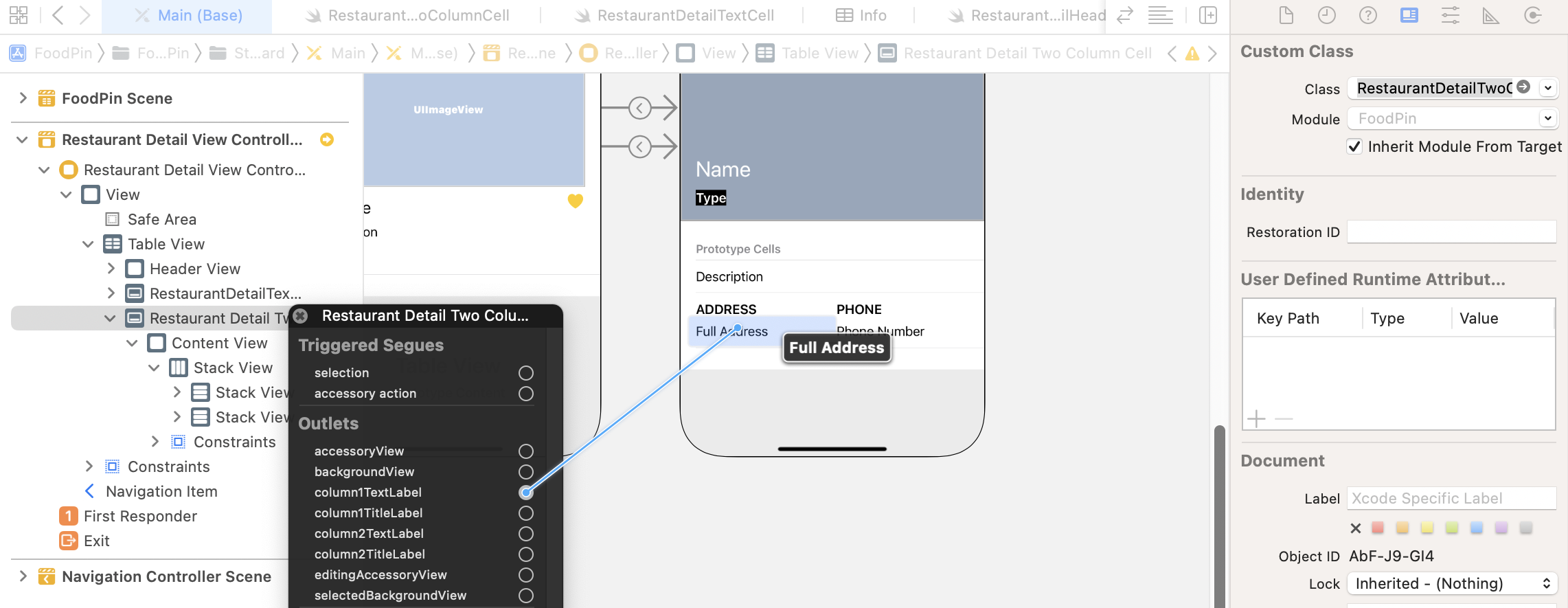
Finally, establish a connection between the labels and the outlet variables. The column1TitleLabel should be connected to the ADDRESS label and the column1TextLabel should be connected to Full Address. For the PHONE label, it should be connected to the column2TitleLabel.
Updating the RestaurantDetailViewController Class
Great! You will finished the design of the prototype cells. Let's update the RestaurantDetailViewController class to populate the restaurant information. The RestaurantDetailViewController class is a subclass of UIViewController. As you've learned in chapter 8, we have to adopt both the UITableViewDataSource and UITableViewDelegate protocols for displaying content in the table view.
In the earlier chapter, we learned to adopt the protocols with the following syntax:
class RestaurantDetailViewController: UIViewController, UITableViewDataSource, UITableViewDelegate {
You append the required protocols after the super class. This is one of the ways to adopt protocols in Swift. Let me take this chance to show you another approach by using a Swift feature known as Extensions. Extensions allow you to extend the functionalities of an existing class and structure. To create an extension, you start with the keyword extension followed by the class you want to extend. For example, to adopt the UITableViewDataSource and UITableViewDelegate protocols in the RestaurantDetailViewController class, you can create an extension like this:
extension RestaurantDetailViewController: UITableViewDataSource, UITableViewDelegate {
     .
     .
     .
}
Now let's open the RestaurantDetailViewController.swift file and write the extension. Insert the following code at the end of the file:
extension RestaurantDetailViewController: UITableViewDataSource, UITableViewDelegate {

    func tableView(_ tableView: UITableView, numberOfRowsInSection section: Int) -> Int {
        return 2
    }

    func tableView(_ tableView: UITableView, cellForRowAt indexPath: IndexPath) -> UITableViewCell {
        switch indexPath.row {
        case 0:
            let cell = tableView.dequeueReusableCell(withIdentifier: String(describing: RestaurantDetailTextCell.self), for: indexPath) as! RestaurantDetailTextCell

            cell.descriptionLabel.text = restaurant.description

            return cell

        case 1:
            let cell = tableView.dequeueReusableCell(withIdentifier: String(describing: RestaurantDetailTwoColumnCell.self), for: indexPath) as! RestaurantDetailTwoColumnCell

            cell.column1TitleLabel.text = "Address"
            cell.column1TextLabel.text = restaurant.location
            cell.column2TitleLabel.text = "Phone"
            cell.column2TextLabel.text = restaurant.phone

            return cell

        default:
            fatalError("Failed to instantiate the table view cell for detail view controller")

        }
    }

}
We created an extension for RestaurantDetailViewController, adopted the protocols, and implemented the required method for populating the table view's data. The detail view has two rows of data. This is why we return 2 in the tableView(_:numberOfRowsInSection:) method.
The implementation of the tableView(_:cellForRowAt:) method is a bit different from what you learned before because we now have to cater for two different types of prototype cells. The first cell uses RestaurantDetailTextCell, while the second one uses RestaurantDetailTwoColumnCell.
In the code above, we use switch to control the program flow and execute different branches of code depending on the value of indexPath.row. For the first cell (i.e. indexPath.row is 0), we dequeue the reusable cell with the identifier RestaurantDetailTextCell and then populate the restaurant description.
Recall that we set the cell's identifier to its custom class name, you can explicity specify the identifier and dequeue the cell like this:
let cell = tableView.dequeueReusableCell(withIdentifier: "RestaurantDetailTextCell", for: indexPath) as! RestaurantDetailIconTextCell
The result of the code above is exactly the same as the one we wrote earlier. The code String(describing: RestaurantDetailTextCell.self) will return you the name of the class (i.e. RestaurantDetailTextCell).
let cell = tableView.dequeueReusableCell(withIdentifier: String(describing: RestaurantDetailTextCell.self), for: indexPath) as! RestaurantDetailTextCell
So, why do we use the latter version? Hardcoding the cell's identifier is prone to typos. Xcode will not show you any errors even if you type the identifier wrongly. You can only reveal the error when running the app.
By using the latter version, if we wrongly type the class name (say, RestaurantDetailTxtCell.self), Xcode will immediately prompt you the error.
For case 1, the code is very similar but we use the RestaurantDetailTwoColumnCell for displaying the address and phone number.
The case default will be executed only if the value of indexPath.row doesn't match 0 or 1. In this case, we give a fatal error.
Okay, the code of the RestaurantDetailViewController class is almost ready. There is only one thing left. We haven't established the connection with the table view in the storyboard.
In earlier chapters, I showed you how to do it via Interface Builder (refer to chapter 8). This time let's do it using code. In the viewDidLoad method of RestaurantDetailViewController, insert the following lines of code:
tableView.delegate = self
tableView.dataSource = self
That's it. We set the table view's delegate and dataSource to self.
Ready to Test
Hit the Run button and test your app. The detail view now displays more information about the selected restaurant.
Customizing the Table View Separator
The table view is now pretty nice. If you want to remove the separator of the table, you can insert the following line in the viewDidLoad method of RestaurantDetailViewController:
tableView.separatorStyle = .none
By setting the style of the separator to .none, you can remove all the separators.
Understanding Self Sizing Cells
Before we end this chapter, let me talk about the concept of self sizing cells. Have you ever wondered why the cell's height is automatically adjusted? When the description / location has more text, the height of the cell will be increased accordingly.
Prior to iOS 8, if you want to display dynamic content in a table view with multiple rows, you have to calculate the row height of a cell manually. Later in iOS 8, Apple introduced a new feature for UITableView known as Self Sizing Cells.
In brief, to enable self sizing of a table view cell, you have to implement a few things:
- Define auto layout constraints for the prototype cell.
- Specify the
estimatedRowHeightproperty of the table view. - Set the
rowHeightproperty of the table view toUITableViewAutomaticDimension.
Before iOS 11, you have to manually handle point 2 and 3. Now Xcode sets both the estimated row height and row height to automatic by default (see figure 14-35). Therefore, to use self sizing cells, all you need to do is just to define the layout constraints.
As long as you define the proper layout constraints, the cell will be resized automatically to fit its content.
Summary
Great! You've made it. I hope you love it and the app you created. You've already built a quite polished app. It's not a complex app but you've managed to use some common components such as table view and navigation controller in iOS. What's more is that you've learned how to work with custom fonts and create a detail screen using a custom table view.
I also introduced a popular feature in Swift called Extensions. This is a very powerful feature that you will utilize it in your app development. To learn more about Swift Extensions, you can check out this document (https://docs.swift.org/swift-book/LanguageGuide/Extensions.html).
This is a huge chapter. Even if you can't wait to proceed to the next chapter, I suggest taking a break here. It needs time to let yourself digest all the materials we discussed so far. Grab a coffee or whatever drinks you like and relax.
For reference, you can download the complete project from http://www.appcoda.com/resources/swift57/FoodPinDetailView.zip.