- Made by AppCoda
- Contact us / Support
- Tweet this book
- Preface
- 1. The Development Tools, the Learning Approach, and the App Idea
- 2. Your First Taste of Swift with Playgrounds
- 3. Hello World! Build Your First App in Swift
- 4. Hello World App Explained
- 5. Introduction to Auto Layout
- 6. Designing UI Using Stack Views
- 7. Introduction to Prototyping
- 8. Creating a Simple Table-based App
- 9. Customize Table Views Using Prototype Cell, Diffable Data Source and Dark Mode
- 10. Displaying Alerts with UIAlertController and Handling Table View Selection
- 11. Object Oriented Programming, Project Organization and Code Documentation
- 12. Table Row Deletion, Custom Action Button and MVC
- 13. Introduction to Navigation Controller and Segue
- 14. Detail View Enhancement and Navigation Bar Customization
- 15. Navigation Bar Customization, Extensions and Dynamic Type
- 16. Working with Maps
- 17. Basic Animations, Visual Effects and Unwind Segues
- 18. Working with Static Table Views, Camera and NSLayoutConstraint
- 19. Working with Core Data
- 20. Search Bar and UISearchController
- 21. Building Walkthrough Screens with UIPageViewController and Container Views
- 22. Exploring Tab Bar Controller and Storyboard References
- 23. Getting Started with WKWebView and SFSafariViewController
- 24. Exploring CloudKit
- 25. Localizing Your App to Reach More Users
- 26. Deploying and Testing Your App on a Real iOS Device
- 27. Beta Testing with TestFlight and CloudKit Production Deployment
- 28. Submit Your App to App Store
- 29. Adopting 3D Touch, Haptic Touch and Context Menus
- 30. Developing User Notifications in iOS
- 31. Appendix - Swift Basics
- Published with GitBook
Chapter 17
Basic Animations, Visual Effects and Unwind Segues

Animation can explain whatever the mind of man can conceive. This facility makes it the most versatile and explicit means of communication yet devised for quick mass appreciation.
– Walt Disney
In iOS, creating sophisticated animations does not require you to write complex code. All you need to know is a single method in the UIView class:
UIView.animateWithDuration(1.0, animations)
There are several variations of the method that provide additional configuration and features. This is the basis of every view animation.
First things first, what's an animation? How is an animation created? Animation is a simulation of motion and shape change by rapidly displaying a series of static images (or frames). It is an illusion that an object is moving or changing in size. For instance, a growing circle animation is actually created by displaying a sequence of frames. It starts with a dot. The circle in each frame is a bit larger than the one before it. This creates an illusion that the dot grows bigger and bigger. Figure 17-1 illustrates the sequence of static images. I keep the example simple so the figure displays 5 frames. To achieve a smooth transition and animation, you'd need to develop several more frames.

Now that you have a basic idea of how animation works, how will you create an animation in iOS? Consider our growing circle example. You know the animation starts with a dot (i.e. start state) and ends with a big red circle (i.e. end state). The challenge is to generate the frames between these states. You may need to think of an algorithm and write hundreds of lines of code to generate the series of frames in between. UIView animation helps you compute the frames between the start and end state resulting in a smooth animation. You simply specify the start state and tell UIView the end state by calling the UIView.animateWithDuration method. The rest is handled by iOS. Sounds good, right?
There is no better way to understand the technique than by working on a real example. We will add some basic animations to our FoodPin app. Here is what we're going to do:
- Add a "Rate it" button in the detail view
- When a user taps the button, it brings up a review view controller, in which the buttons are animated, for the user to rate the restaurant.
Through building the review view controller, I will show you how to create basic animations using UIView. On top of that, I will show you how to create a blurred background using the built-in API and pass data between view controllers using unwind segues.

Adding a Rating button
Before creating the animated views, we'll add a rating button to the detail view controller. First, download this image pack (http://www.appcoda.com/resources/swift4/FoodPinRatingButtons.zip) and add the icons to Assets.xcassets. Optionally, you can create a folder in the asset catalog to better organize the images.

Credit: The icons are made by Pat Johnson.You've learned how to use the table view's header. This time, we will add the Rate it button to the footer of the table view. Go to the
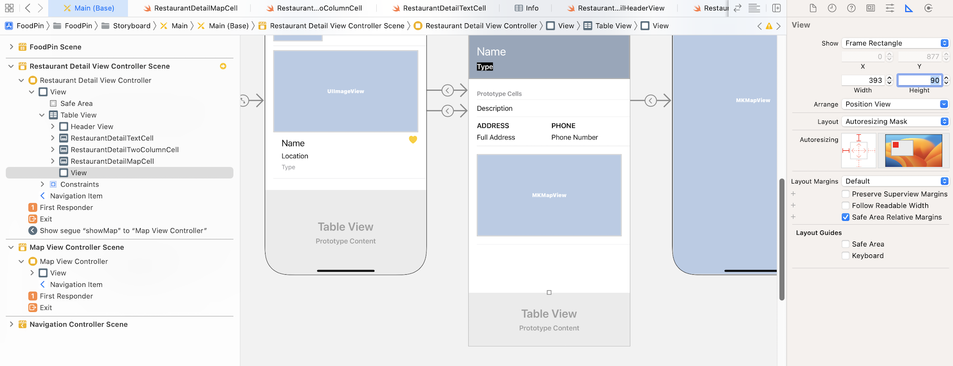
Main storyboard and select the Restaurant Detail View Controller in document outline. For convenience sake, before we add the rate button, let's first make the controller a little bit longer. In the Size inspector, set the simulated size to Freeform and height to 1200.
Next, drag a View object from the Object library to the footer of the table view. Place the view right under RestaurantDetailMapCell in document outline. This view object serves as a container holding the rate button. If you've done it correctly, you should see a white area below the map view. The default size of the view is a bit large. Go to the Size inspector and set the height to 90.
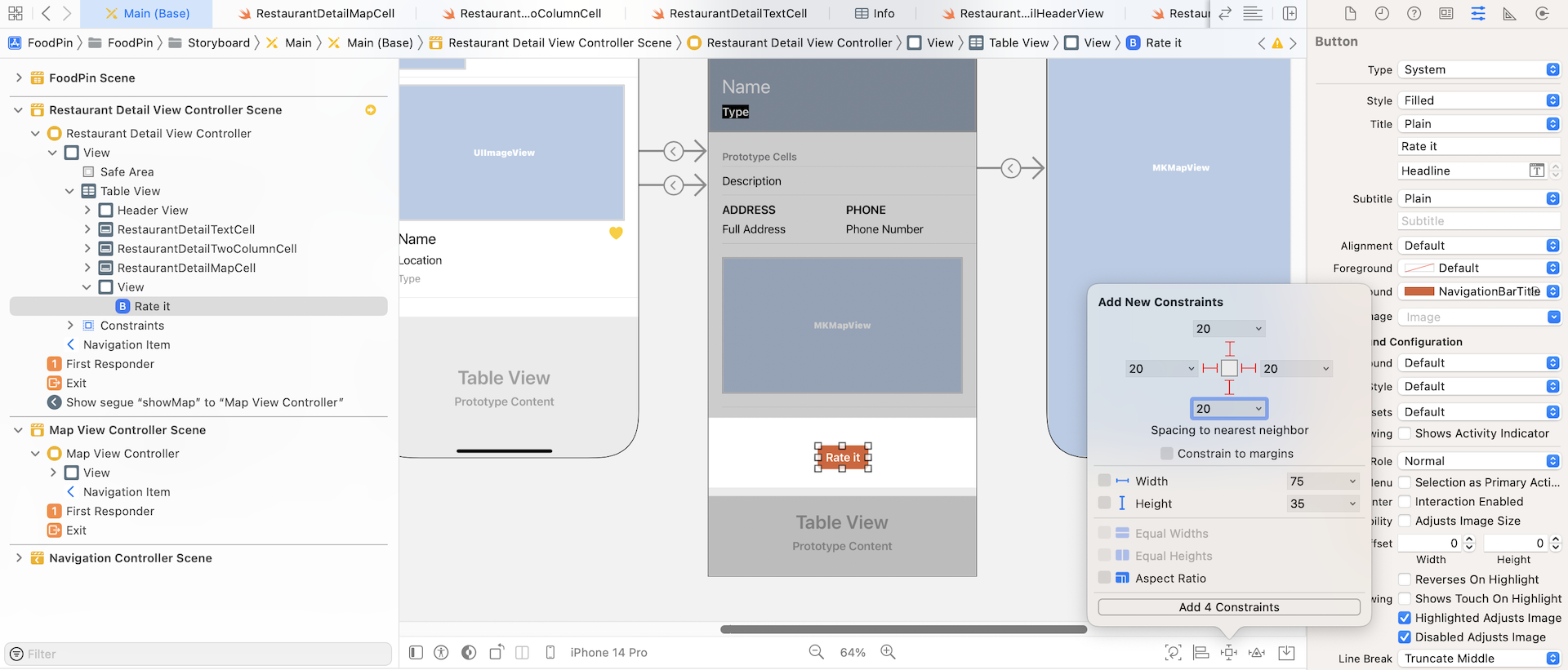
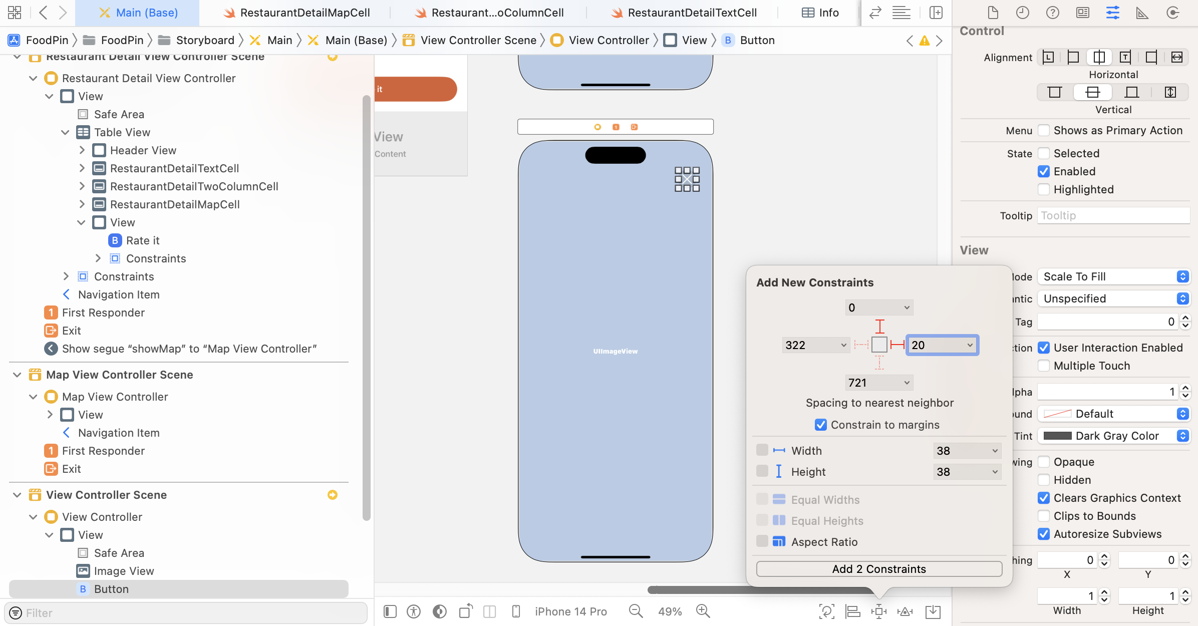
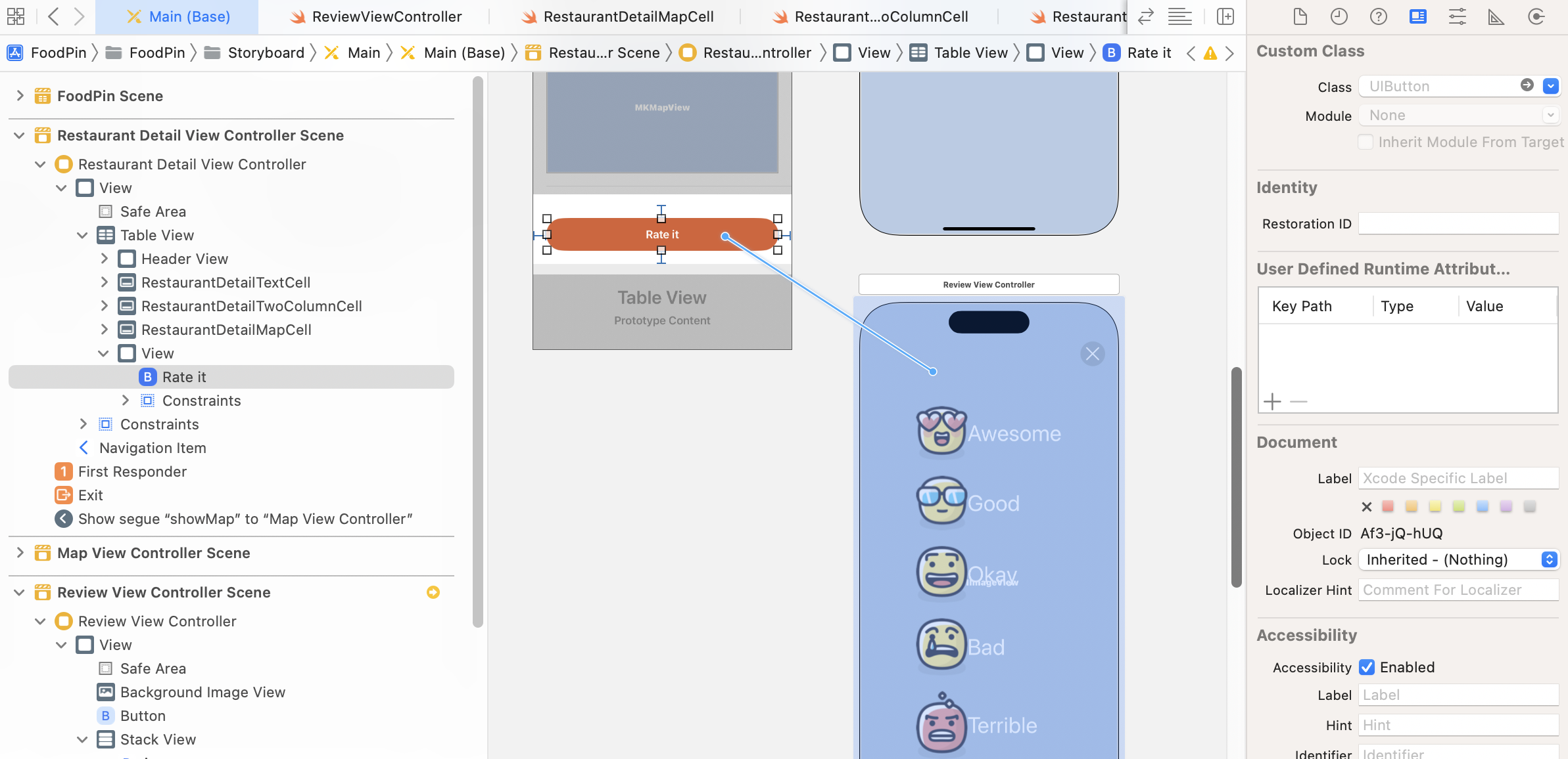
Next, drag a button from the Object library to the view we just added. In the Attributes inspector, set the title to Rate it and change the style option to Filled. Change the font to Headline - Text Style. For the background color, set it to NavigationBarTitle.
As usual, we need to add some layout constraints for the button. Select the button and click the Add New Constraints button of the layout bar. Set the value of all sides to 20 and deselect the Constrain to margins option. Click Add 4 Constraints to confirm.
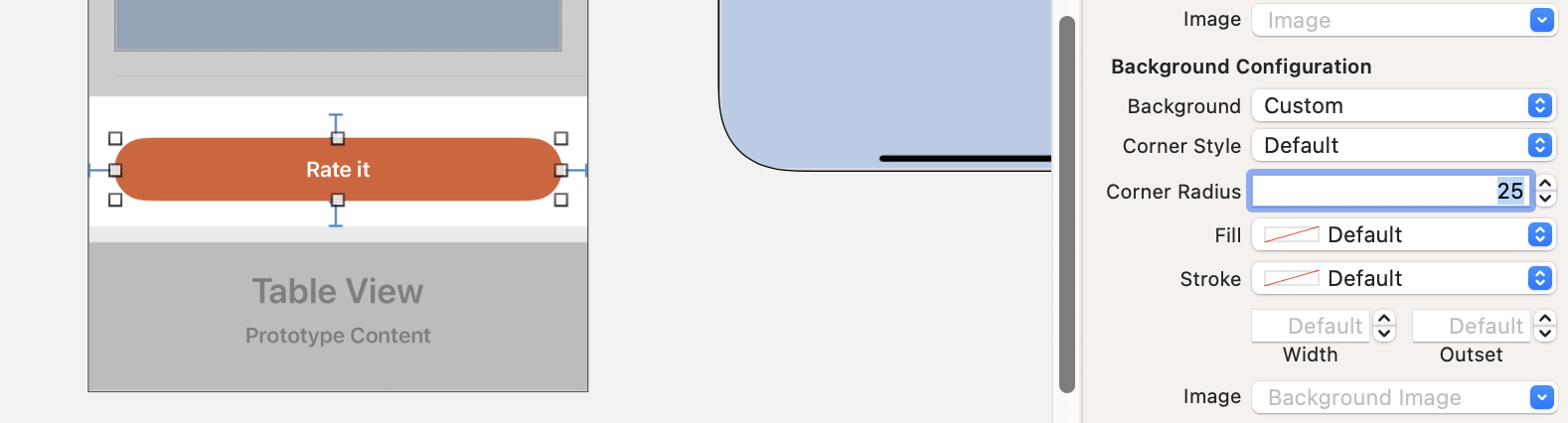
When the button is set to use the Filled style, it already has rounded corners. However, if you want to alter the default corner radius, you can change the Background option to Custom and set a new value for the Corner Radius option under Background Configuration. For this demo app, I set it to 25 points.
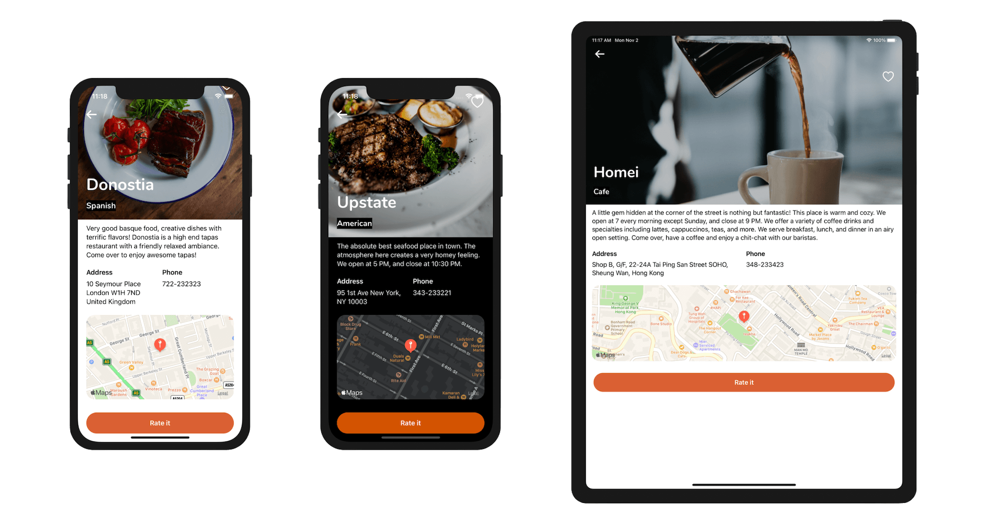
Once done, run the app to have a quick test. Your detail view should look very similar to that in figure 17-7.
Create a View Controller for Restaurant Review
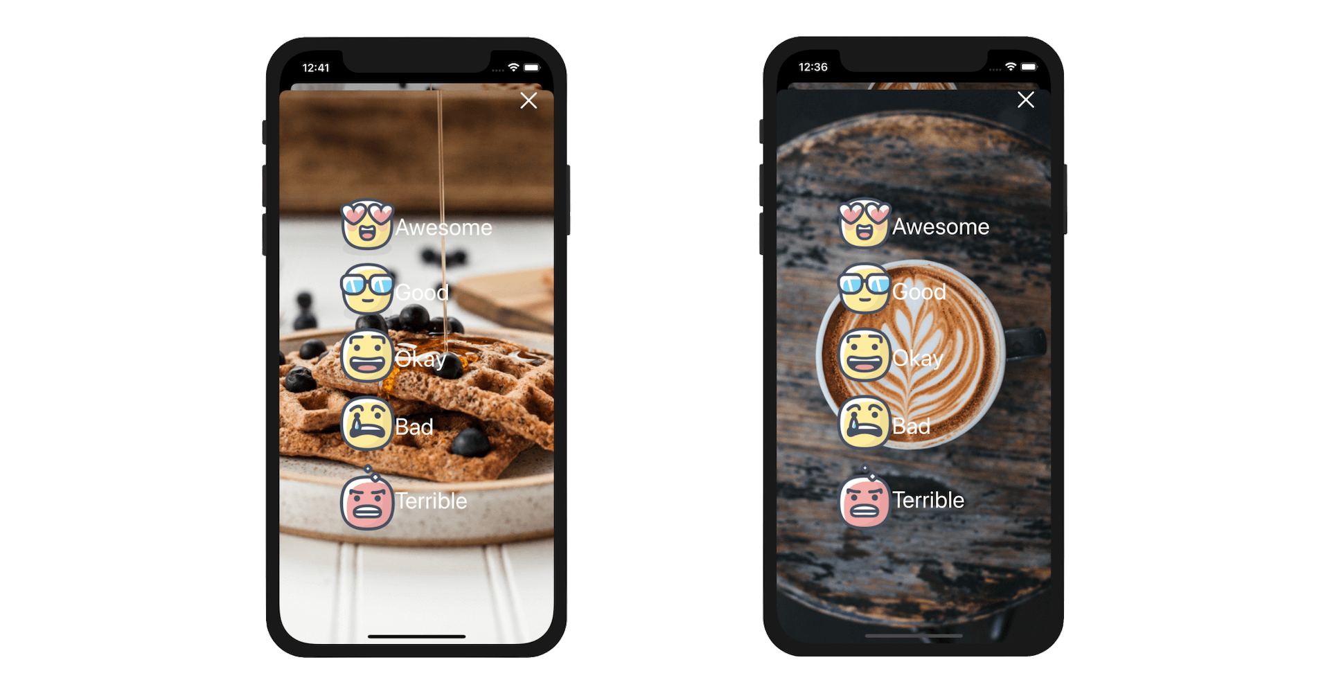
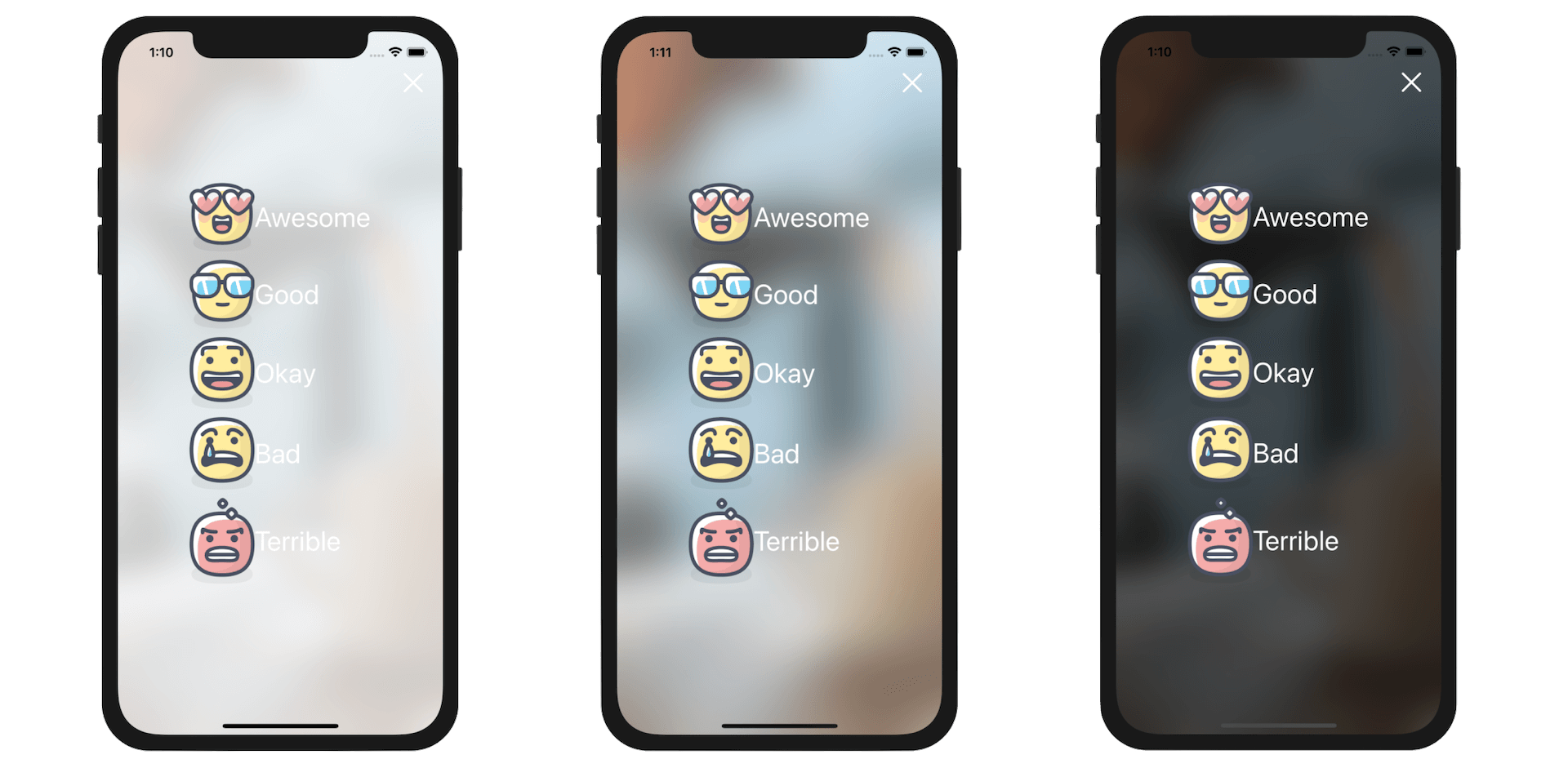
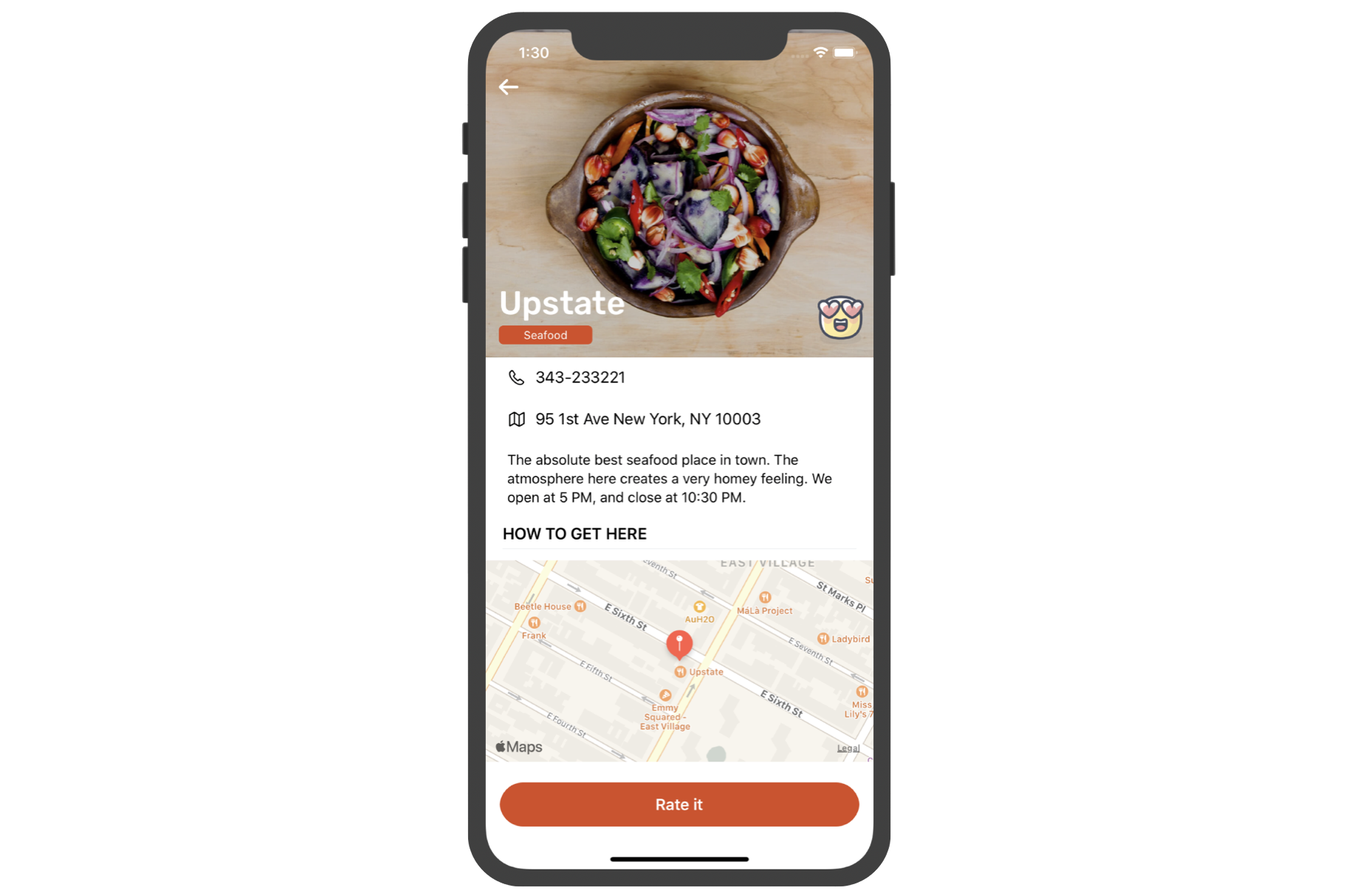
When a user taps the Rate it button, we want to bring up a modal view for the user to give a rating for the restaurant. If you forgot how the review screen looks like, refer to figure 17-2.
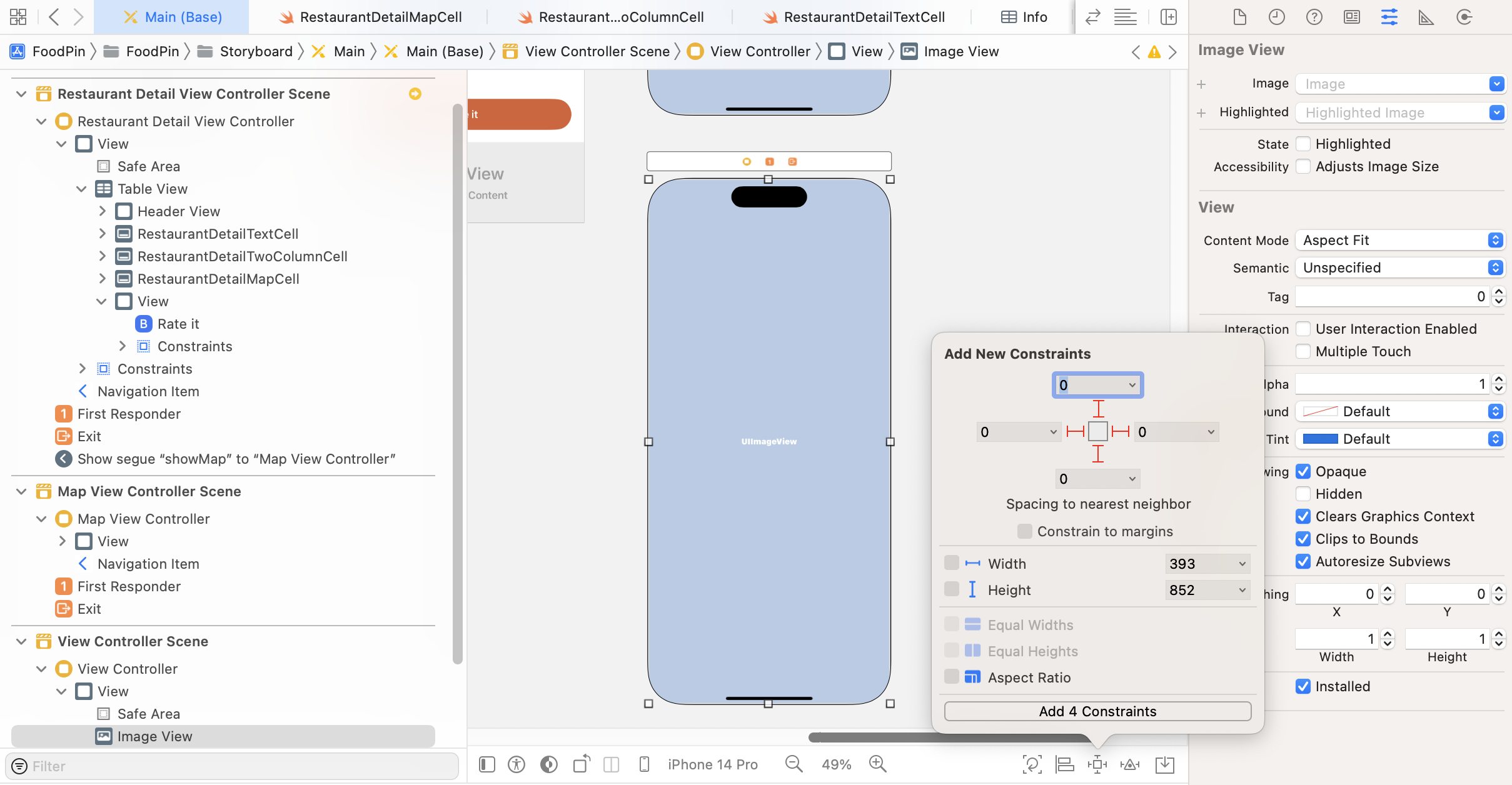
In Interface Builder, drag a new view controller from the Object library to the storyboard. Add an image view to the view and set its content mode to Aspect fill. The image view is used for displaying a background image. Later you will learn how to blur the image to create a blurred background.
As always, we need to define some layout constraints for the UI component. Click the Add New Constraints button. Set the value of the top, left, bottom and right sides to 0. Press Add 4 Constraints to confirm.
Next, drag a button from the Object library and place it near the top-right corner. This button is a close button. In the Attributes inspector, set its title to blank and image to xmark. You can directly use the SF Symbols in Interface Builder. xmark is the name of the X symbol. Next, set the foreground color to white.
For the corner style, change it to Capsule to create a round button. Optionally, you can change the style to Tinted, which will give the button a tinted background.
To make the button a little bit larger, you can change the configuration option to Point Size and set it to 20 points. Also, scroll down to the View section and change the tint color to Dark Gray.
Again, we need to add a couple of spacing constraints for the top and right side. You can refer to figure 17-9 for details.
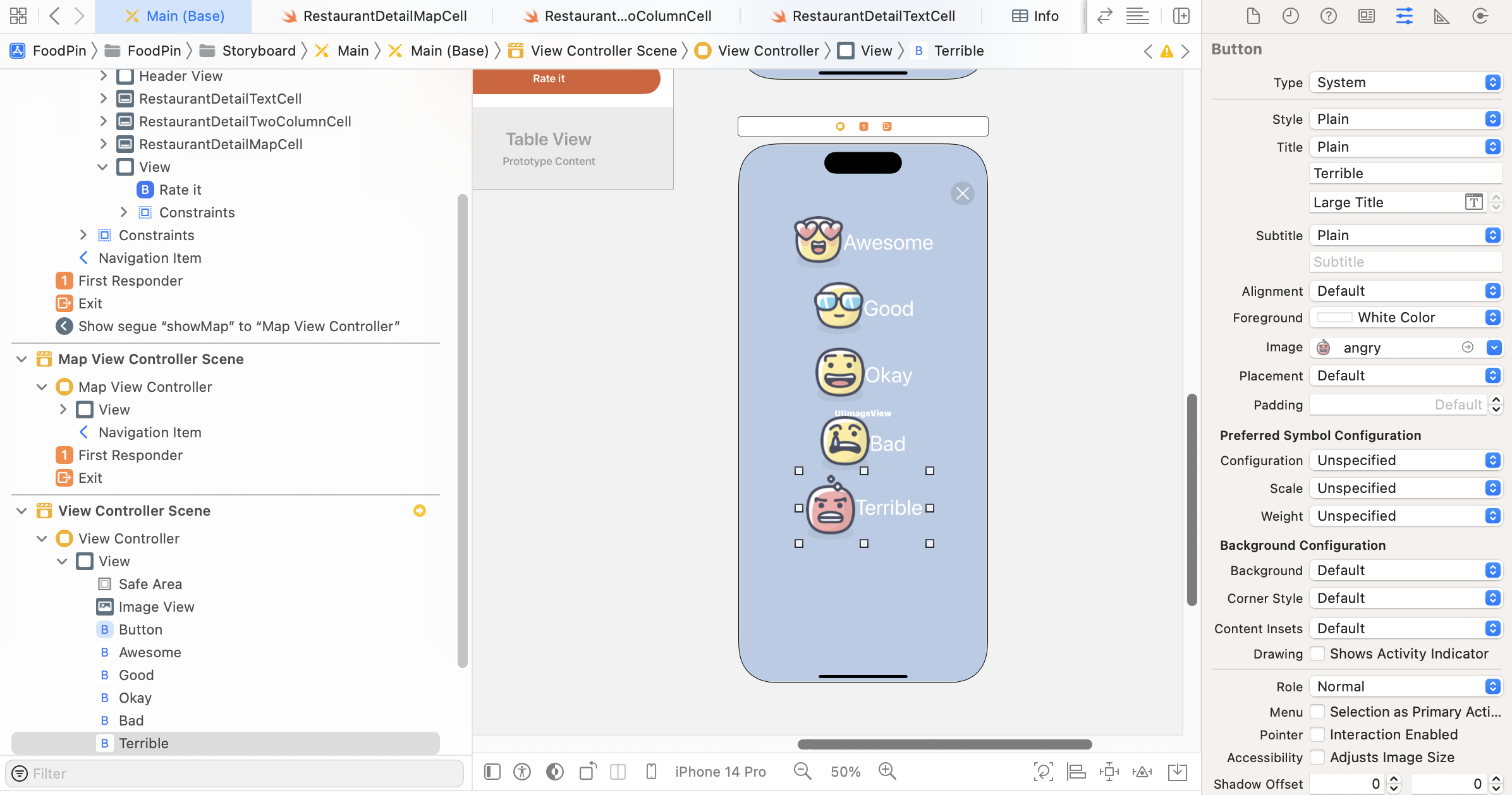
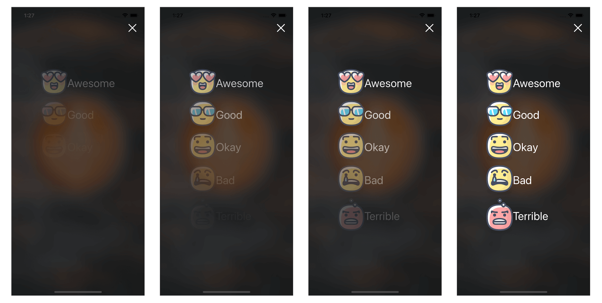
Now we are going to lay out the rating buttons. Drag a button from the Object library to the view controller. In earlier chapters, we either worked with an image button or a text button. This time, it is a little bit different. The button has both text and image. In the Attributes inspector, set the title to Awesome and image to love. Change the font to the text style Large Title. Also, change the foreground color to white.
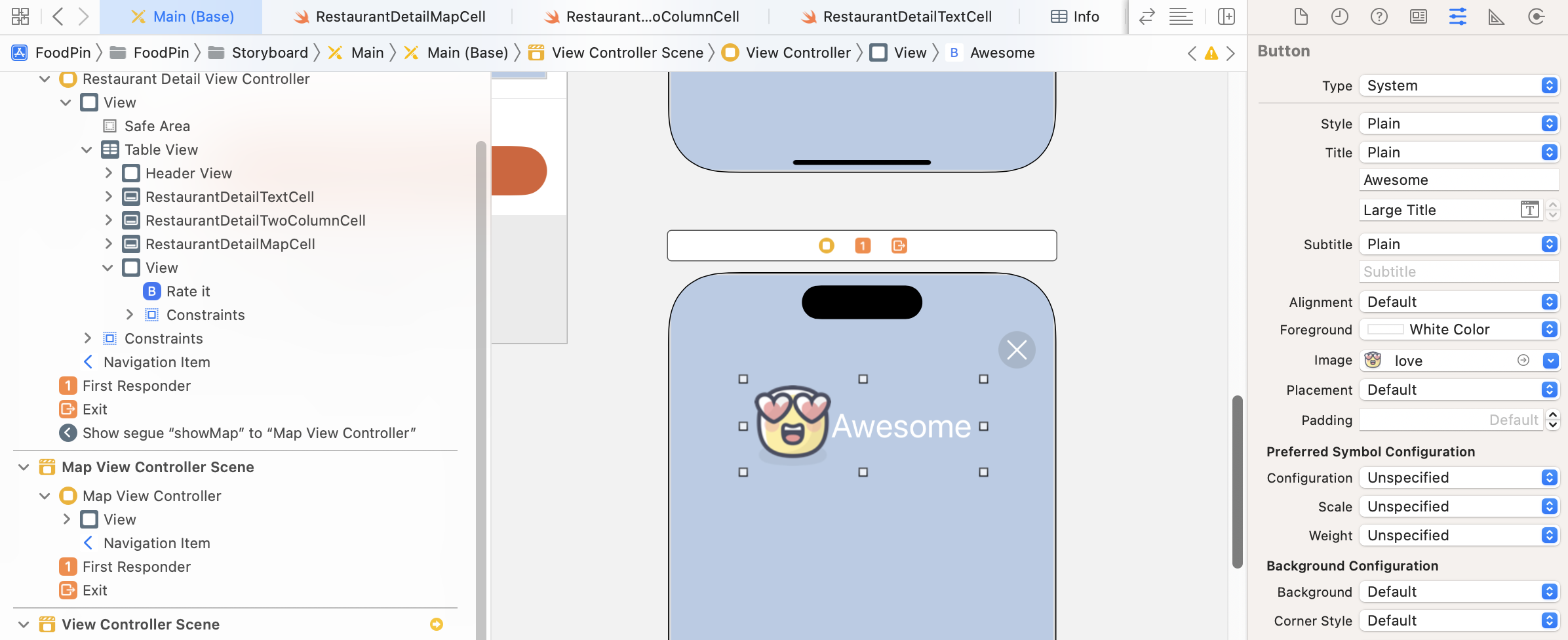
As the other 4 buttons are similar to the one we created, we can just do "copy & paste" and change each of the title and image accordingly:
- For the second button, set the title
Goodand image tocool. - For the third button, set the title
Okayand image tohappy. - For the fourth button, set the title
Badand image tosad. - For the fifth button, set the title
Terribleand image toangry.
Your buttons should be similar to that in figure 17-11.
Again, it's time to define the layout constraints for the UI objects. First, let's embed the buttons in a stack view, and then define the necessary constraints. Hold the command key and select all the five buttons. Click the Embed in button in the layout bar and choose Stack view to embed them in a vertical stack view. In the Attributes inspector, change the Alignment option to Leading and spacing to 10 points.
We want to center the stack view both vertically and horizontally. Make sure you select the stack view. Click the Align button, and check both Horizontally in Container and Vertically in Container checkboxes. Once you confirm to add the constraints, the stack view is now always centered.

Now that we've completed the design of the view controller, let's create a class to pair with it. In the project navigator, right-click the Controller folder and choose New File…. Choose the Cocoa Touch Class template. Set the class name ReviewViewController and its subclass to UIViewController.
Once the file is created, declare an outlet variable for the background image view in the ReviewViewController class. Also, declare a variable for holding the current restaurant:
@IBOutlet var backgroundImageView: UIImageView!

var restaurant = Restaurant()
In the viewDidLoad() method, insert the following line of code to set the image view:
backgroundImageView.image = UIImage(named: restaurant.image)
This line of code loads the restaurant's image as the background image. Switch over to Main.storyboard and select the view controller with the rating buttons. In the Identify inspector, change the custom class to ReviewViewController. Then right-click the Review View Controller in document outline and connect the backgroundImageView outlet variable.
Create a Segue for the Modal View
To bring up the review view modally, we have to connect the Rate it button with the review view controller with a segue. Hold the control key and drag from the Rate it button to the review view controller. Release the buttons and select Present modally as the segue type. Once the segue is created, select it and set the identifier of the segue to showReview under the Attribute inspector.
As we need to pass the restaurant object from the detail view to the review view, open the RestaurantDetailViewController.swift file and edit the following method like this:
override func prepare(for segue: UIStoryboardSegue, sender: Any?) {
    switch segue.identifier {
    case "showMap":
        let destinationController = segue.destination as! MapViewController
        destinationController.restaurant = restaurant

    case "showReview":
        let destinationController = segue.destination as! ReviewViewController
        destinationController.restaurant = restaurant

    default: break
    }
}
The change is very straightforward. For segue with the identifier showReview, we retrieve the ReviewViewController object and then pass it the current restaurant. Now let's have a quick test. Run the app and go to the detail view. Tapping the Rate it button should now bring up the review view.
Starting from iOS 13, the presentation of a modal view has changed. iOS doesn't show you a full screen modal view. Instead, when a view is presented modally, the system displays a card like modal view with the original view sits behind the modal view. What's more is that it has gesture support built-in. Swiping down from the top of the screen will close the modal view.
In case you don't like this default behaviour and want to change it back to full screen mode, you can select the "showReview" segue and set the Presentation option to Full Screen in the Attributes inspector.
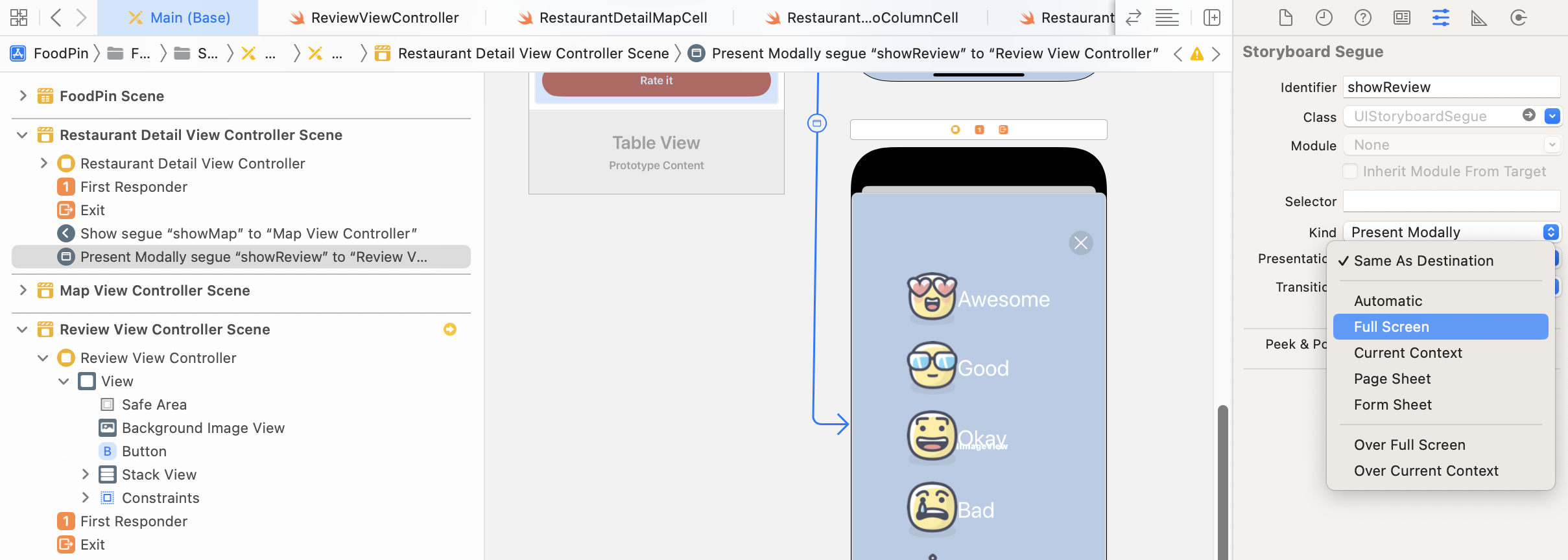
iOS has some built-in transition animation at your disposal. By default, the review view is brought up from the bottom of the screen. This transition animation is known as Cover Vertical, which is the default transition for modal presentation. If you select the segue and go to the Attributes inspector, you can find other transition options such as Cross Dissolve and Flip Horizontal. Try to change the transition option from Default to Cross Dissolve and see what animation you get. In this demo, I will continue to use Cross Dissolve as the transition animation, but you are free to choose your own.
Defining an Exit for the Review View Controller
After you change the presentation mode to Full Screen, you lose the built-in gesture support for dismissing the view. There are multiple ways to handle view dismissal. What we are going to implement is something called unwind segue. An unwind segue can be used to navigate back through a modal or push segue. In this example, we can use it to dismiss the modal view.
To use an unwind segue, you need to do two things. First, declare a method in the destination view controller. In this case, it is the RestaurantDetailViewController class. Add the following method in RestaurantDetailViewController.swift:
@IBAction func close(segue: UIStoryboardSegue) {
    dismiss(animated: true, completion: nil)
}
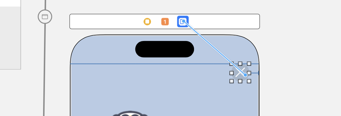
Before you can add unwind segues in Interface Builder, you must define at least one unwind action in the destination controller. This action method serves a sign that this view controller can be the destination controller of an unwind segue. Here we just call the dismiss(animated: true, completion: nil) method to dismiss the current view controller. Optionally, you can implement additional logic in the method. Go back to Interface Builder. Press and hold control key and drag from the Close button to the Exit icon of the scene dock (see figure 17-16). When prompted, select closeWithSegue: for the action segue.
You can run the project again. Now when the user taps the close button, the modal view will be dismissed.
Applying a Blurring Effect to the Background Image
Now that the background image shows the original photo of a restaurant, this doesn't look as expected. It should be blurred instead. The iOS SDK has a class called UIVisualEffectView that lets developers apply visual effects to a view. Combining with the UIBlurEffect class, you can easily apply a blurring effect to an image view.
Open the ReviewViewController.swift file and update the viewDidLoad method like this:
override func viewDidLoad() {
    super.viewDidLoad()

    backgroundImageView.image = UIImage(named: restaurant.image)

    // Applying the blur effect
    let blurEffect = UIBlurEffect(style: .dark)
    let blurEffectView = UIVisualEffectView(effect: blurEffect)
    blurEffectView.frame = view.bounds
    backgroundImageView.addSubview(blurEffectView)
}
To apply a blurring effect to the background image view, all you need to do is create a UIVisualEffectView object with the blurring effect, followed by adding the visual effect view to the background image view. The UIBlurEffect class offers three different styles: .dark, .light, and .extraLight. I like the dark style but it is up to you to choose your own style. The above lines of code are all you need to blur the background image.
You're ready to go. Figure 17-17 displays the resulting screen, depending on your choice of blur style.
Understanding Outlet Collections
We will soon discuss how to create UI animations. Since we want to animate the buttons, we have to connect them to our code. Usually, we create an outlet for each of the buttons. This time, let me show you something different called Outlet Collections.
The function of an outlet collection is exactly the same as an outlet. It is still a property that references the UI objects in Interface Builder. However, the difference is that an outlet collection allows you to reference multiple UI objects with a single outlet variable. You will see what I mean in a while.
Let's say, we want to reference the group of the rate buttons with an outlet collection. We can declare an outlet variable in the ReviewViewController class:
@IBOutlet var rateButtons: [UIButton]!
As you can see, the variable of an outlet collection has a type [UIButton]. It holds an array of UIButton instead of a single button.
Now head over to the Main storyboard. We will connect each of the rate buttons to this outlet variable. Right-click the Review View Controller. Click the circle button of rateButtons and drag it to the Love button.
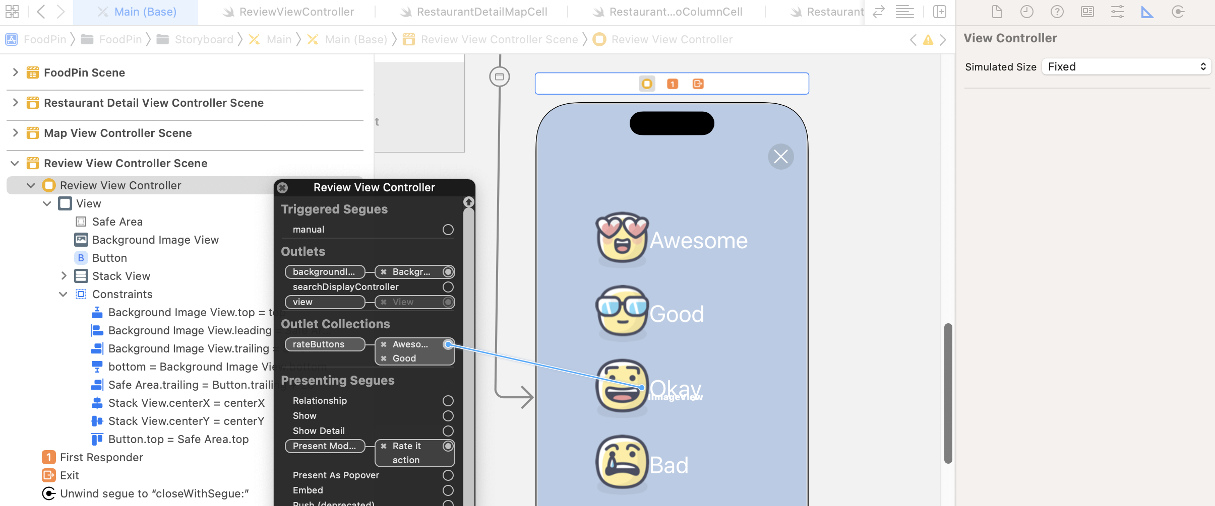
You should be very familiar with this procedure. What's interesting about outlet collections is that you can keep establishing connections with other buttons. Once the Love button is connected, click the circle button and drag to the Cool button to establish a connection.
Repeat the procedures for the rest of the buttons. The result of the rateButton outlet collection should appear like the one shown in figure 17-19.
You may wonder how you can retrieve each of the buttons from the rateButtons outlet. The buttons are added to the array based on the connection order. So you can access the first button using rateButtons[0], and vice versa.
rateButtons[0] // Awesome button
rateButtons[1] // Good button
rateButtons[2] // Okay button
rateButtons[3] // Bad button
rateButtons[4] // Terrible button
Animating Dialog View Using UIView Animation
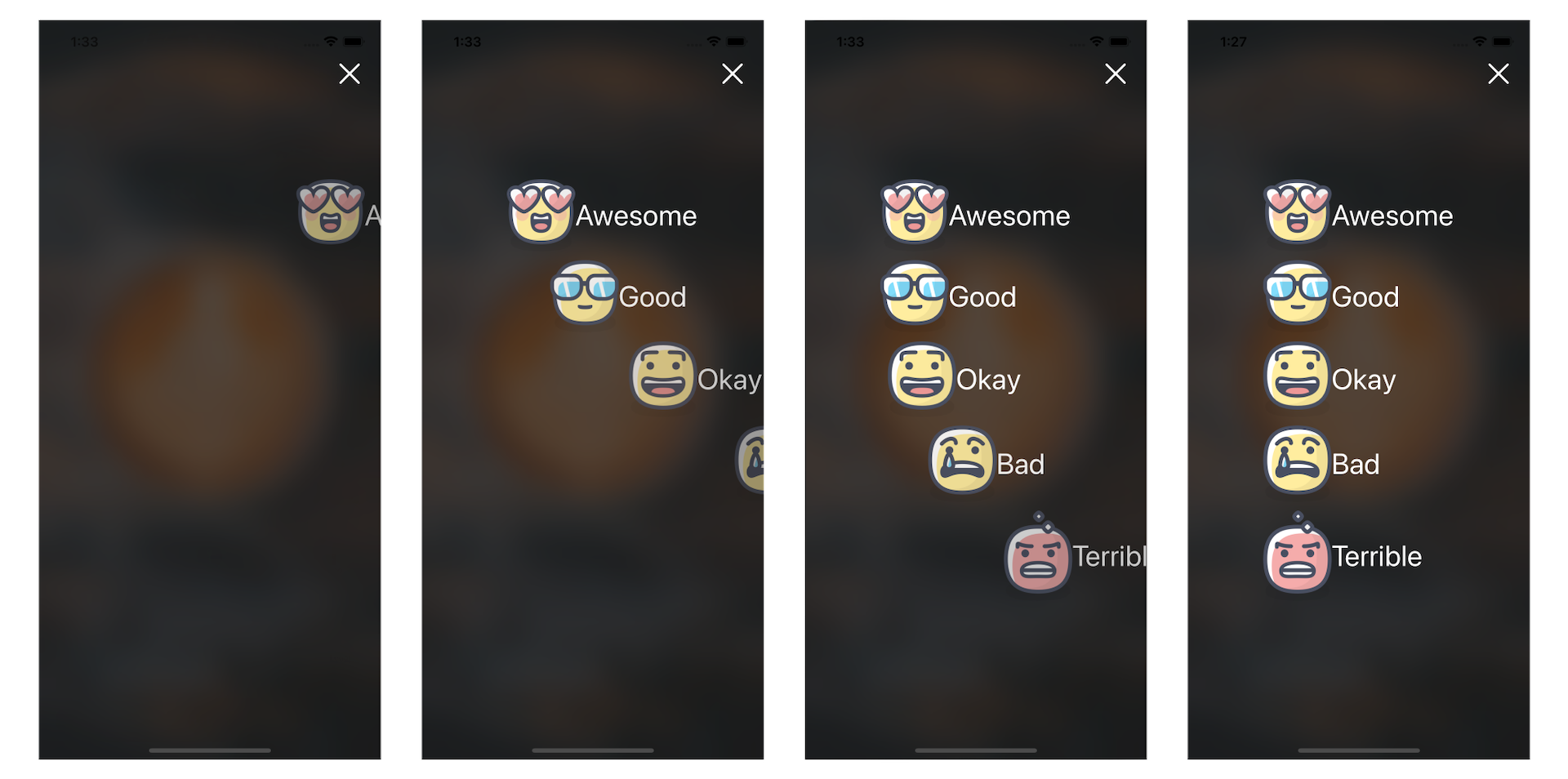
After all the preparation, we finally come to the core part of the chapter: UIView animation. To begin, we're going to create a simple fade-in animation for the rate buttons. Figure 17-20 will give you a better idea of the animation.
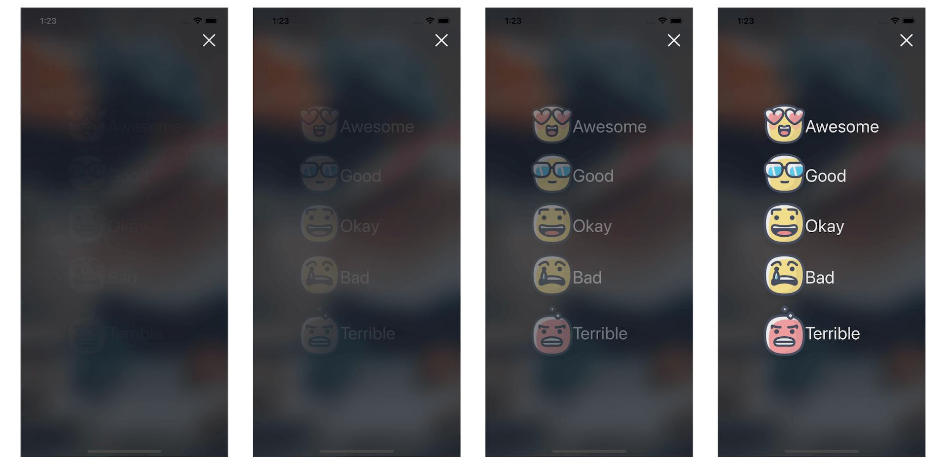
As explained before, you just need to provide two states (start and end state) of an animation. UIView will then generate the animation for you. For the fade-in animation, these are the start and end states:
- Invisible state - this is the buttons' start state. This can be done by setting its alpha value to
0. - Visible state - this is the end state. The alpha value is set to
1.
Let's begin with the start state. We will make all the rating buttons invisible in the viewDidLoad() method of the ReviewViewController class. Insert the following code at the end of viewDidLoad():
// Make the button invisible
for rateButton in rateButtons {
    rateButton.alpha = 0
}
When setting the value of the alpha property to 0, we can make the buttons invisible.
Now it comes to the end state. To create the fade-in effect, insert the following code in the ReviewViewController class:
override func viewWillAppear(_ animated: Bool) {
    UIView.animate(withDuration: 2.0) {
        self.rateButtons[0].alpha = 1.0
        self.rateButtons[1].alpha = 1.0
        self.rateButtons[2].alpha = 1.0
        self.rateButtons[3].alpha = 1.0
        self.rateButtons[4].alpha = 1.0
    }
}
The code is very straightforward. We call the UIView.animate(withDuration:animations:) method to animate the change of the alpha value. In the body of the closure, you just need to specify the end state (i.e. alpha = 1.0). The API will automatically compute the animation for you. The duration parameter specifies the duration of the animation. In this example, the animation will complete in 2 seconds.
You may have a question about viewWillAppear. Why do you implement the animation in this method instead of viewDidLoad? I have briefly explained the view controller life cycle in earlier chapters. The viewDidLoad method is called when a view is first loaded, but the view hasn't displayed on the screen. If we implement the animation in this method, the animation may start too early and probably finish even before the view appears on the screen. The viewWillAppear method, on the other hand, is automatically called after viewDidLoad by iOS when the view is about to appear on the screen. It is more suitable for us to render the animation. This is why we write the code in viewWillAppear rather than viewDidLoad.
That's it. Run the app for a quick test and enjoy the animation.
Note: If you can't see the animation clearly, you can change the duration parameter from 2 seconds to other value (e.g. 10.0) to slow down the animation. Alternatively, you can enable slow animations in the iOS simulator. Go up to the simulator menu, select Debug > Slow animations.The
UIView.animate(withDuration:animations:) method is not the only API for rendering animations. It has other variations with additional parameters to control an animation. Try to replace the viewWillAppear method with the following code:
override func viewWillAppear(_ animated: Bool) {

    UIView.animate(withDuration: 0.4, delay: 0.1, options: [], animations: {
        self.rateButtons[0].alpha = 1.0
    }, completion: nil)

    UIView.animate(withDuration: 0.4, delay: 0.15, options: [], animations: {
        self.rateButtons[1].alpha = 1.0
    }, completion: nil)

    UIView.animate(withDuration: 0.4, delay: 0.2, options: [], animations: {
        self.rateButtons[2].alpha = 1.0
    }, completion: nil)

    UIView.animate(withDuration: 0.4, delay: 0.25, options: [], animations: {
        self.rateButtons[3].alpha = 1.0
    }, completion: nil)

    UIView.animate(withDuration: 0.4, delay: 0.3, options: [], animations: {
        self.rateButtons[4].alpha = 1.0
    }, completion: nil)

}
The UIView.animate method has other parameters such as delay for developers to further customize an animation. In the code above, we set a distinct delay value for each of the buttons. Run the app again and you will experience a fancier fade-in animation.
Slide-in Animation
A slide-in animation is another common type of animations. If you don't know what a slide-in animation looks like, take a look at figure 17-22. The object slides from the far right of the screen until it reaches a certain position.
Let's see how to implement this type of animation. Again, consider the start and end state of the animation. To create a slide-in-from-right animation, we will move all the rate buttons off the screen to the right. This is the start state. The end state is the original position of the buttons that we define in Interface Builder.
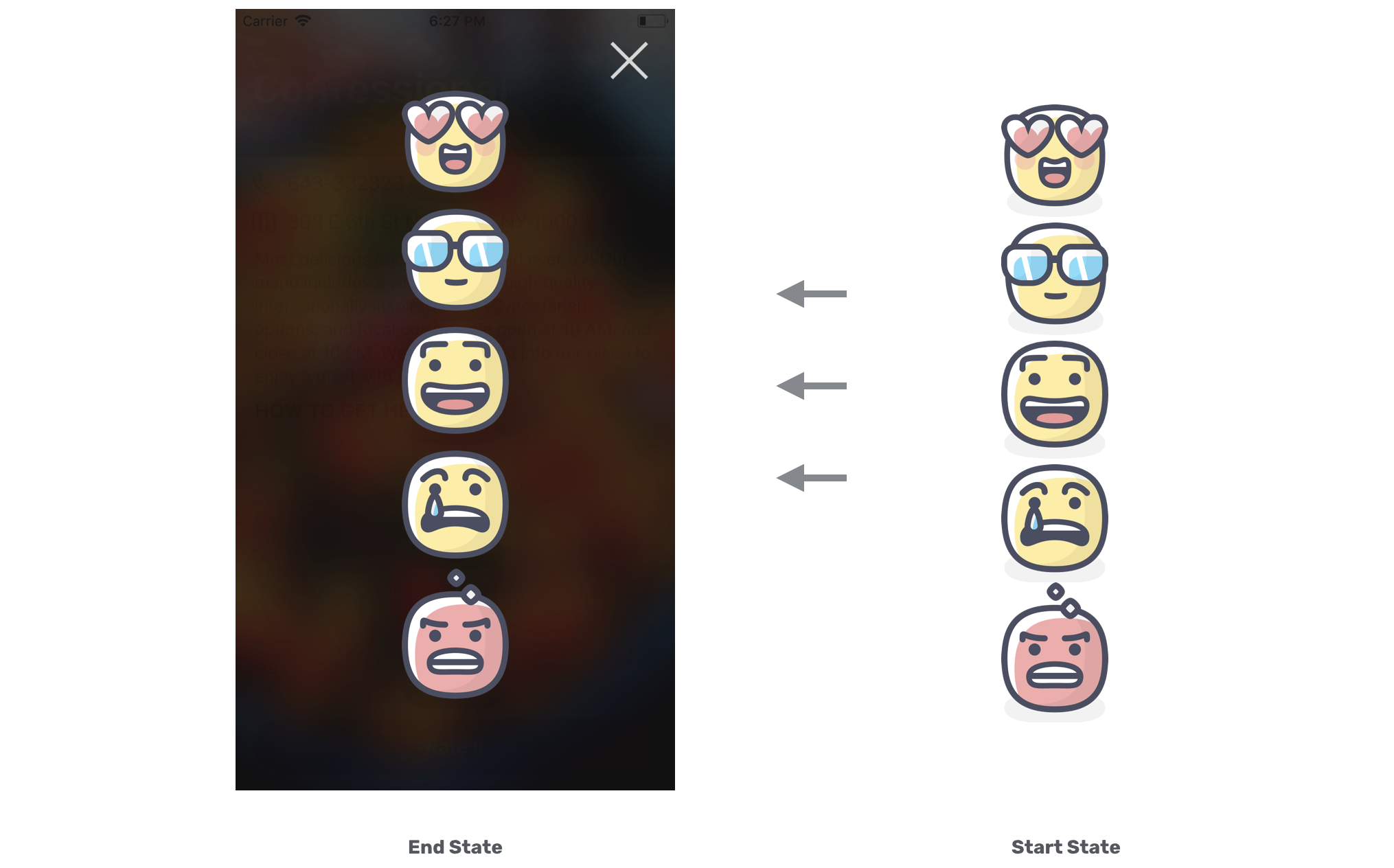
At this point, you might be trying to figure out how to move a view (or button) off the screen. iOS provides a structure called CGAffineTransform for you to move, scale, and rotate a view. To move a view, all you need to do is create an affine transformation and set it to the transform property of a UIView object. Here is the line of code for creating a translation transform that moves a view 600 points to the right of the screen:
CGAffineTransform.init(translationX: 600, y: 0)
If you want to move a view to the left of the screen, use a negative number. The parameter y lets you move a view along the y-axis. In other words, you can set this value to move a view vertically.
Now let's try out the code in action. Update the viewDidLoad method of the ReviewViewController class like this:
override func viewDidLoad() {
    super.viewDidLoad()

    backgroundImageView.image = UIImage(named: restaurant.image)

    // Applying the blur effect
    let blurEffect = UIBlurEffect(style: .dark)
    let blurEffectView = UIVisualEffectView(effect: blurEffect)
    blurEffectView.frame = view.bounds
    backgroundImageView.addSubview(blurEffectView)

    let moveRightTransform = CGAffineTransform.init(translationX: 600, y: 0)

    // Make the button invisible
    for rateButton in rateButtons {
        rateButton.transform = moveRightTransform
        rateButton.alpha = 0
    }
}
We have made a couple of minor changes here. First, we declare a constant called moveRightTransform that holds the translation transform for moving a view to the right. Secondly, we add a line of code in the for-in loop:
rateButton.transform = moveRightTransform
The transform property of each button is assigned with moveRightTransform. This will move the buttons off the screen to the right.
Okay, that's the implementation for the start state. For the end state, the question is how can we reset the position of rate buttons to its original position?
That's very simple. There is a built-in transform called identity transform that can be used to clear any pre-defined transform. So update the viewWillAppear method like this:
override func viewWillAppear(_ animated: Bool) {

    UIView.animate(withDuration: 0.4, delay: 0.1, options: [], animations: {
        self.rateButtons[0].alpha = 1.0
        self.rateButtons[0].transform = .identity
    }, completion: nil)

    UIView.animate(withDuration: 0.4, delay: 0.15, options: [], animations: {
        self.rateButtons[1].alpha = 1.0
        self.rateButtons[1].transform = .identity
    }, completion: nil)

    UIView.animate(withDuration: 0.4, delay: 0.2, options: [], animations: {
        self.rateButtons[2].alpha = 1.0
        self.rateButtons[2].transform = .identity
    }, completion: nil)

    UIView.animate(withDuration: 0.4, delay: 0.25, options: [], animations: {
        self.rateButtons[3].alpha = 1.0
        self.rateButtons[3].transform = .identity
    }, completion: nil)

    UIView.animate(withDuration: 0.4, delay: 0.3, options: [], animations: {
        self.rateButtons[4].alpha = 1.0
        self.rateButtons[4].transform = .identity
    }, completion: nil)

}
For each of the buttons, we add a line of code to set the button's transform to .identity that will reset the button to its original position.
That's it! Now it's time to test the app and see the animation in action.
Spring Animation
The animation is cool, right? Let me introduce a variation of the UIView animation known as spring animation. The spring animation API lets you easily create some bouncing animations. To take advantage of spring animation in your app, here is the single method call you need:
UIView.animate(withDuration: 0.8, delay: 0.1, usingSpringWithDamping: 0.2, initialSpringVelocity: 0.3, options: [], animations: {
    self.rateButtons[0].alpha = 1.0
    self.rateButtons[0].transform = .identity
}, completion: nil)
The method should look familiar to you, but it adds the damping and initialSpringVelocity parameters. Damping takes a value from 0 to 1, and controls how much resistance the spring has when it approaches the end state of an animation. If you want to increase oscillation, set to a lower value. The initialSpringVelocity property specifies the initial spring velocity. Try to replace the existing animation code of rateButtons[0] with the above code and see how the spring animation works.
Combining Two Transforms
What's interesting about affine transform is that you can concatenate one transform with another. This is the function you need to remember:
transform1.concatenating(transform2)
Now that we have implemented the translate transform for the rate buttons, wouldn't it be great if we can add a scale transform to them to create some amazing animations? In the viewDidLoad method, replace the following code:
let moveRightTransform = CGAffineTransform.init(translationX: 600, y: 0)

// Make the button invisible
for rateButton in rateButtons {
    rateButton.transform = moveRightTransform
    rateButton.alpha = 0
}
with:
let moveRightTransform = CGAffineTransform.init(translationX: 600, y: 0)
let scaleUpTransform = CGAffineTransform.init(scaleX: 5.0, y: 5.0)
let moveScaleTransform = scaleUpTransform.concatenating(moveRightTransform)

// Make the button invisible and move off the screen
for rateButton in rateButtons {
    rateButton.transform = moveScaleTransform
    rateButton.alpha = 0
}
We create a scale-up transform that will make a view 5 times larger. And then we combine it with the translation transform by calling the concatenating function. Each of the rate buttons is assigned with this combine transform.
For the end state, we can keep the viewWillAppear method unchanged. That's it! You're ready to go and see how the combined animation works.
Unwind Segues and Data Passing
Earlier, we used an unwind segue to "go back" to the detail view when a user taps the close button. How about the rating buttons? How can we pass the selected rating from the review view controller to the detail view controller?
We will make use of unwind segues to facilitate the data passing. Here are what we are going to implement:
- We will add another unwind action method in the
ReviewViewControllerclass - when any of the buttons (awesome/good/okay/bad/terrible) is tapped, the method will be called. - In the method, we determine which button is tapped, and save the corresponding rating.
- Then we display the selected rating in the detail view. You can refer to figure 17-2 to see how the rating icon is displayed.
It sounds complicated, but the implementation is quite similar to the one we just implemented for the close button. That said, there are some extra works we have to do before we can store the rating of a restaurant.
First, the Restaurant class doesn't have any property for holding the value of the selected rating. So we need to edit the class to add a rating property. The question is what type should be used for this rating property? Should we use a String type to store the image file name? Or do we need to create a new type?
In this case, creating a new type using an enum is a better approach. Open the Restaurant.swift file and update the Restaurant structure like this:
struct Restaurant: Hashable {
    enum Rating: String {
        case awesome
        case good
        case okay
        case bad
        case terrible

        var image: String {
            switch self {
            case .awesome: return "love"
            case .good: return "cool"
            case .okay: return "happy"
            case .bad: return "sad"
            case .terrible: return "angry"
            }
        }
    }

    var name: String = ""
    var type: String = ""
    var location: String = ""
    var phone: String = ""
    var description: String = ""
    var image: String = ""
    var isFavorite: Bool = false
    var rating: Rating?
}
In the code above, we have added a new rating property of the type Rating. This variable is an optional meaning that it is not a must to store a value. The Rating type is an enumeration that stores all the available ratings including awesome, good, okay, bad, and terrible. In the enum, we have a computed property named image that returns the corresponding file name of the rating image.
You may wonder why we used an enum instead of a string to represent the rating. String is a good choice for handling freeform text but not a perfect choice for storing this kind of data. We only have 5 different ratings here. If we use String type to hold the rating, this means it can store any text data. You may store "awesome", "Awesome", or "AWESOME". Since Swift is a case sensitive language, all these values are not the same. To avoid programming errors, it is more appropriate to use enum to creat a new type, defining the possible values it can hold.
Now switch over to the Main storyboard. We will add another image view to the header view. This image view will be used to display the icon of the selected rating. Drag an image view from the Object library to the Restaurant Detail View Controller. Place it right under the Dim View in document outline.
Next, click the Add New Constraints button to add a few layout constraints. Set the value of right and bottom sides to 20. To limit the size of the image view, check both height and width options. Set the height to 50 and width to 52. Click Add 4 Constraints to confirm.
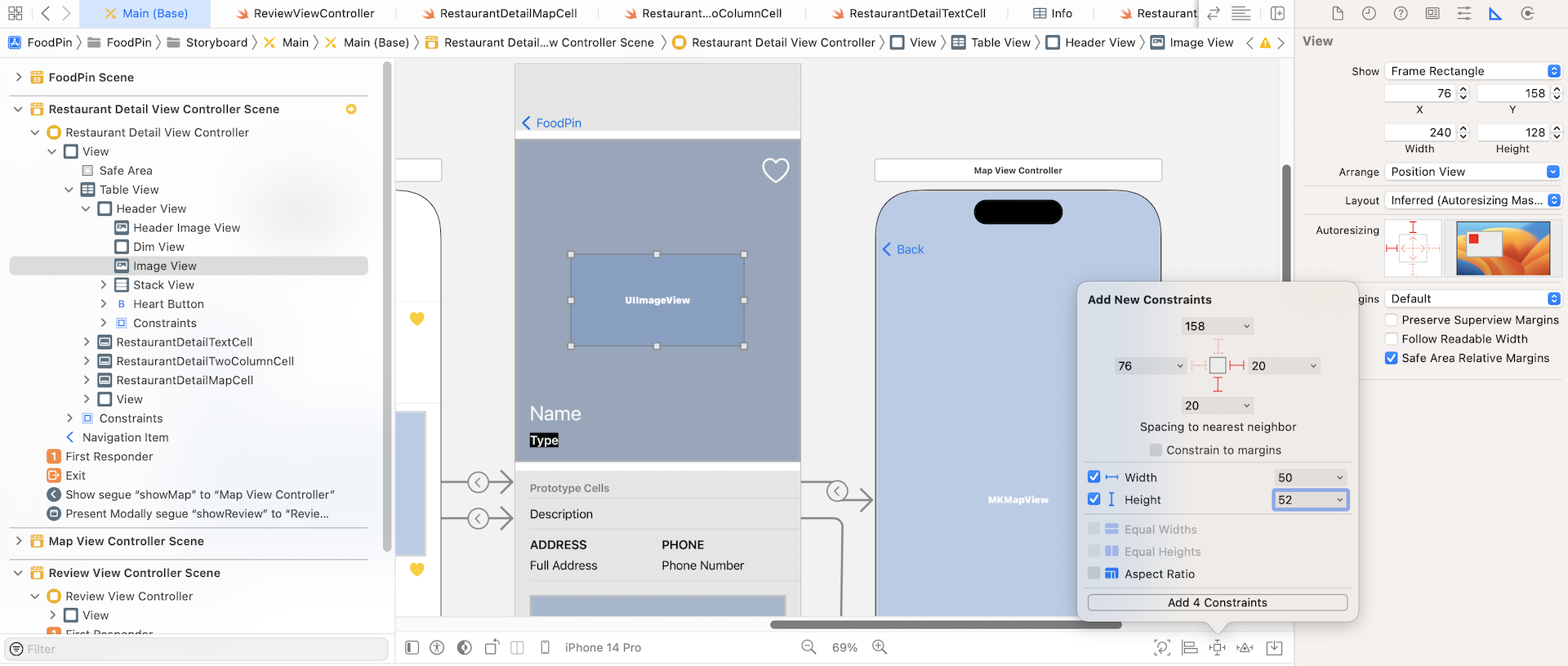
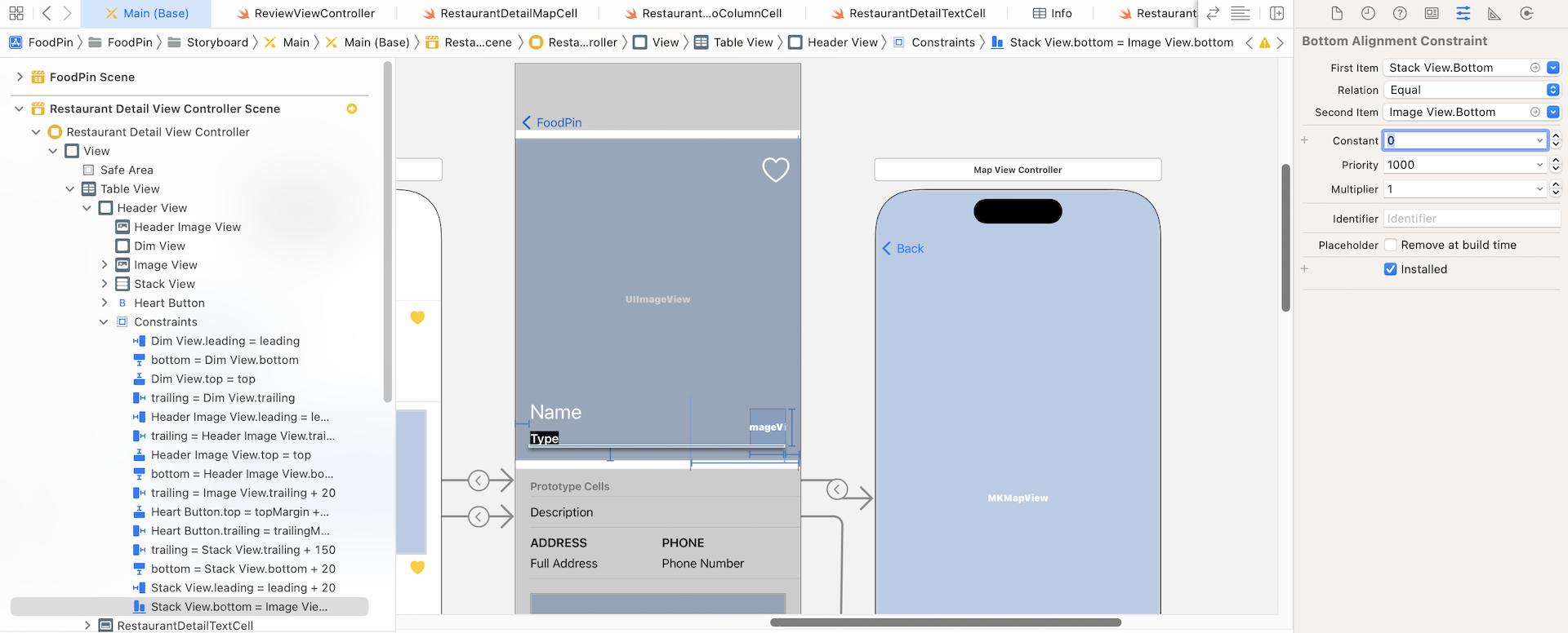
After adding the constraints, the image view is resized and moved. However, it is not placed at our preferred location. We expect it resides near the lower-right corner of the header view. There is an issue with the bottom constraint of the image view. If you select it, you will find that this spacing constraint is relative to the Name label, which is incorrect. It should be relative to the bottom of the header view.
In the Attributes inspector, change the First Item from Stack View.Top to Stack View.Bottom. You have to click the Stack View.Top option and select Bottom. Also, change the constant to 0.
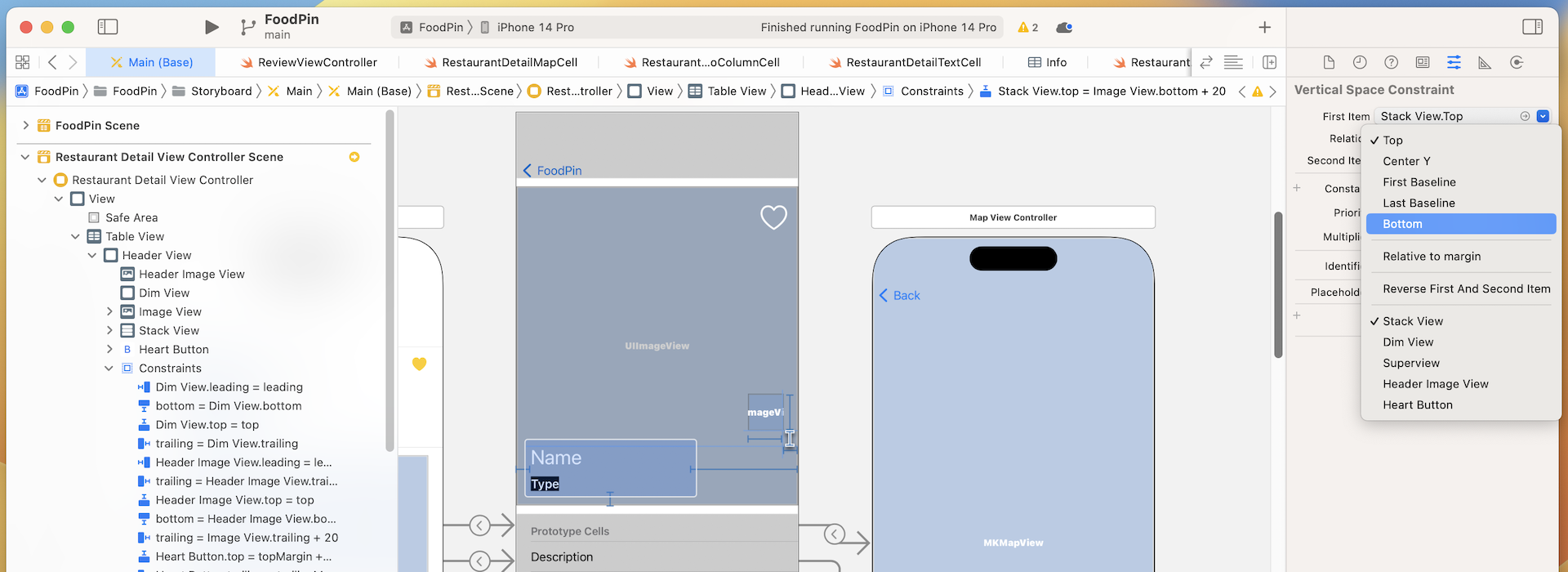
If you've made the change correctly, the bottom of the image view should be perfectly aligned with the bottom of the type label.
Now we've completed the UI design of the detail view. Open the RestaurantDetailHeaderView.swift file and add an outlet variable for this image view:
@IBOutlet var ratingImageView: UIImageView!
Go back to the storyboard. Right-click Header View in document outline to establish the connection between the outlet variable and the new image view.
Finally, we've completed all the UI preparations. It's time to create the unwind segue to facilitate the data passing. Declare the following method in the RestaurantDetailViewController class:
@IBAction func rateRestaurant(segue: UIStoryboardSegue) {

}
Now go to the Main storyboard to connect each of the rating buttons with the unwind action method. Control-drag from the Love button to the exit icon. Release the button and select rateRestaurantWithSegue:. Once the unwind segue is created, select it in the document outline. Set its identifier to awesome in the Attributes inspector.
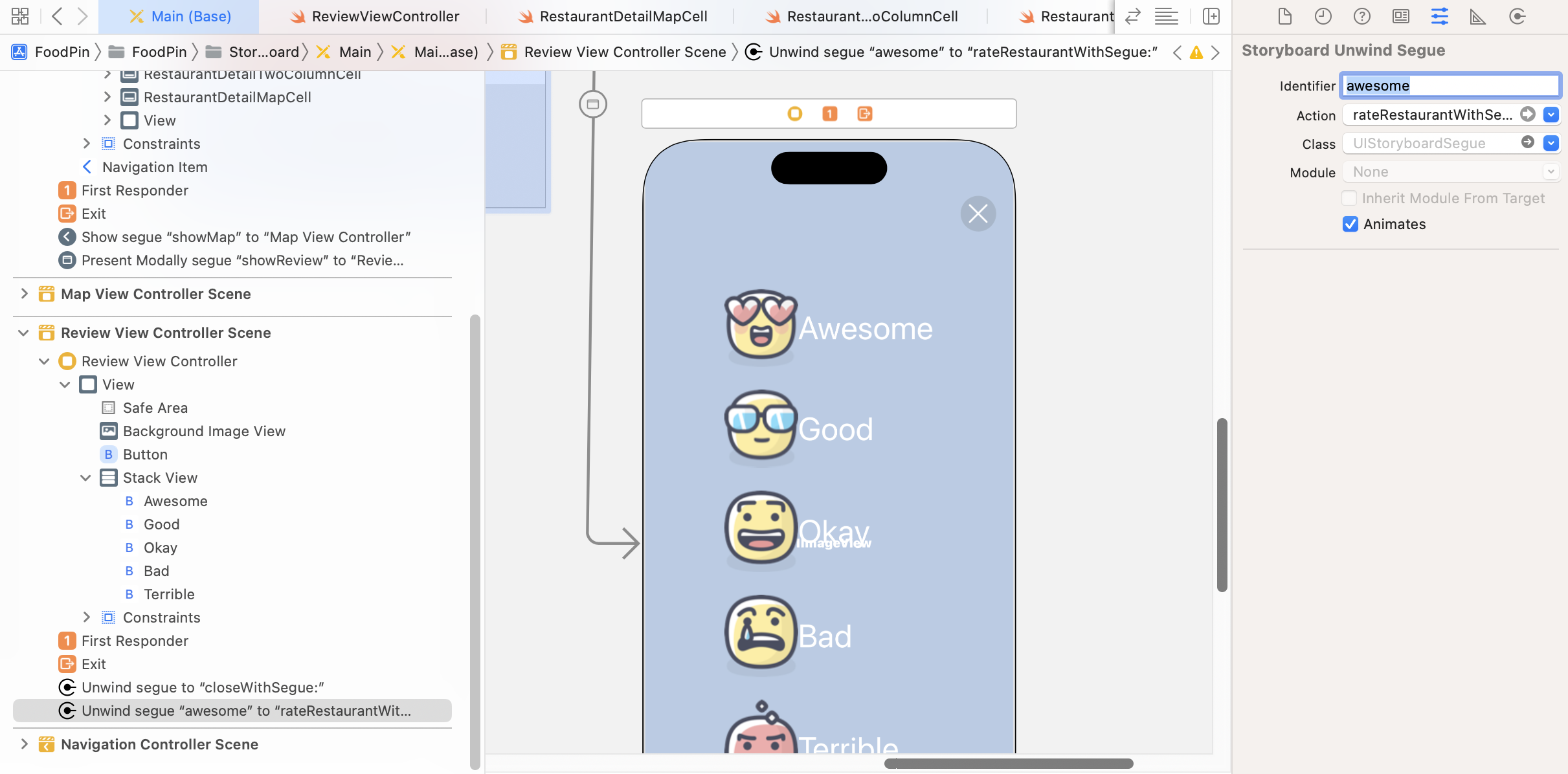
Repeat the same step to connect the other 4 buttons with the ratingButtonTappedWithSegue: method:
- For the Good button, set the unwind segue's identifier to
good. - For the Okay button, set the unwind segue's identifier to
okay. - For the Bad button, set the unwind segue's identifier to
bad. - For the Terrible button, set the unwind segue's identifier to
terrible.
Do you know why we set these identifiers? Each of the rating buttons is connected to the same unwind action method. We need to have a way to find out which button is tapped. This is the reason why we set these segue identifiers. And, the value of the identifier is the same as that we defined in the Rating enum.
Now, go back to RestaurantDetailViewController.swift to implement the unwind action method. Update the rateRestaurant(segue:) method like this:
@IBAction func rateRestaurant(segue: UIStoryboardSegue) {

    guard let identifier = segue.identifier else {
        return
    }

    if let rating = Restaurant.Rating(rawValue: identifier) {
        self.restaurant.rating = rating
        self.headerView.ratingImageView.image = UIImage(named: rating.image)
    }

    dismiss(animated: true, completion: nil)
}
The code above is pretty straightforward. We first retrieve the unwind segue's identifier. Depending on the segue's identifier (awesome/good/okay/bad/terrible), we set the rating of the restaurant accordingly. And then we retrieve the rating image by accessing the image property and assign it to the rating image view.
If you run the app now and rate a restaurant, you will notice the image of your selected rating appeared on the detail view.
The rating feature works great! But we can further improve it by adding a subtle animation. Try to update the rateRestaurant method to the following:
@IBAction func rateRestaurant(segue: UIStoryboardSegue) {

    guard let identifier = segue.identifier else {
        return
    }

    dismiss(animated: true, completion: {

        if let rating = Restaurant.Rating(rawValue: identifier) {
            self.restaurant.rating = rating
            self.headerView.ratingImageView.image = UIImage(named: rating.image)
        }

        let scaleTransform = CGAffineTransform.init(scaleX: 0.1, y: 0.1)
        self.headerView.ratingImageView.transform = scaleTransform
        self.headerView.ratingImageView.alpha = 0

        UIView.animate(withDuration: 0.4, delay: 0, usingSpringWithDamping: 0.3, initialSpringVelocity: 0.7, options: [], animations: {
            self.headerView.ratingImageView.transform = .identity
            self.headerView.ratingImageView.alpha = 1
        }, completion: nil)

    })

}
The dismiss method accepts two parameters: animated and completion. The animated parameter indicates whether the view dismissal is animated. The completion parameter lets you specify a block of code to be executed after the view controller is dismissed. In the code block, we first scale down the rating image and then reset it back to its original size to create a subtle animation.
Run the app to try it out. You will understand what I mean.
Exercise #1
This time, I have two exercises for you. The first one is designed to test your knowledge of view animations. The close button of the review view controller is not animated. Your task is to implement a slide-in-from-top animation for the close button.
Hint: You will need to create an outlet for the close button and create a translate transform for the button.
Exercise #2
The next exercise is related to code refactoring. If you look into the viewWillAppear method of ReviewViewController, you will find a lot of duplicate code:
override func viewWillAppear(_ animated: Bool) {

    UIView.animate(withDuration: 0.4, delay: 0.1, options: [], animations: {
        self.rateButtons[0].alpha = 1.0
        self.rateButtons[0].transform = .identity
    }, completion: nil)

    UIView.animate(withDuration: 0.4, delay: 0.15, options: [], animations: {
        self.rateButtons[1].alpha = 1.0
        self.rateButtons[1].transform = .identity
    }, completion: nil)

    UIView.animate(withDuration: 0.4, delay: 0.2, options: [], animations: {
        self.rateButtons[2].alpha = 1.0
        self.rateButtons[2].transform = .identity
    }, completion: nil)

    UIView.animate(withDuration: 0.4, delay: 0.25, options: [], animations: {
        self.rateButtons[3].alpha = 1.0
        self.rateButtons[3].transform = .identity
    }, completion: nil)

    UIView.animate(withDuration: 0.4, delay: 0.3, options: [], animations: {
        self.rateButtons[4].alpha = 1.0
        self.rateButtons[4].transform = .identity
    }, completion: nil)

}
For each of the buttons, we set the value of alpha to 1.0 and transform to .identity. The code above can be rewritten using a for-in loop. Give it some thought and try to rewrite it.
Summary
This is another huge chapter that covers UIView animation, visual effects, and unwind segues. I hope you love all the techniques you've learned about UIView animations and visual effects. As you can see, it is very easy to animate a view, whether it's a button or a view. I would encourage you to play around with the parameters (like damping, initial spring velocity, and delay) and see what animations you can create. And, don't forget to take some time to complete the exercises.
For your reference, you can download the complete Xcode project from http://www.appcoda.com/resources/swift57/FoodPinAnimation.zip. The solution to the exercises is included in the project.