- Made by AppCoda
- Contact us / Support
- Tweet this book
- Preface
- 1. The Development Tools, the Learning Approach, and the App Idea
- 2. Your First Taste of Swift with Playgrounds
- 3. Hello World! Build Your First App in Swift
- 4. Hello World App Explained
- 5. Introduction to Auto Layout
- 6. Designing UI Using Stack Views
- 7. Introduction to Prototyping
- 8. Creating a Simple Table-based App
- 9. Customize Table Views Using Prototype Cell, Diffable Data Source and Dark Mode
- 10. Displaying Alerts with UIAlertController and Handling Table View Selection
- 11. Object Oriented Programming, Project Organization and Code Documentation
- 12. Table Row Deletion, Custom Action Button and MVC
- 13. Introduction to Navigation Controller and Segue
- 14. Detail View Enhancement and Navigation Bar Customization
- 15. Navigation Bar Customization, Extensions and Dynamic Type
- 16. Working with Maps
- 17. Basic Animations, Visual Effects and Unwind Segues
- 18. Working with Static Table Views, Camera and NSLayoutConstraint
- 19. Working with Core Data
- 20. Search Bar and UISearchController
- 21. Building Walkthrough Screens with UIPageViewController and Container Views
- 22. Exploring Tab Bar Controller and Storyboard References
- 23. Getting Started with WKWebView and SFSafariViewController
- 24. Exploring CloudKit
- 25. Localizing Your App to Reach More Users
- 26. Deploying and Testing Your App on a Real iOS Device
- 27. Beta Testing with TestFlight and CloudKit Production Deployment
- 28. Submit Your App to App Store
- 29. Adopting 3D Touch, Haptic Touch and Context Menus
- 30. Developing User Notifications in iOS
- 31. Appendix - Swift Basics
- Published with GitBook
Chapter 9
Customize Table Views Using Prototype Cell, Diffable Data Source and Dark Mode

I think that's the single best piece of advice: Constantly think about how you could be doing things better and questioning yourself.
- Elon Musk, Tesla Motors
In the previous chapter, we created a simple table-based app to display a list of restaurants using the basic cell style. In this chapter, we'll customize the table cell and make it look more stylish. And, I will show a modern way to handle the data source of a table view. There are a number of changes and enhancements we are going to work on:
- Rebuild the same app using
UITableViewControllerinstead ofUITableView - Use the new
UITableViewDiffableDataSourceto configure the data of the table view - Display a distinct image for each restaurant rather than showing the same thumbnail
- Design a custom table view cell instead of using the basic style of table view cell
- Test the app in dark mode
You may wonder why we need to rebuild the same app. There are always more than one way to do things. Previously, we used UITableView to create the table view. In this chapter, we'll use UITableViewController and UITableViewDiffableDataSource to create a table view app. Will it be easier? Yes, it's going to be easier. Recalled that we needed to explicitly adopt both UITableViewDataSource and UITableViewDelegate protocols, UITableViewController has already adopted these protocols and established the connections for us. On top of this, it has all the required layout constraints right out of the box.
The UITableViewDiffableDataSource class was first introduced in iOS 13, which is a modern way to supply a table view with the data to display. You can still use the traditional way, which was discussed in chapter 8, to populate data into a table. This new approach replaces the UITableViewDataSource protocol and will make your life much easier to cope with data changes in a table view. As more devices are adopting iOS 13 (or up), the UITableViewDiffableDataSource approach will become the standard implementation of UITableView.
Starting from this chapter and onwards, you begin to develop a real-world app called FoodPin. It's gonna be fun!
Building a Table View App Using UITableViewController and UITableViewDiffableDataSource
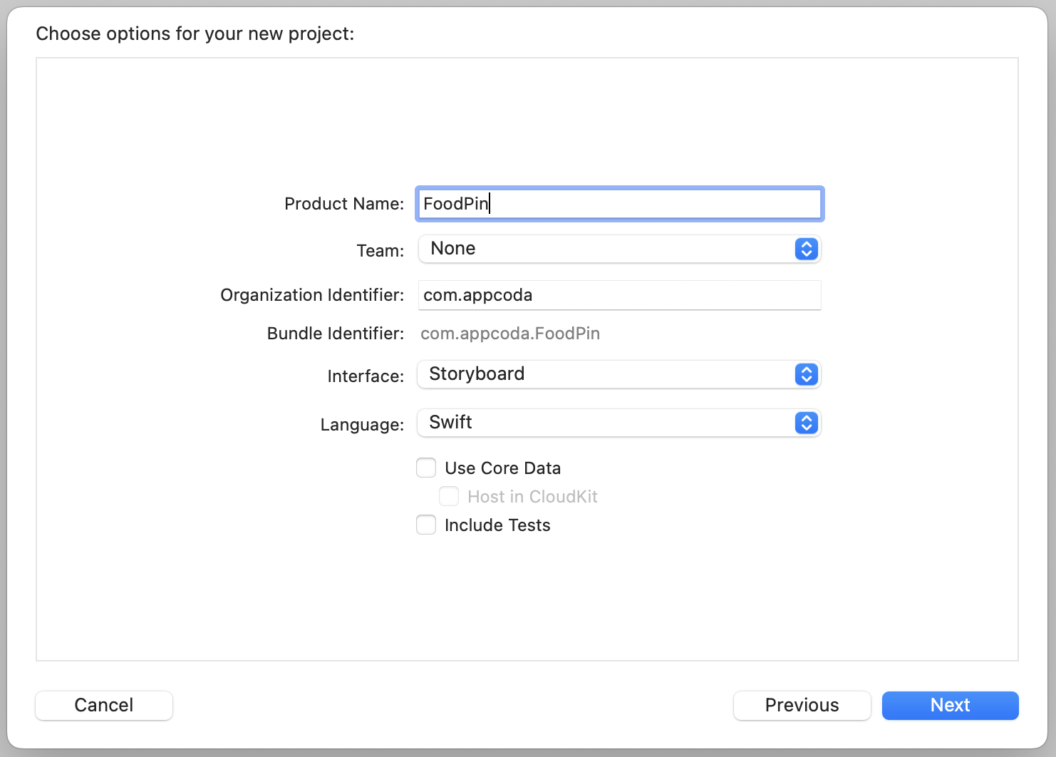
First, let's see how to use UITableViewController to re-create the same SimpleTable app. Fire up your Xcode, and create a new project using the App template. Name the project FoodPin and fill in all the required options for the Xcode project, just like what you did in the previous chapter.
Quick note: We're building a real app, so let's give it a better name. Feel free to use other names if you want. Also, make sure you use your own organization identifier. Otherwise, you can't test your app on a real iPhone.
Once you create the Xcode project, select the Main storyboard and jump to the Interface Builder editor. As usual, a default view controller is generated by Xcode.
This time, we will not use the default controller. Select the view controller, and press the delete key to delete it. The view controller is associated with ViewController.swift. We do not need it either. In the Project Navigator, select the file and hit the delete button. Select "Move to Trash" when prompted. This will completely delete the file.
Go back to Interface Builder. We will design the UI using iPhone 14 Pro, so change the device to iPhone 14 Pro using the configuration bar.
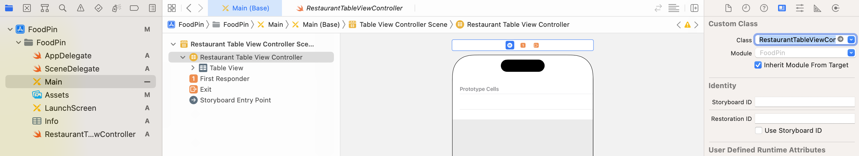
Next, open the Object library and search for "Table". Then drag a Table View Controller (i.e. UITableViewController) from the library and place it in the storyboard. You have to designate that controller as the initial view controller. This tells iOS that the table view controller is the first view controller to load. All you need to do is go to the Attributes inspector, and tick the Is Initial View Controller option. You'll then see an arrow pointing to the table view controller (see figure 9-2).
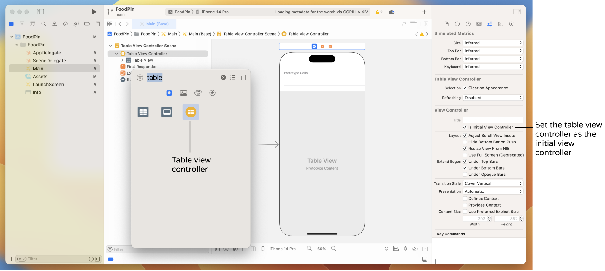
We haven't inserted any data into the table yet. If you compile and run the app now, you'll end up with a blank table.
By default, the table view controller is associated with the UITableViewController class (Go to the Identity inspector to take a look). In order to populate our own data, we have to associate it with our own class.
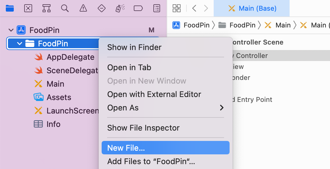
Go back to the Project Navigator and right-click the FoodPin folder. Select "New File..." to create a new file.
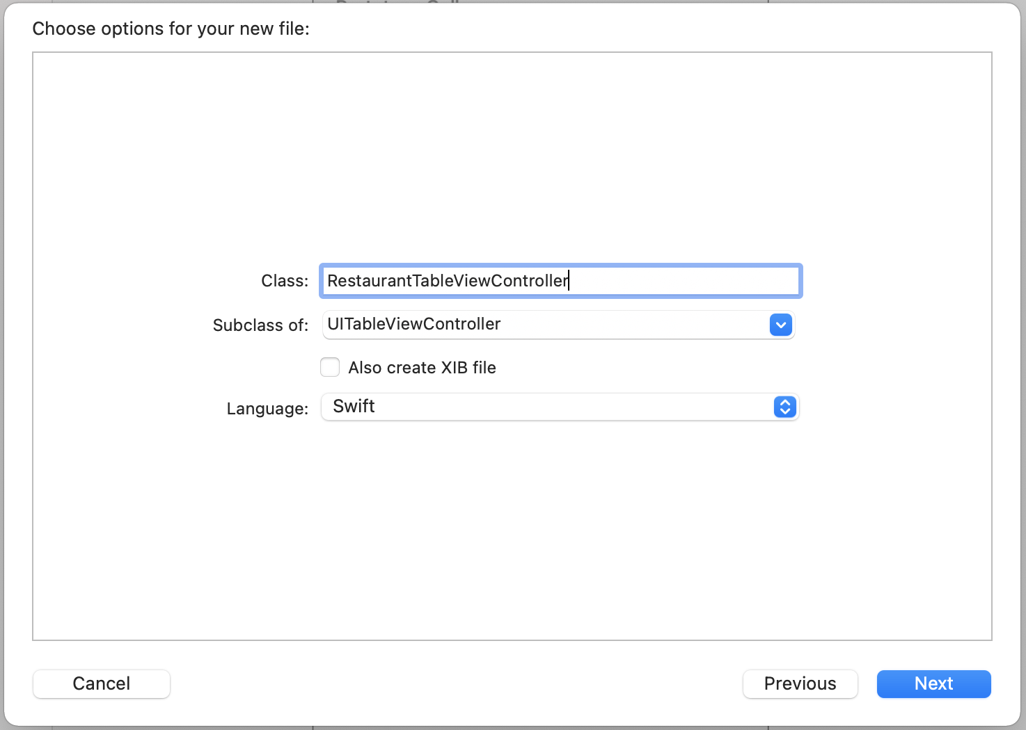
Under the iOS category, choose Cocoa Touch Class as the template and click Next. Name the new class RestaurantTableViewController. Because we're working with a table view controller, change the value of "Subclass of" to UITableViewController. Keep the rest of the values intact, click "Next" and save it to the project folder. You should see the RestaurantTableViewController.swift file in the project navigator.

The table view controller in the storyboard has no idea about theSuperclass and Subclass
If you're new to programming, you may wonder what a subclass is. Swift is an object oriented programming (OOP) language. In OOP, a class can be inherited by another class. In the example, theRestaurantTableViewControllerclass inherits from theUITableViewControllerclass. It inherits all the states and functionalities provided by theUITableViewControllerclass. TheRestaurantTableViewControllerclass is known as a subclass (or child class) ofUITableViewController. In other words, theUITableViewControllerclass is referred as the superclass (or parent class) ofRestaurantTableViewController.
RestaurantTableViewController class we just created. We have to assign the table view controller with the new custom class. Go to Main and select the table view controller. In the Identity inspector, set the custom class to RestaurantTableViewController and hit the return key to confirm the change. Now we have established a relationship between the table view controller in the storyboard and the new class.
There is one more thing to configure for the table view. In the document outline, expand Table View and select the table view cell. In the Attributes inspector, change the cell style to Basic and set the identifier to datacell. This is pretty much the same as what we have done in the previous chapter.
Okay, the user interface is ready. Let's move onto the code. Select the RestaurantTableViewController.swift file in the Project Navigator. By default, Xcode still uses the traditional way to handle the data source of the table view. If you look into the RestaurantTableViewController.swift file, you should find these lines of code:
// MARK: - Table view data source

override func numberOfSections(in tableView: UITableView) -> Int {
    // #warning Incomplete implementation, return the number of sections
    return 0
}

override func tableView(_ tableView: UITableView, numberOfRowsInSection section: Int) -> Int {
    // #warning Incomplete implementation, return the number of rows
    return 0
}
As mentioned earlier, we will use a new approach (i.e. UITableViewDiffableDataSource) to populate the table data. You can delete the code above and remove those commented code. After the clean up, your RestaurantTableViewController class should be like this:
class RestaurantTableViewController: UITableViewController {

    override func viewDidLoad() {
        super.viewDidLoad()
    }

}
Now we are ready to adopt the new approach to create the same table view as shown in the previous chapter. First, declare an instance variable, which is used for holding the table data.
var restaurantNames = ["Cafe Deadend", "Homei", "Teakha", "Cafe Loisl", "Petite Oyster", "For Kee Restaurant", "Po's Atelier", "Bourke Street Bakery", "Haigh's Chocolate", "Palomino Espresso", "Upstate", "Traif", "Graham Avenue Meats", "Waffle & Wolf", "Five Leaves", "Cafe Lore", "Confessional", "Barrafina", "Donostia", "Royal Oak", "CASK Pub and Kitchen"]
Previously, we implemented the following required methods of the UITableViewDataSource protocol to provide the table data:
- func tableView(_ tableView: UITableView, numberOfRowsInSection section: Int) -> Int
- func tableView(_ tableView: UITableView, cellForRowAt indexPath: IndexPath) -> UITableViewCell
The new approach no longer requires us to deal with the UITableViewDataSource protocol and all the methods above. Instead, we have to create a UITableViewDiffableDataSource object to configure the table view cell and then create a NSDiffableDataSourceSnapshot object to tell the table view what data to display.
UITableView supports multiple sections, thus the UITableViewDiffableDataSource object also requires us to specify the number of sections and the cell configuration of each section. For the demo app, we only have one section. So, declare an enum variable in RestaurantTableViewController like this:
enum Section {
    case all
}
We use enum to define a new Section type. In the enumeration, it only has one case because the table has a single section. I name the case all, which means all records. But you can actually name it to whatever name you like. Anyway, let's keep it to all.
Now that we have defined the section, the next step is to create an instance of UITableViewDiffableDataSource. We will write a new function called configureDataSource() for this purpose. Insert the following code inside RestaurantTableViewController:
func configureDataSource() -> UITableViewDiffableDataSource<Section, String> {

    let cellIdentifier = "datacell"

    let dataSource = UITableViewDiffableDataSource<Section, String>(
        tableView: tableView,
        cellProvider: {  tableView, indexPath, restaurantName in
            let cell = tableView.dequeueReusableCell(withIdentifier: cellIdentifier, for: indexPath)

            cell.textLabel?.text = restaurantName
            cell.imageView?.image = UIImage(named: "restaurant")

            return cell
        }
    )

    return dataSource
}
The function looks a bit complicated but if you study the code, some of the lines should be familiar to you. As you are pretty new to Swift, let me walk you through the code line by line. The first line is the function declaration. The symbol (->) means return and the type that follows is the type of returned object.
func configureDataSource() -> UITableViewDiffableDataSource<Section, String> {
  ...
}
So, in the code above, we create a function named configureDataSource() which returns an instance of UITableViewDiffableDataSource<Section, String>.
What's Section and String here?
UITableViewDiffableDataSource is a generic object which is capable to handle different types of section and item of a table view. The type Section and String inside the angle bracket indicated that we use the Section type for the table section and the String type for the table cell data. The reason why String type is used is that the restaurant name is of the type String.
Inside the configureDataSource() function, we create an instance of UITableViewDiffableDataSource. When initializing the object, it is required to provide the instance of table view that the data source is connected, plus the cell provider. Obviously, the data source will connect to the tableView of RestaurantTableViewController. The cellProvider parameter is where you set up each cell of the table view. In the closure of the cell provider, you have three parameters including tableView, indexPath, and restaurantName. The restaurantName here is the restaurant name of the current cell.
The code inside cellProvider is pretty much like those in the tableView(_:cellForRowAt) function you wrote in the previous chapter:
override func tableView(_ tableView: UITableView, cellForRowAt indexPath: IndexPath) -> UITableViewCell {

    let cellIdentifier = "datacell"
    let cell = tableView.dequeueReusableCell(withIdentifier: cellIdentifier, for: indexPath)

    // Configure the cell...
    cell.textLabel?.text = restaurantNames[indexPath.row]
    cell.imageView?.image = UIImage(named: "restaurant")

    return cell
}
The core difference is that we have to figure out the restaurant name from the restaurantNames array using index path. For cellProvider, it already passes us the restaurant name to display.
Now that we have created the function for configuring the data source, declare the following variable in RestaurantTableViewController to use it:
lazy var dataSource = configureDataSource()
You may wonder why we add a modifier lazy before the variable declaration. If you try to omit the lazy keyword, Xcode will show you the following message:
"Cannot use instance member 'configureDataSource' within property initializer; property initializers run before 'self' is available"
In this case, you must declare the variable with the lazy modifier because its initial value cannot be retrieved until after the instance initialization completes.
Okay, we have configured the data source of the table view. That said, your app is not yet ready to display the restaurants. We still have one more step to implement before the data shows up in the table view. Update the viewDidLoad function like this:
override func viewDidLoad() {
    super.viewDidLoad()

    tableView.dataSource = dataSource

    var snapshot = NSDiffableDataSourceSnapshot<Section, String>()
    snapshot.appendSections([.all])
    snapshot.appendItems(restaurantNames, toSection: .all)

    dataSource.apply(snapshot, animatingDifferences: false)
}
We first assign our custom dataSource to the table view's data source. The final step is to create a snapshot of the data to display in the table view. The snapshot is an instance of NSDiffableDataSourceSnapshot. This line of code creates an empty snapshot using the section identifier type Section and item identifier type String:
var snapshot = NSDiffableDataSourceSnapshot<Section, String>()
With the empty snapshot, we call appendSections to add a section to the snapshot. Then we call appendItems to add all items in the restaurantNames array to the .all section. Lastly, we apply the snapshot to the data source.
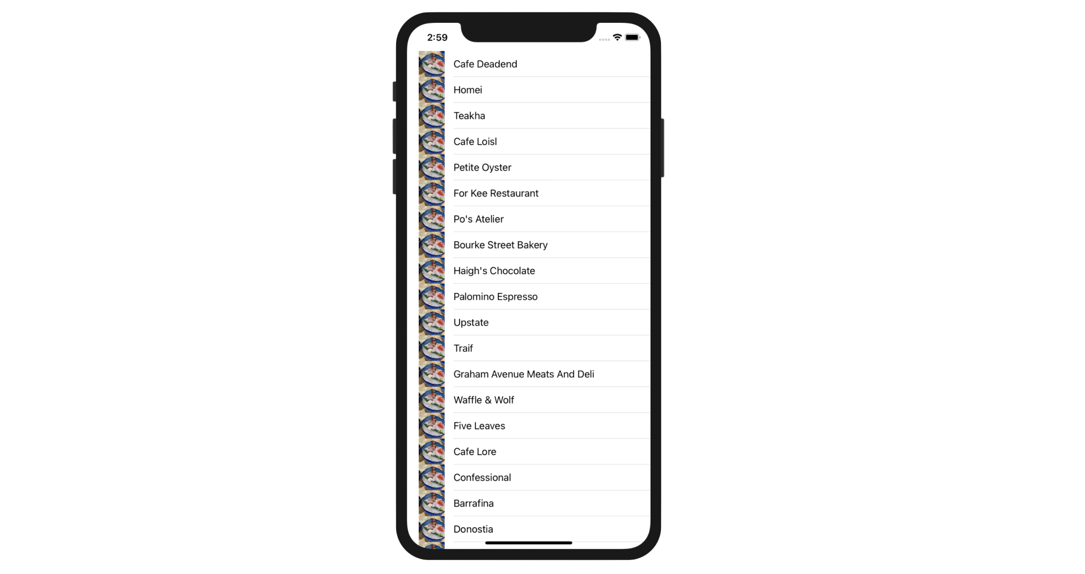
Before you run the app, download the image pack from http://www.appcoda.com/resources/swift53/simpletable-images1.zip and drag all images to the Assets.xcassets. Now, hit the "Run" button and your FoodPin app should look the same as the one we built earlier.
This is how we use the UITableViewDiffableDataSource approach to present data in a table view. To recap, here is the steps we used with this new approach:
- Create an enum which indicates the table sections.
- Create a
UITableViewDiffableDataSourceobject to connect with your table and provide the configuration of the table view cells. - Assign the diffable data source to your table view.
- Generate the current state of the table data by creating a snapshot
- Call the
apply()function of the data source to populate the data
Comparing with the traditional approach, which adopt the UITableViewDataSource protocol, you may wonder which approach is preferred. In general, use the diffable data source approach to create your table view. While the code may be more difficult to understand, this modern way of table view implementation will save you a lot of work when you need to update or change the table data. And, I forgot to mention this approach can automatically animate the data change. You will understand what this means in later chapters.
Display Different Thumbnails
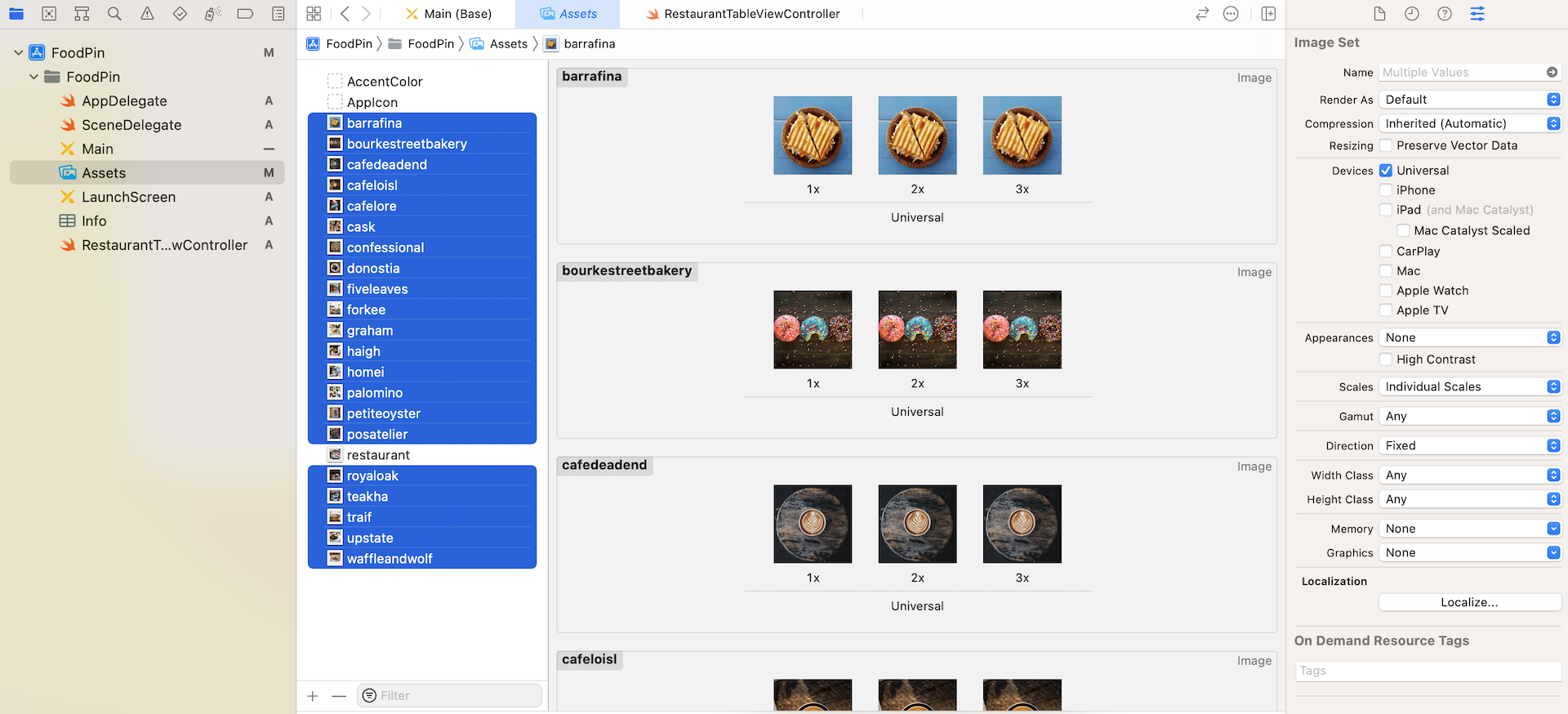
Did you go through the exercise in the previous chapter? I hope you've put your effort in it. In this section, we will modify the existing app to display different restaurant images. First, download another image pack from http://www.appcoda.com/resources/swift53/simpletable-images2.zip, and unzip it. Add all the images into the asset catalog (i.e. Assets.xcasset). The pack includes some food and restaurant images. If you like, you're free to use your own images.
First, let's declare a new array named restaurantImages for holding the file name of the restaurant images. Insert the following line of code in the RestaurantTableViewController class:
var restaurantImages = ["cafedeadend", "homei", "teakha", "cafeloisl", "petiteoyster", "forkee", "posatelier", "bourkestreetbakery", "haigh", "palomino", "upstate", "traif", "graham", "waffleandwolf", "fiveleaves", "cafelore", "confessional", "barrafina", "donostia", "royaloak", "cask"]
Note that the order of images are aligned with that of the restaurantNames.
Before we continue to modify the code, let's revisit the code for displaying the thumbnails in table row:
cell.imageView?.image = UIImage(named: "restaurant")
The above line of code, inside the cellProvider closure of the configureDataSource function, tells UITableView to display restaurant.jpg in each cell. In order to display a different image, we need to modify this line of code.
As explained before, one of the parameters provided by the cellProvider closure is indexPath. With the index path, you can use indexPath.row to find out which row is now being processed.
Therefore, in order to load the corresponding image of the restaurant, change the line of code in the configureDataSource function from:
cell.imageView?.image = UIImage(named: "restaurant")
to:
cell.imageView?.image = UIImage(named: self.restaurantImages[indexPath.row])
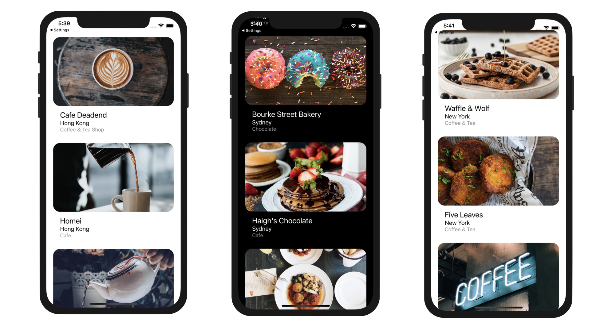
After saving the changes, try to run your app again. Each restaurant should display its own image.

Customize Table View Cells
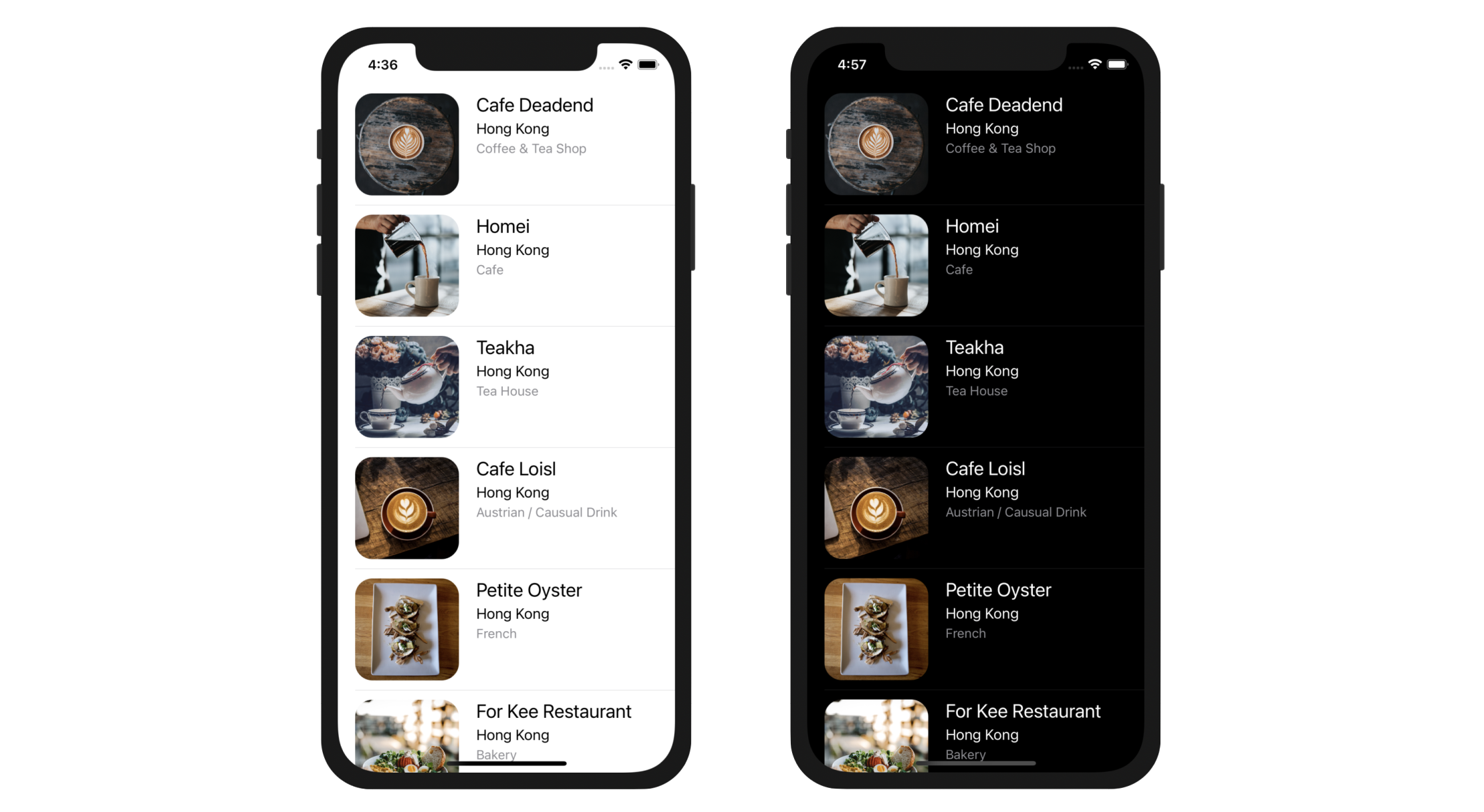
So far we use the basic cell type for the table view. We're going to make it even better by customizing the table cells. Here is what we are going to do. We will redesign the table view cell such that it will be a bit bigger and display a larger restaurant image. Also, we will show more information about the restaurant such as location and type. On top of that, we will round the corners of the images. To give you a better idea about how the cell is customized, take a look at figure 9-9. The cell looks awesome, right? And, I forgot to mention that the table view will also look great in dark mode.

Designing Prototype Cells in Interface Builder
The beauty of prototype cells is that it allows developers to customize the cell right inside the table view controller. To build a custom cell, you simply add other UI controls (e.g. labels, image views) to the prototype cell.
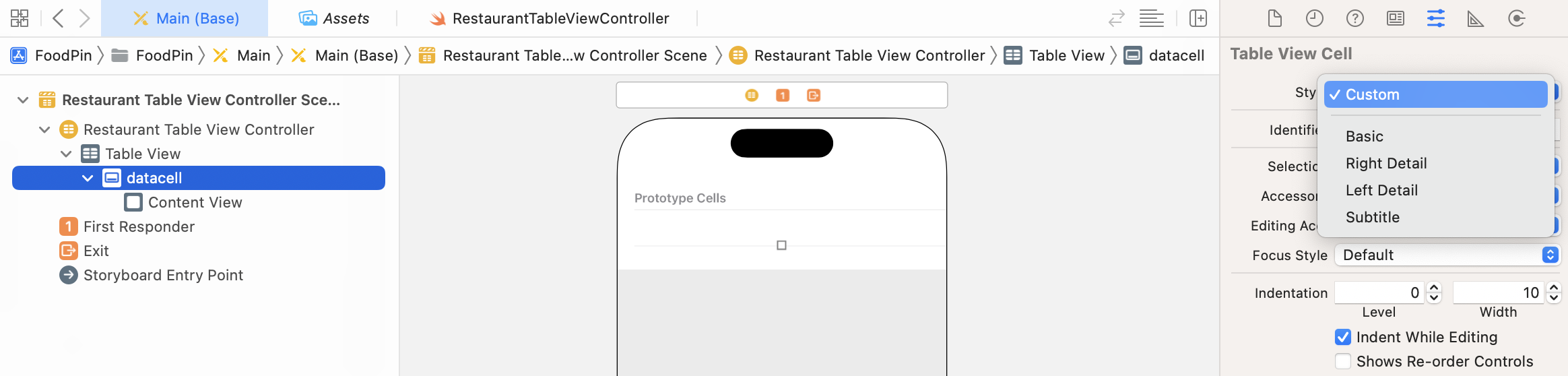
First, let's change the style of the cell. You can't customize the cell when it's set to the Basic style. Select the prototype cell and change the style from Basic to Custom in the Attributes inspector.
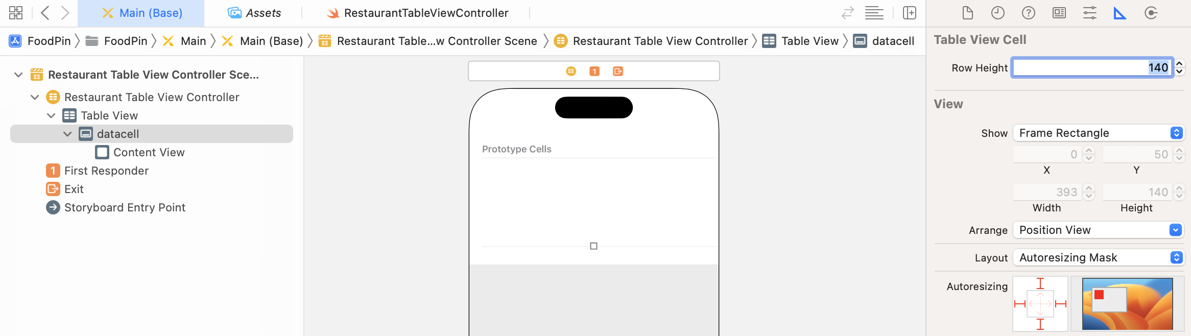
In order to accommodate a larger thumbnail, we have to make the cell a little bit bigger. You'll need to change the row height of the prototype cell. Select the prototype cell and change the row height to 140.
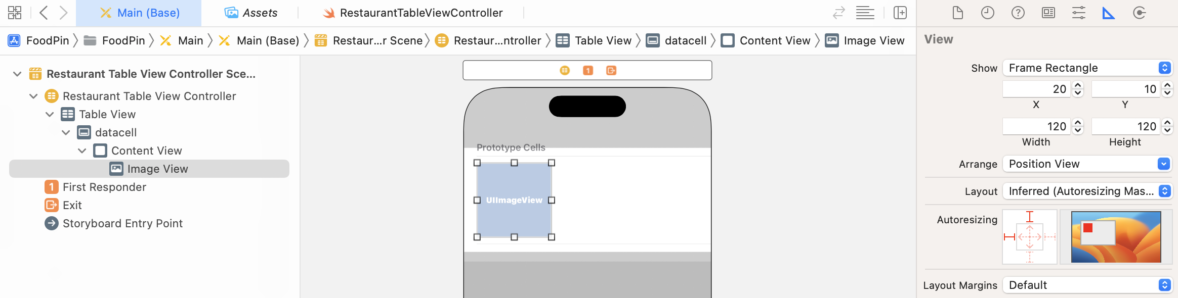
After altering the row height, open the Object library and drag an Image View object to the prototype cell. Adjust its size to 120x120 points. You can select the image view, click the Size inspector and change the attribute of X, Y, Width and Height like that shown in figure 9-12. Once you set the size of the image view, switch over to the Attributes inspector and set the Content Mode of the image view to Aspect Fill. Since our image view is not a perfect square, the image will look better in this mode.
Next, we will add three labels to the prototype cell:
- Name - for restaurant name
- Location - for restaurant location (e.g. New York)
- Type - for restaurant type (e.g. tea house)
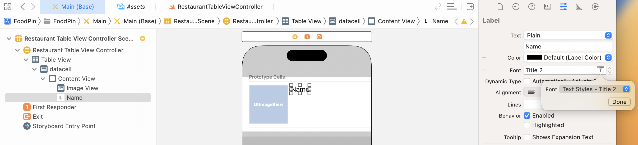
To add a label, drag a Label object from the Object library to the cell. Name the first label Name. Instead of using the system font for the label, we'll use a text style. I will explain to you the difference of a fixed font and a text style in later chapters. For now, just go to the Attributes inspector, and change the font to Text Styles - Title 2. To change the font to the Title 2 style, click the T button of the font option and change the font from System to Title 2.
Drag another label to the cell and name it Location. Change the font to Text Styles - Body. Lastly, create another label and name it Type. For this label, change the font style to Text Styles - Subhead and set the font color to System Gray Color.
I've covered stack views in chapter 6. Not only can you use stack views in a view controller, you can also apply stack views to layout the components in a prototype cell. Thus, instead of defining the layout constraints for each of the labels and the image view, we will use stack views to group them together.
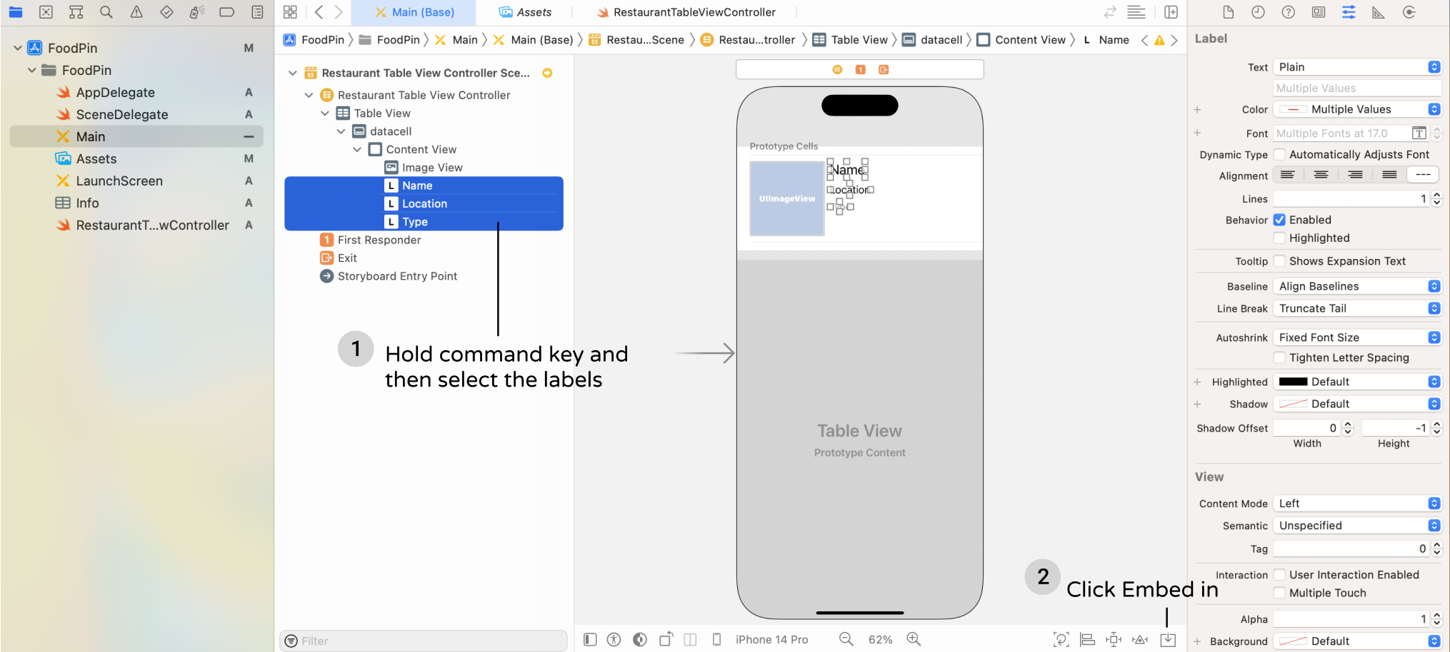
First, hold the command key, and select the three labels. Click the Embed in button in the layout bar and then choose Stack View to embed them in a vertical stack view. Go to the Attributes inspector, and change the spacing of the stack view to 4. This will add a space between the labels.
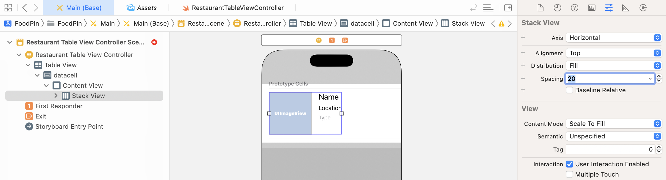
Next, select both the image view and the stack view that we have just created. Click the Embed in button and choose Stack View to embed them into a horizontal stack view. You can go up to the Attribute inspector, and change the spacing option to 20. Awesome, right? You can nest stack views to create complex layouts.
Again, it doesn't mean you do not need to use auto layout. We still need to define the layout constraints for the stack view. Figure 9-16 depicts the layout requirements of the cell.
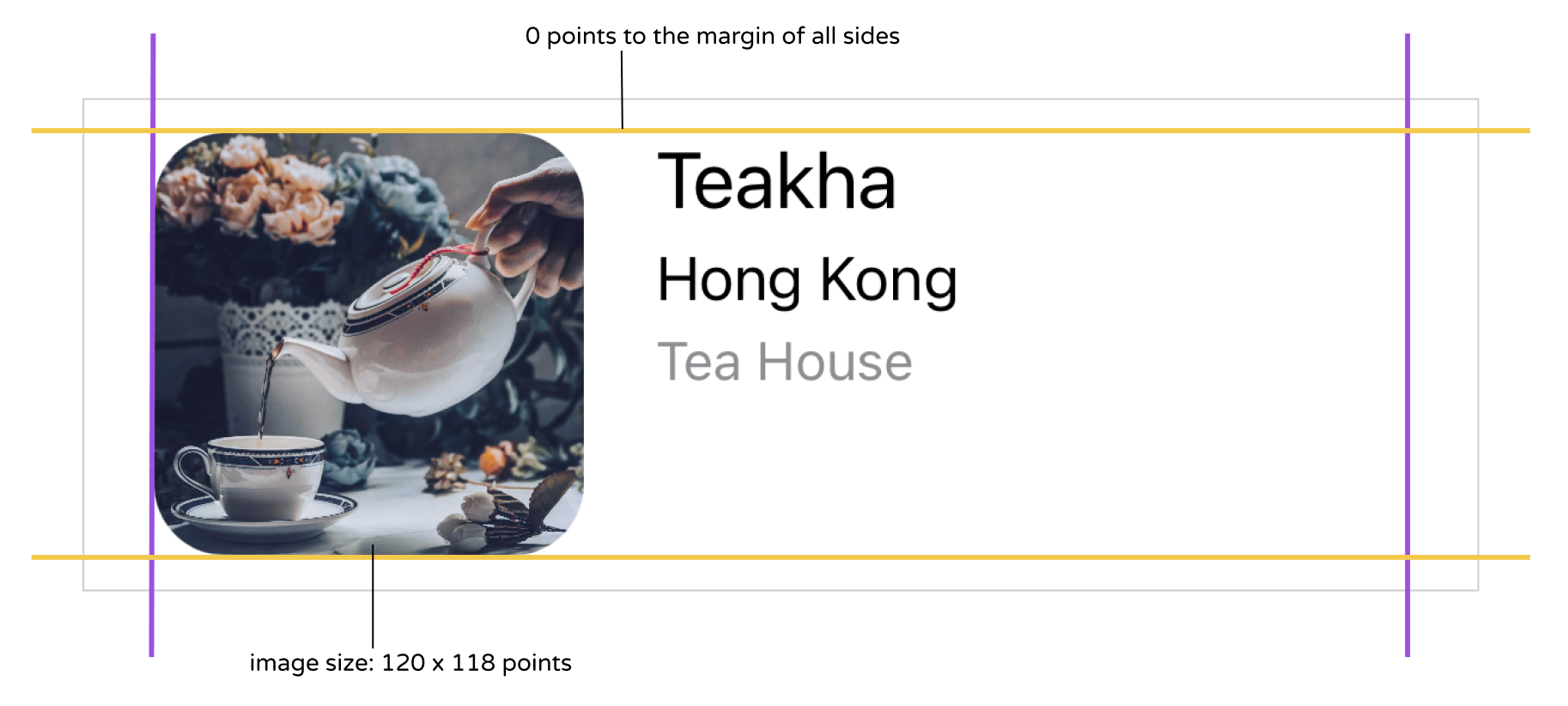
In brief, we want the cell content (i.e. the stack view) is confined to the viewable area of the cell. This is why we're going to define a spacing constraint for each side of the stack view. On top of this, the size of image view should be fixed to 120x120 points.
Now select the stack view and click the Add New Constraints button in the layout bar. Set the values of the top, left, bottom and right sides to 0, 0, 0 and 0 respectively. Also, make sure the Constrain to margins option is checked.

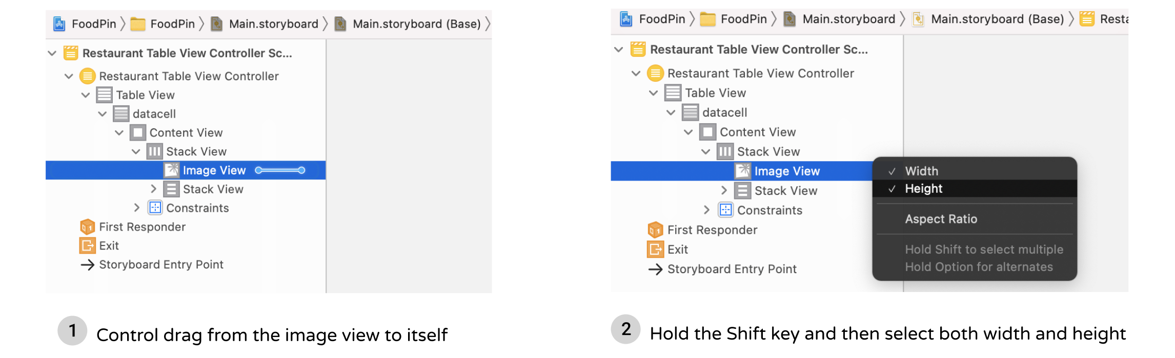
Once you add the 4 constraints, the stack view should be resized automatically. Next, we need to add a couple of constraints to control the size of the image view. In the document outline, drag horizontally from the image view to itself. In the pop over menu, hold shift key and choose both "width" and "height" options. Press enter to confirm. This ensures the size of the image view is fixed.
Cool! You've completed the layout of the prototype cell. Let's move on and write some code.
Creating a Class for the Custom Cell
So far, we've designed the table cell. But how can we change the label values of the prototype cell? These values are supposed to be dynamic. By default, the prototype cell is associated with the UITableViewCell class. You can select the datacell in document outline and then go to the Identity inspector to reveal the association.

In order to update the cell data, we're going to create a new class, which extends from UITableViewCell, for the prototype cell. We want to create a custom version of UITableViewCell that associates with the custom cell in Interface Builder.
As usual, right click the "FoodPin" folder in Project Navigator and select "New File…". After selecting the option, Xcode prompts you to select a template. Since we need to create a new class for the custom table view cell, select "Cocoa Touch Class" and click "Next". Fill in RestaurantTableViewCell as the class name and set the value of "Subclass of" to UITableViewCell.
Click "Next" and save the file in the FoodPin project folder. Xcode should create a file named RestaurantTableViewCell.swift in the Project Navigator.
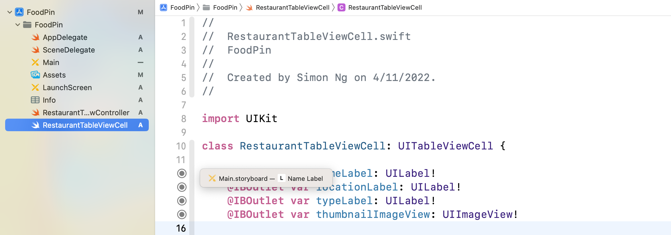
Next, declare the following outlet variables in the RestaurantTableViewCell class:
@IBOutlet var nameLabel: UILabel!
@IBOutlet var locationLabel: UILabel!
@IBOutlet var typeLabel: UILabel!
@IBOutlet var thumbnailImageView: UIImageView!
The RestaurantTableViewCell class serves as the view model of the custom cell. In the cell, we have 4 properties that are changeable:
- thumbnail image view
- name label
- location label
- type label
The view model stores and provides the values for the cell to display. Each of them is required to connect with the corresponding user interface object in Interface Builder. By connecting the source code with the UI objects, we can change the values of UI objects dynamically.
This is a very important concept in iOS programming. Your UI in storyboard and code are separated. You design the UI in Interface Builder and write your code in Swift. If you want to change the value or properties of a UI element (e.g. label), you have to establish a connection between them such that an object in your code can obtain a reference to an object defined in a storyboard. In Swift, you use @IBOutlet keyword to indicate a property of a class, that can be exposed to Interface Builder. For properties annotated with the IBOutlet keywords, we call it outlets.
So in the above code, we declare four outlets. Each outlet is going to connect with its corresponding UI object. Figure 9-21 depicts the connections.

Before we can establish a connection between the outlets of@IBAction vs @IBOutlet
We've used @IBAction to indicate action methods when developing the HelloWorld app. What's the difference between @IBAction and @IBOutlet? @IBOutlet is used to indicate a property that can be connected with a view object in a storyboard. For example, if the outlet is connected with a button, you can use the outlet to change the color or title of the button. On the other hand, @IBAction is used to indicate an action method that can be triggered by a certain event. For example, when a user taps a button, it can trigger an action method to do something.
RestaurantTableViewCell class and the prototype cell in Interface Builder. We have to first set the custom class.
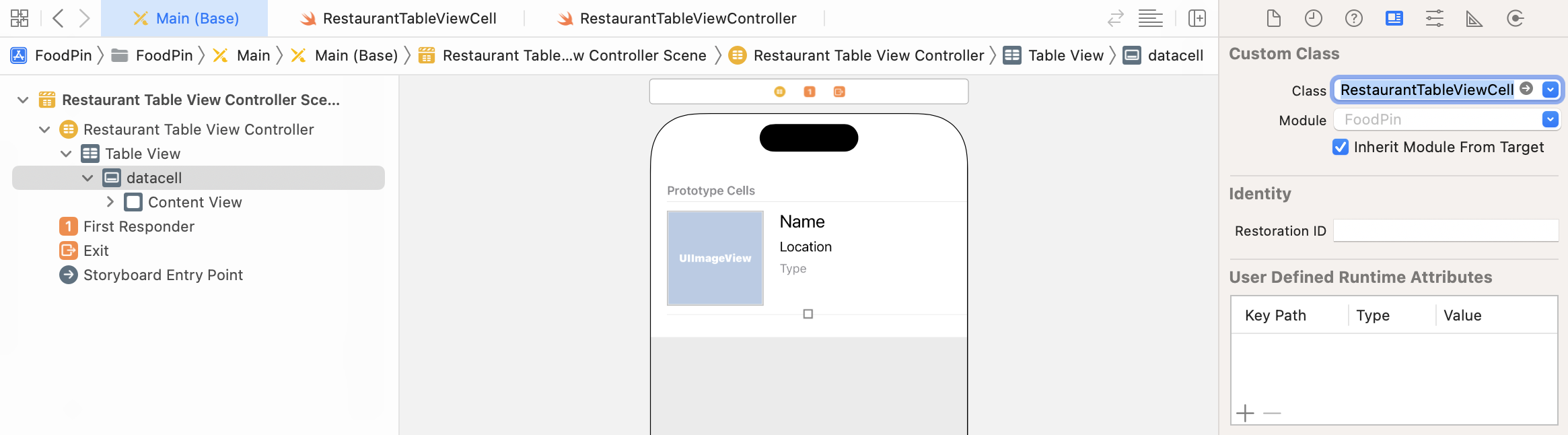
As said earlier, the prototype cell is associated with the default UITableViewCell class. To assign the prototype cell with the custom class, select the cell in storyboard. In the Identity inspector, set the custom class to RestaurantTableViewCell (see figure 9-22).
Establishing the Connections
Next, we will establish the connections between the outlets and UI objects in the prototype cell. In Interface Builder, right click the cell (i.e. datacell) in the Document Outline view to bring up the Outlets inspector. Drag from the circle (next to thumbnailImageView) to the image view object in the prototype cell (see figure 9-23). Xcode automatically establishes the connection when you release the button.
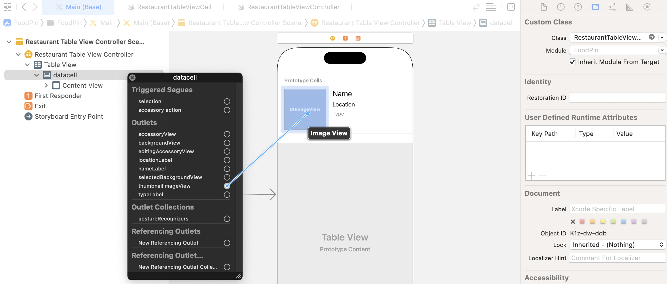
Repeat the above procedures for the following outlets:
- locationLabel - connects to the Location label the cell
- nameLabel - connects to the Name label of the cell
- typeLabel - connects to the Type label of the cell
After you've made all the connections, the UI should look like the screenshot shown in figure 9-24.

You can also switch back to RestaurantTableViewCell.swift to review the connections. If an outlet variable is connected, it will be indicated by a gray circle indicator. You can even click on the indicator to reveal the connection.
Updating the Cell Provider
Finally, we come to the last part of the change. In the RestaurantTableViewController class, we're still using UITableViewCell (i.e. the default cell) to display the content. We need to modify a line of code to replace it with our custom cell. If you look into the existing implementation of the configureDataSource method, you should find this line of code:
let cell = tableView.dequeueReusableCell(withIdentifier: cellIdentifier, for: indexPath)
I've explained the meaning of the dequeueReusableCell method in the previous chapter. It is flexible enough to return any cell type from the queue. By default, it returns a generic cell of a UITableViewCell type. How do I know that? I read the documentation. Xcode provides you a convenient way to read the documentation of the APIs. Hold option key, place the mouse cursor over dequeueReusableCell and then click on it. Xcode will show you the description of the method.
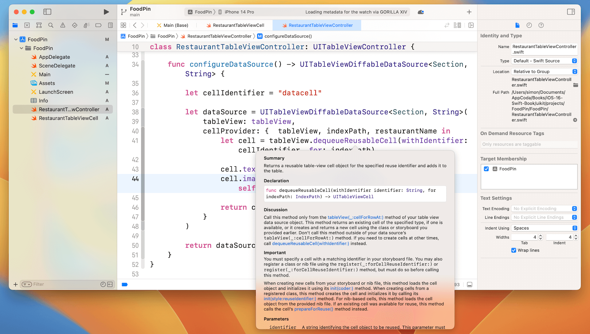
In order to use the RestaurantTableViewCell class, it's our responsibility to "convert" the returned object of dequeueReusableCell to RestaurantTableViewCell. This conversion process is known as downcasting. In Swift, we use the as! keyword to perform a forced conversion. Therefore, change the line of code in configureDataSource() to the following:
let cell = tableView.dequeueReusableCell(withIdentifier: cellIdentifier, for: indexPath) as! RestaurantTableViewCell
I know you can't wait to test the app, but we need to change a few more lines of code. The lines of code below set the values of restaurant name and image:as! and as?
Downcasting allows you to convert a value of a class to its derived class. For example,RestaurantTableViewCellis a child class ofUITableViewCell. ThedequeueReusableCellWithIdentifiermethod always returns aUITableViewCellobject. If a custom cell is used, this object can be converted to the specific cell type (e.g. RestaurantTableViewCell). Prior to Swift 1.2, you can just use theasoperator for downcasting. However, sometimes the object may not be converted to a specified type. Therefore, from Swift 1.2 and onwards, Apple introduced two more operators:as!andas?. If you're quite sure that the downcasting can perform correctly, useas!to perform the conversion. In case you're not sure if the value of one type can be converted to another, useas?to perform an optional downcasting. You're required to perform additional checking to see if the downcasting is successful or not.
cell.textLabel?.text = restaurantName
cell.imageView?.image = UIImage(named: self.restaurantImages[indexPath.row])
Both textLabel and imageView are properties of the default UITableViewCell class. Because we're now using our own RestaurantTableViewCell, we need to use the properties of the custom class. Change the above lines to the following:
cell.nameLabel.text = restaurantName
cell.thumbnailImageView.image = UIImage(named: self.restaurantImages[indexPath.row])
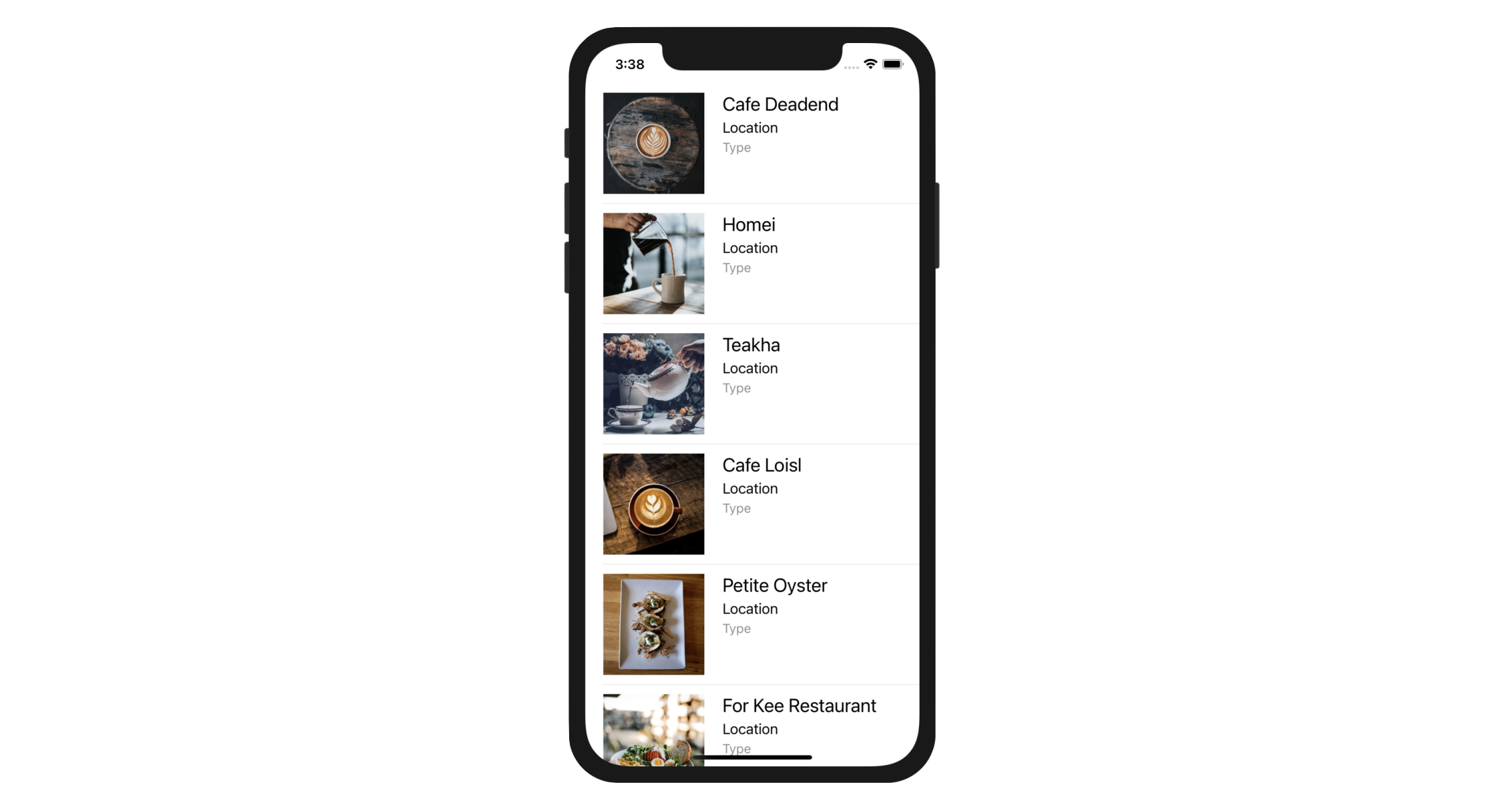
Now you're ready to go. Hit the Run button and test the app. Your app should look like the one shown in figure 9-27. Try to rotate the simulator. The app also works in landscape orientation. It is a huge improvement from the previous version of the app. We're going to make it even better by rounding the corners of the images.
Rounding Image Corners
Since the release of iOS 14 and macOS Big Sur, it made me feel that Apple favors to round the edges of UI elements. For this demo app, wouldn't it be great to make all the restaurant images rounded corners? You do not need Photoshop to tweak the images. What you need is to write a couple lines of code.
Every view in the UIKit (e.g. UIView, UIImageView) is backed by an instance of the CALayer class (i.e. layer object). The layer object is designed to manage the backing store for the view and handles view-related animations.
The layer object provides various attributes that can be set to control the visual content of the view such as:
- Background color
- Border and border width
- Shadow color, width, etc
- Opacity
- Corner radius
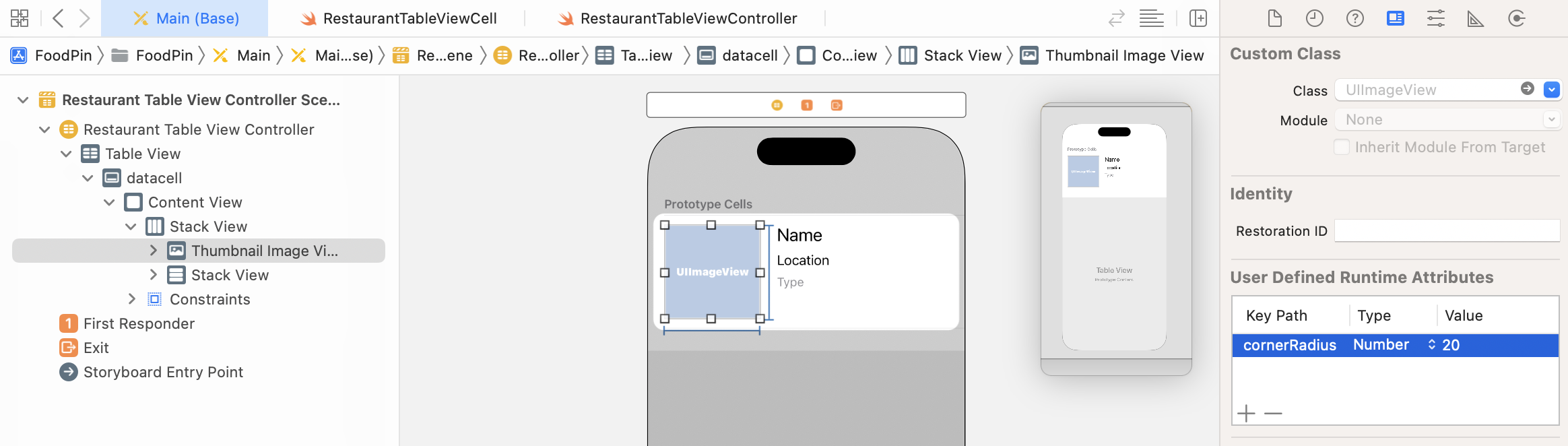
The corner radius is the attribute, which we use to draw rounded corners. Xcode provides two ways to edit the layer properties. One of the approaches is make the change through Interface Builder. First, select the image view in the stack view. Go to the Identity inspector, click the Add button (+) in the lower left of the User Defined Runtime Attributes editor. A new runtime attribute appears in the editor. Double click on the Key Path field of the new attribute to edit the key path for the attribute. Set the value to cornerRadius and hit Return to confirm. Click on the Type attribute and choose Number. Lastly, set the value to 20.
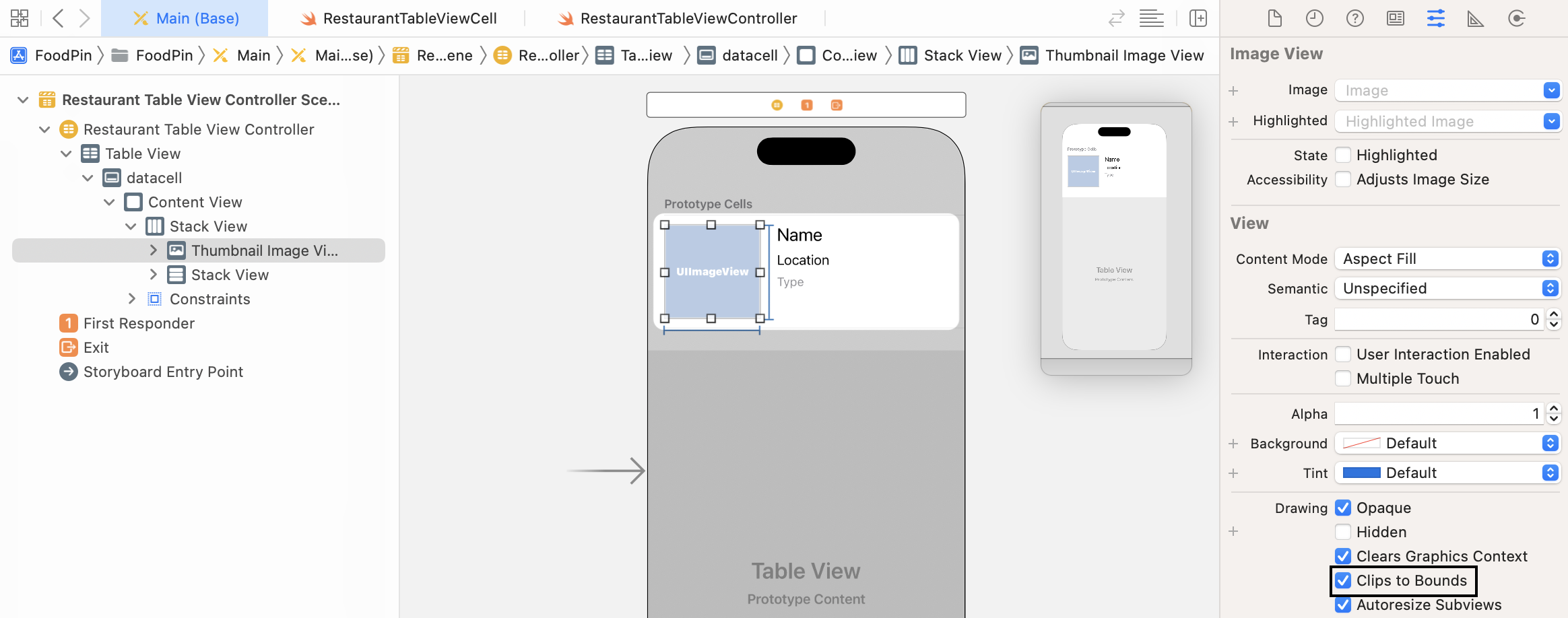
When the image view is initialized, this runtime attribute will be automatically loaded to round the corners. There is one more thing you have to configure before the circular image works properly. Select the image view and go to the Attributes inspector. In the Drawing section, please make sure to enable the Clip to Bounds option. This causes the content to be clipped to the rounded corners.
Now compile and run the app. The UI looks even better, right? Without writing a line of code, we round the edge of the images. You're free to alter the value of corner radius. Try to change the corner radius to 60 points and see what you get.
Other than using Interface Builder, you can also change the corner radius programatically. In RestaurantTableViewCell.swift, you can add a didSet code block for thumbnailImageView like this :
@IBOutlet var thumbnailImageView: UIImageView! {
    didSet {
        thumbnailImageView.layer.cornerRadius = 20.0
        thumbnailImageView.clipsToBounds = true
    }
}
didSet is known as a property observer in Swift. As its name suggests, the code block specified in didSet will be called every time a property's value is set. In the code above, when an image view is assigned, the didSet code block will be called to change the corner radius and set the clipsToBounds value to true.
To create a circular image, you can change the code snippet like this, which set the radius to half the width of the image view.
@IBOutlet var thumbnailImageView: UIImageView! {
    didSet {
        thumbnailImageView.layer.cornerRadius = thumbnailImageView.bounds.width / 2
        thumbnailImageView.clipsToBounds = true
    }
}
Testing the App Using Dark Mode
Since the release of iOS 13, Apple allows users to choose between light and dark system-wide appearance. When the user chooses to adopt Dark Mode, both the system and apps use a darker color palette for all screens and views. As an app developer, you should make sure your apps also comply with Dark Mode. There are multiple ways to test your app in Dark Mode.
While you are running the app on a simulator, you can click the Environment Overrides button to switch the appearance from light to dark. Once you enable the switch, the simulator is set to adopt Dark Mode. Our FoodPin app already looks great without any additional changes.
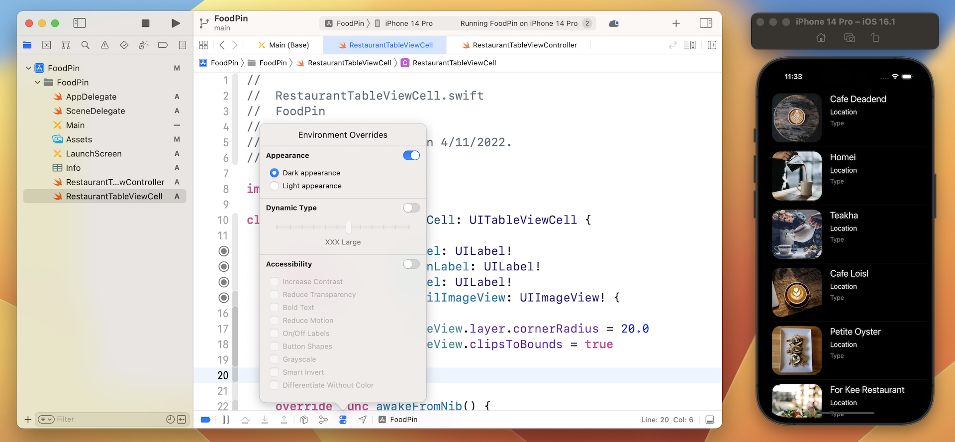
Alternatively, you can directly change the setting of your simulator. On any of the simulators, go to Settings > Developer. Turn the switch of the Dark Appearance option to ON to enable Dark Mode.
Exercise #1
As of now, the app simply displays "Location" and "Type" for all rows. As an exercise, I'll leave it to you to fix the issue. Try to edit the source code to update the location and type labels. Below are the two arrays you need:
var restaurantLocations = ["Hong Kong", "Hong Kong", "Hong Kong", "Hong Kong", "Hong Kong", "Hong Kong", "Hong Kong", "Sydney", "Sydney", "Sydney", "New York", "New York", "New York", "New York", "New York", "New York", "New York", "London", "London", "London", "London"]

var restaurantTypes = ["Coffee & Tea Shop", "Cafe", "Tea House", "Austrian / Causual Drink", "French", "Bakery", "Bakery", "Chocolate", "Cafe", "American / Seafood", "American", "American", "Breakfast & Brunch", "Coffee & Tea", "Coffee & Tea", "Latin American", "Spanish", "Spanish", "Spanish", "British", "Thai"]
Exercise #2
The previous exercise may be too easy for you. Here is another challenge. Try to redesign the prototype cell and see if you create an app like this (see figure 9-31).
As a hint, you can add the following line of code in viewDidLoad() to remove the cell separator:
tableView.separatorStyle = .none
Summary
Congratulations! You've made a huge progress. If you understand the ins and outs of cell customization, you're ready to make some awesome UIs. Table view is the backbone for most iOS apps. Unless you're building a game, you'll probably implement a table view in one way or another when building your own apps. Table view customization may be a bit complex for some of you. So take some time to work on the exercises and play around with the code. Remember "learn by doing" is the best way to learn coding.
For reference, you can download the complete Xcode project from http://www.appcoda.com/resources/swift57/FoodPinCustomTable.zip. If you can't figure out how to complete the exercise, you can download the solution from http://www.appcoda.com/resources/swift57/FoodPinCustomTableExercise.zip.